Not all images were able to load for printing. Please close the print window and try again.
Dial Styles, History and Evolution of a Watch’s Crucial Part
From California to military to Art Deco, dials have many distinctive styles that helped define eras of watchmaking.
Following our ABCs of Time article on dial materials, as well as a story dedicated to the sector dials, we’re now shifting focus to dial styles throughout history, which echo many design eras like Art Nouveau, Art Deco and Mid-Century Modernism. Although most dial types essentially provide the same information, whether with Arabic or Roman numerals, printed or applied indices (or a combination of any/all), the style itself makes all the difference. Just look at car designs over the last century. Some dials emphasise legibility for military applications, while others take a minimalist approach with influences from the German Bauhaus movement and so on. Despite these differences in approach, dial styles often have one thing in common – they help define historic moments in watchmaking.
The Early Years
Early watches were mechanical marvels as they ticked autonomously within portable cases, allowing wealthy owners to carry time anywhere. However, they were so inaccurate that dials only featured a single hour hand, as minutes would’ve been pointless (most were off by hours per day). These watches, initially known as Nuremberg eggs from German locksmith Peter Henlein, didn’t have crystals and used hinged metal lids to protect exposed dials and hands. Straightforward and even utilitarian dials with engraved markings and Roman numerals soon gave way to elaborate counterparts. Watchmakers couldn’t quite crack the accuracy code yet, so fancy, artistic dials with floral patterns, geometric shapes, animals and so on made watches luxurious fashion statements as much as practical timekeepers. These early watches were so expensive that they were often the priciest item one could own, including a house and land, so elaborate case and dial designs were paramount for such wealthy clientele. It was the merging of elite yet imperfect technology of the day with fine art.
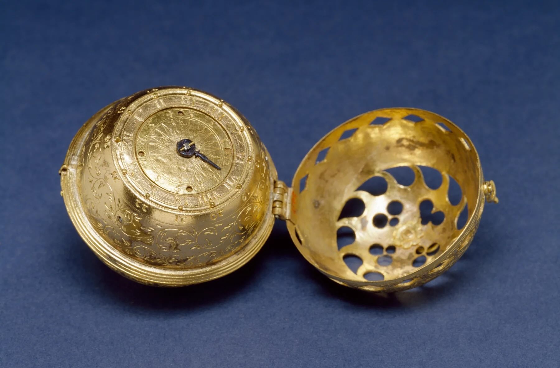
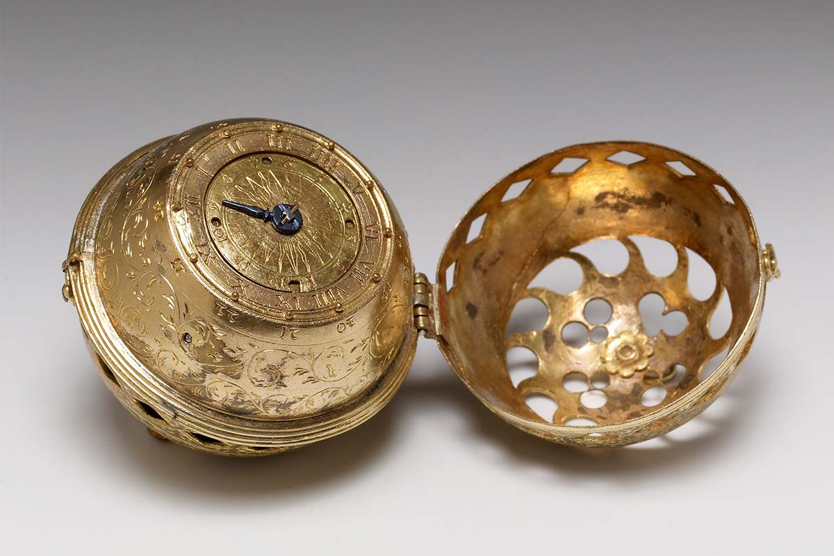
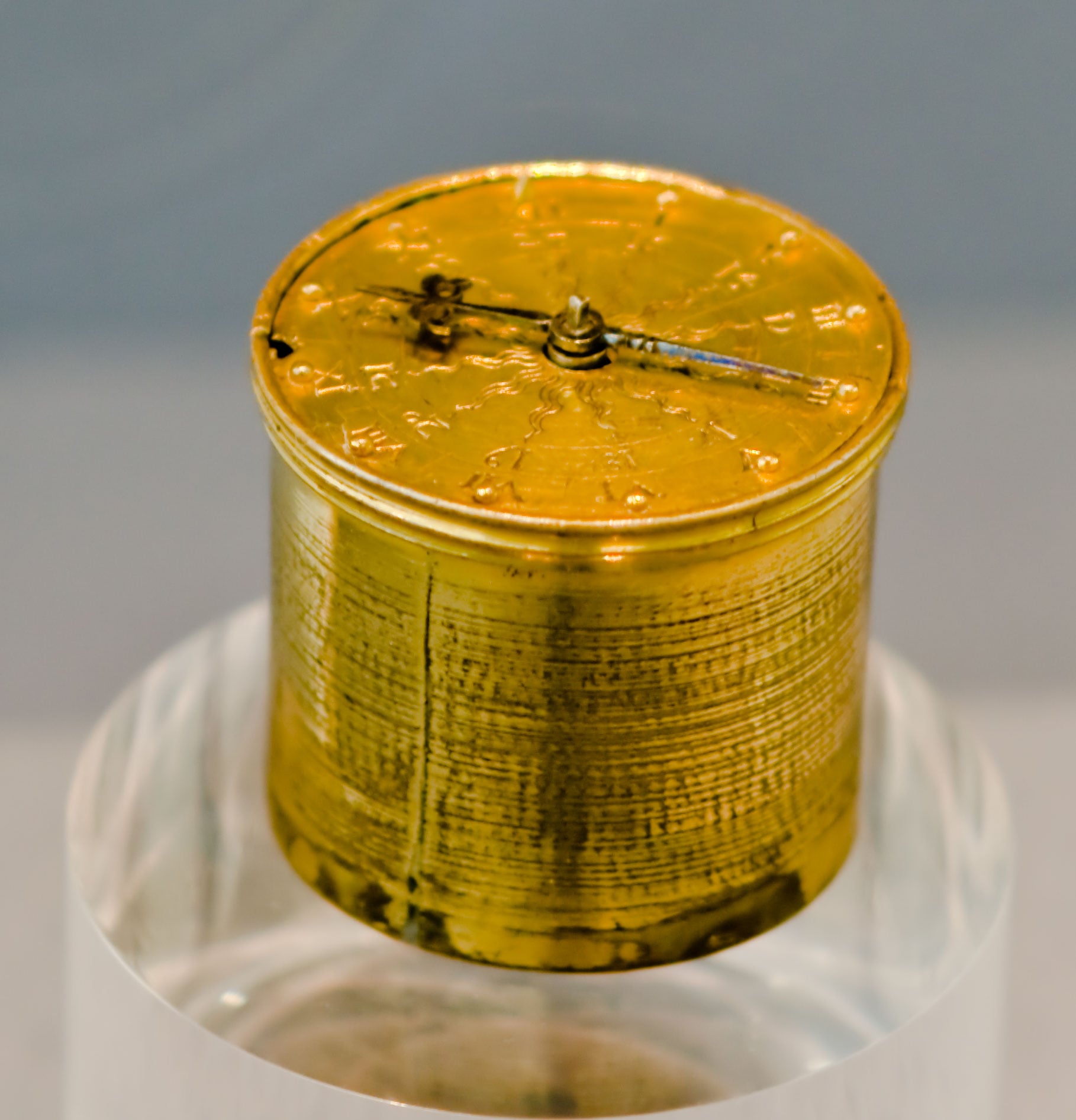
Unlike modern watch dials that usually focus on function over form (without ignoring form, of course), dials during the early years focused on theatrics, status and ornamentation. In some cases (and prior to lume), experimental dials were tactile for nighttime use, where raised metal pins next to hour markers allowed users to feel the time like horological braille (the pin at 12 o’clock was longer to help orient the dial). Vitreous enamel was experimented with in the 16th century for vibrant scenes and patterns, while intricate engravings were also seen throughout the dial and case, leaving no aesthetic stone unturned. As precision mechanics further evolved in clocks and watches, astronomical themes became popular, with tiered rotating discs to show the moon phases, zodiac signs, date and more.
How Mechanical Breakthroughs Changed the Dial
As horology advanced to allow minutes and seconds hands to join the dial with increased accuracy, dial designs evolved into more functional time indicators. The shift happened in the late 17th century thanks to innovations by Dutch polymath Christiaan Huygens, who invented both the clock pendulum and watch balance spring. Starting with the pendulum in 1656, clock accuracy went from 15 minutes or more per day to about 10 seconds, and the seconds hand was introduced for the first time for mainstream use.
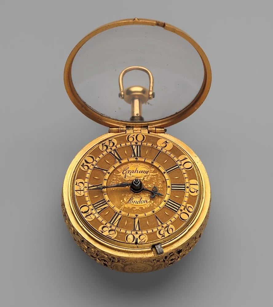
Clock dials changed to highlight this leap in precision, but it was Huygens’ balance spring in 1675 that brought about an even bigger change. Unlike clocks that were still quite precise for day-to-day use before the pendulum, watches could be off by hours per day, with the most accurate dipping to within an hour (with varying degrees of reliability). The balance spring provided consistent balance wheel oscillation and isochronism that brought accuracy to within a few minutes per day. Like clocks, watch dials emphasised this new precision with a no-nonsense approach for each of the three hands – clear hour indicators with detailed minute and seconds tracks. More and more watches became focused and serious tools instead of elaborate statement pieces, although they remained painstakingly handmade devices for the wealthy and royalty.
The Lépine Aesthetic
As ornate dial and case aesthetics from the Baroque era (around 1600 to 1750) shifted to more purposeful designs as pocket watch accuracy advanced, watchmakers focused more on their own dial aesthetics. French master watchmaker Jean-Antoine Lépine invented the Lépine calibre in 1764 that replaced the full movement plate of the day with independent bridges, and moved the balance wheel to the same level as the gear train. Lépine also removed the bulky fusee and chain used to compensate for inconsistent power from the unwinding mainspring. These changes resulted in a significantly thinner movement and flatter watch case, and brought about the modern pocket watch blueprint that endured into the 20th century.
The Lépine Aesthetic was his new dial philosophy to match the thinner, modern case with thin Arabic numerals instead of heavy Roman counterparts and dotted minute tracks, leaving a lot of negative space. The minimalistic and symmetric approach was not only contemporary and easy to read, but also allowed for smaller dial diameters without sacrificing legibility. Lépine was the first watchmaker to consistently use Arabic numerals on dials for both hours and minutes, and favoured thin, crisp black or red scripts. He also introduced open-worked hands with arrow tips that later influenced Abraham-Louis Breguet and other master watchmakers.
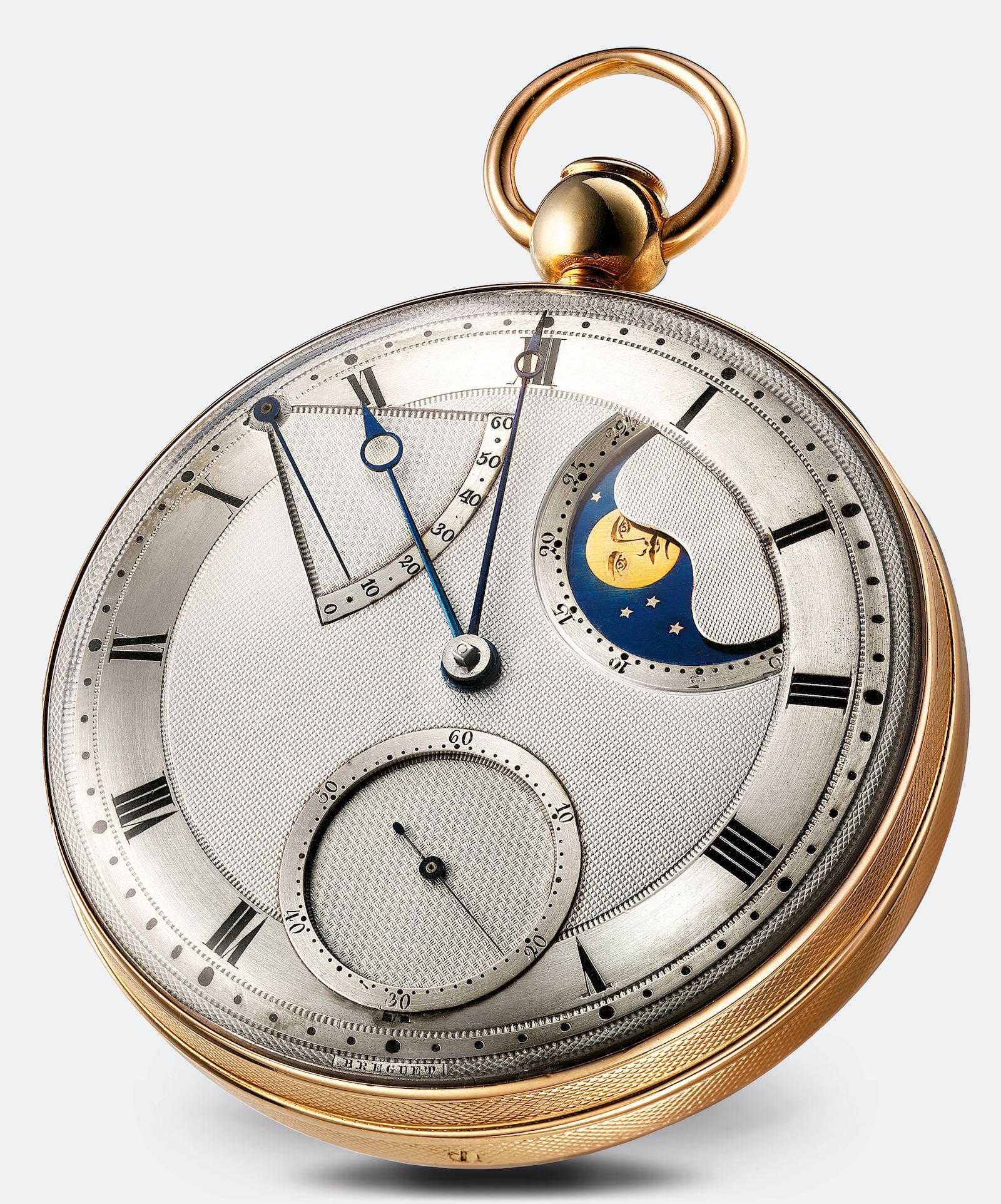
Abraham-Louis Breguet
To say Breguet contributed a lot to watchmaking would be an understatement, as he introduced the tourbillon, Pare-Chute shock protection, repeater gongs, hairspring overcoil and more. He also contributed quite a lot to dial designs, including distinctive Breguet Numerals, which feature thin, calligraphic Arabic numerals with a slight tilt to the right, likely influenced by the earlier work of Lépine. Five-minute marks were usually represented with stylised fleur-de-lys (or sometimes stars or arrows). He also created the instantly recognisable Breguet Hands with an open circle near the tip. Perhaps his most influential dial contribution was guilloché in 1786, as he’s likely the first to use rose engine lathes to create complex geometric patterns on metal dials. This not only looked good, but reduced outdoor glare and could separate various sections of the dial, so it was equal parts form and function. Guilloché was seen earlier on case backs by artisans like Pierre Duhamel in the late 17th century, but Breguet pioneered its use on dials.

Railroad Dials
Watch dials designed for the railroad industry had a distinctive style that emphasised precision and legibility, as accuracy was critical to safely routing trains on shared single tracks (going in opposite directions). Trains could pass each other at specific track sidings or stations, and schedule times had to be exact, as being off by just a minute or two could lead to a catastrophic collision. Although many think of America as the railroad pioneer, it was Great Britain that innovated on steam engines and contemporary tracks. America, however, pioneered the railroad pocket watch that made travel safe and predictable, along with expanding rail on a massive scale across the country. In 1891, an industry-changing collision occurred in Kipton, Ohio, that killed eight, all due to a conductor’s pocket watch being four minutes off. After this “Kipton Train Collision” where a mail train collided head-on with a passenger train, changes were made by Chief Time Inspector Webb C. Ball, who established the Railroad Timepiece Standards requiring all railroad employee watches to be accurate to within 30 seconds per week. In addition, all crewmembers had to set their watches to the standard central clocks at stations and central points, and also ensure their watches were synchronised to each other’s before shifts.
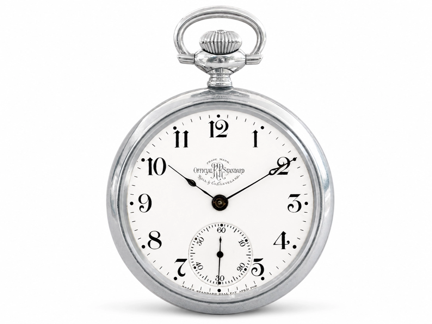
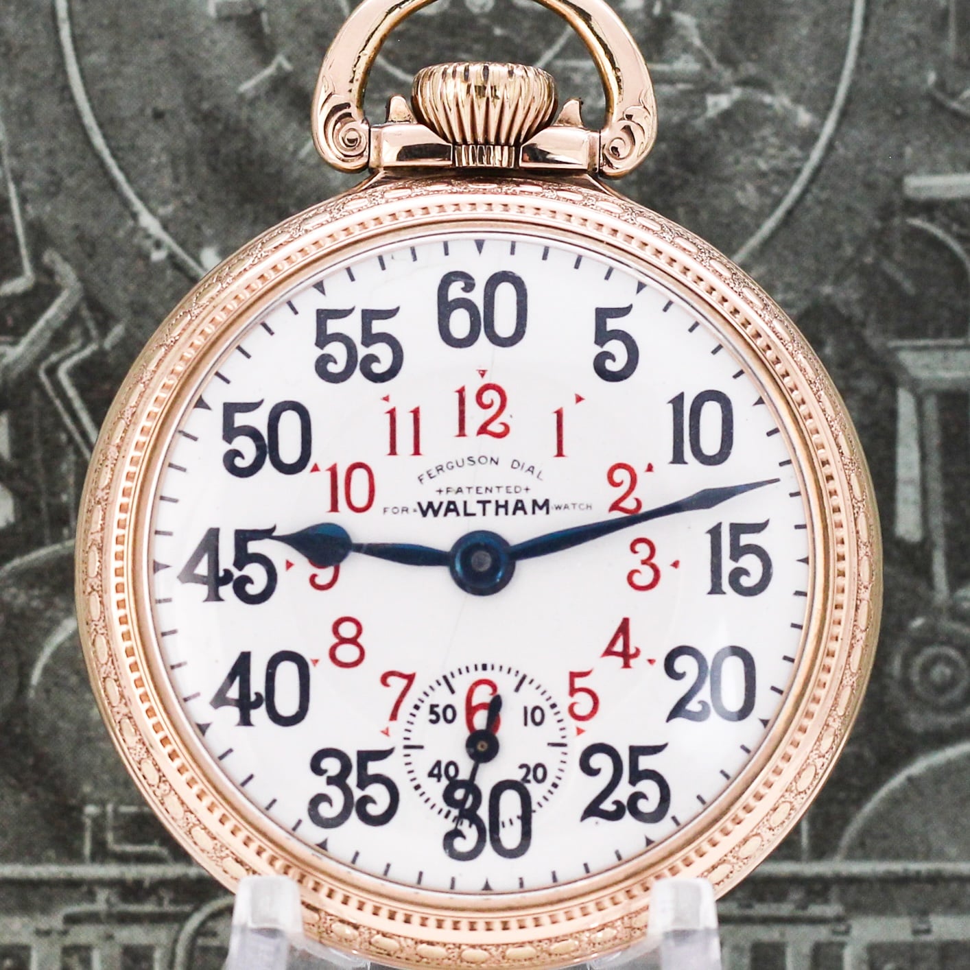
Among Ball’s changes were strict dial requirements to ensure maximum legibility and precision. For starters, all watches had to be open-faced (no hinged covers) and dials were white enamel with large black Arabic numerals (Roman numerals were banned). Five-minute marks had to be dots, squares or diamonds with precise dashes between, while hour and minute hands had to be bold black or blued steel. A sizeable small seconds sub-dial sat at 6 o’clock with a detailed track and Arabic numerals every ten seconds. Branding was allowed by the watchmaker or railroad company, but limited to the top section below 12 o’clock. Although Webb C. Ball’s dial standard was most prevalent among the railroad industry, others pushed their own designs, like Louis Buck Ferguson in 1908 with the Ferguson Dial. This featured a primary ring of oversized Arabic numerals for minutes with a much smaller inner ring of red hour numerals. Specialised hands were needed to make it feasible, with a short red hour hand for the inner ring and long blued minute hand for the outer numerals. These variants were somewhat controversial and never gained the widespread acceptance of Ball’s design as maximum legibility and safety were prioritised.
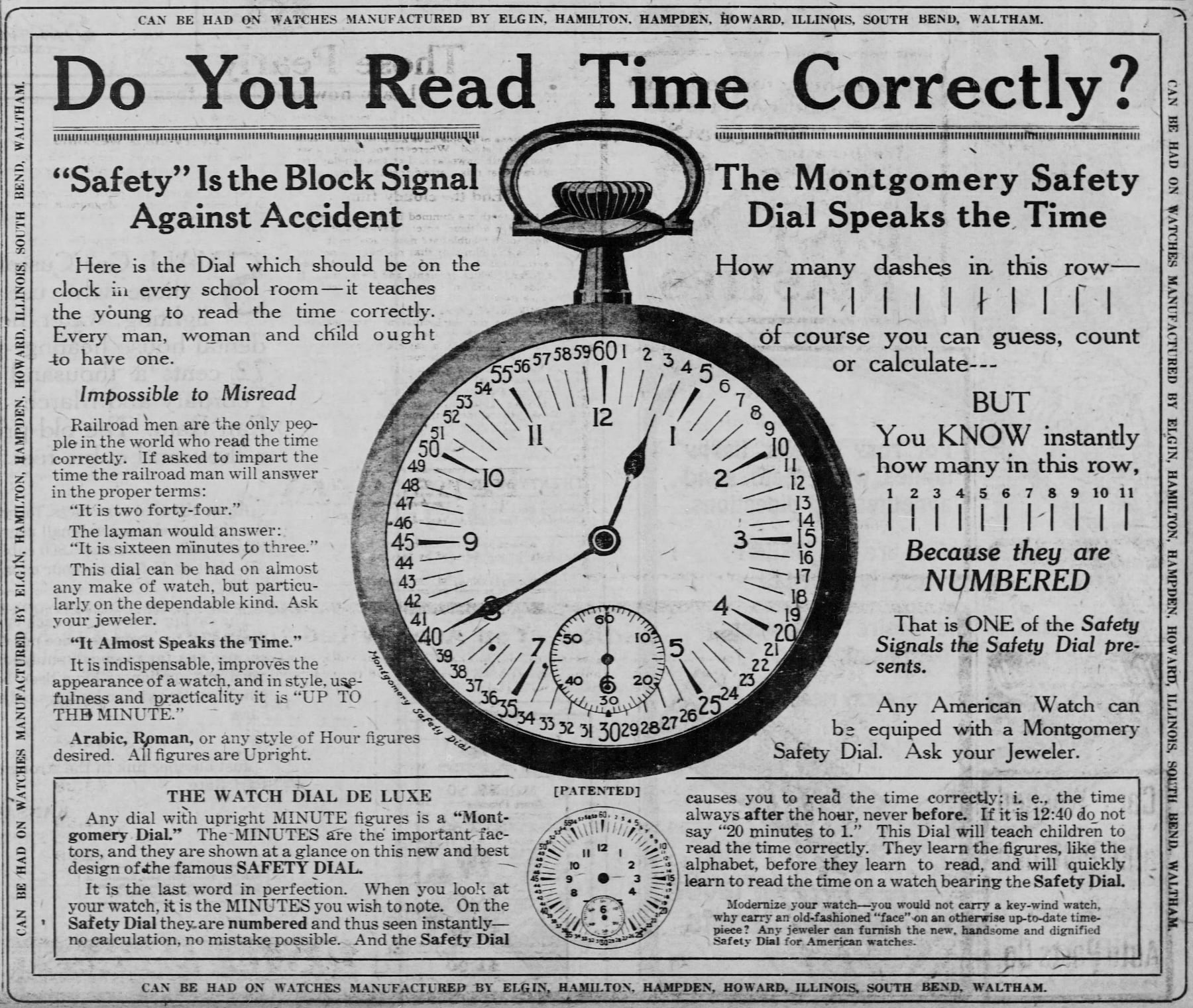
Henry S. Montgomery, however, did make an alternative dial that proved popular in 1899 and into the 20th century. The Montgomery Safety Dial had standard Arabic numerals near the perimeter for hours, with every single minute numeral printed at the outermost perimeter. Every five-minute numeral was red, from 60 at the 12 o’clock position to 5, 10, 15, 20 and so on. This ensured that every minute between the hour numerals was read accurately, and the dial was first used with the Santa Fe Railway on both watches and station clocks. When the dial went mainstream around 1910, brands like Elgin, Hamilton, Hampden, Waltham and more pushed the Montgomery Safety Dial on their railroad-grade pocket watches. The Type II variant debuted in 1920 with smaller hour numerals on the inside of the dial, which proved too controversial for widespread adoption (not unlike the Ferguson Dial). A handful of brands pay tribute to Montgomery and Ferguson dials today, such as RGM Watch Company with Model 222-RR.
World War I
As wristwatches began replacing centuries of pocket watches during and particularly just after World War I, dial designs really took off. Wristwatches during the war (known as wristlets) were a bit scattershot at first, as some were pocket watches with soldered lugs, and others were early dedicated wristwatches from the factory. Legibility was emphasised with either white or glossy black enamel dials and large Arabic numerals, and several watchmakers developed specific designs. In late 1917, for example, Elgin created the Star Dial line for US soldiers with oversized, Bodoni-style white Arabic numerals over black enamel and white stars for the perimeter minute track (with a dash every five minutes). A small seconds sub-dial sat at 6 o’clock, and an eagle was positioned just above the Elgin logo at 12 o’clock.
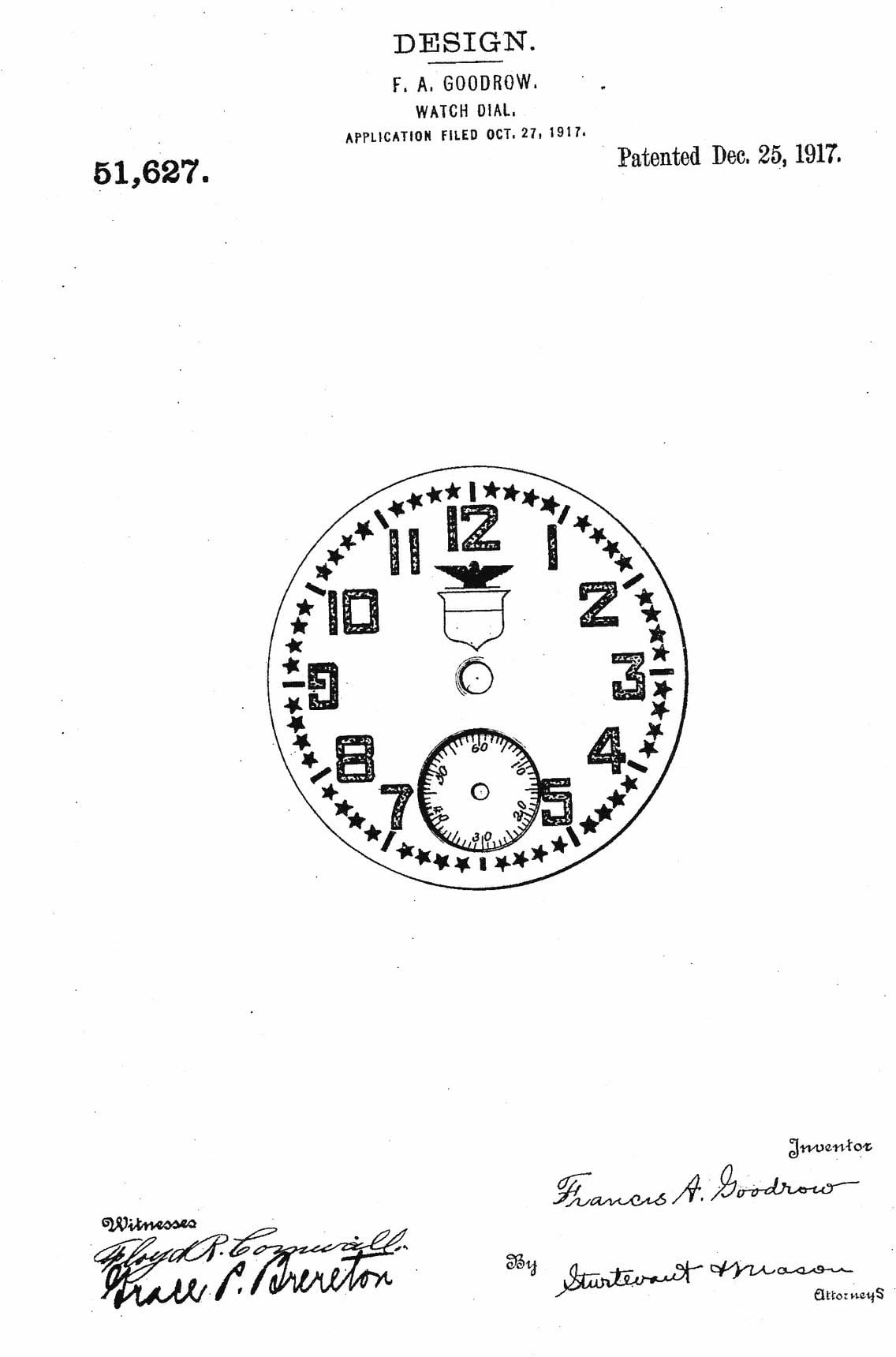
Designer Francis Goodrow received a patent for the layout in 1917, and it was very popular. Longines, Omega and Waltham made Officer Trench Dials that were quite the opposite of Star Dials, with white enamel and large black Arabic numerals (sometimes skeletonised). These included a hinged lid to protect the crystal, often with a grill design to see the time underneath. Many watches for American and British soldiers featured a red numeral at 12 o’clock for quick orientation at a glance, while the majority had luminescent radium 226 paint on the hands and numerals.
Post War Wristwatches
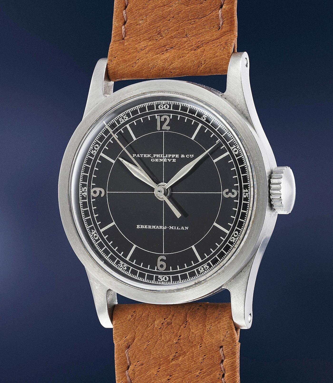
The 1920s saw an explosion of wristwatches as returning soldiers and their trench watches shifted the perception of wristwatches from feminine and a woman’s accessory to positively masculine and trendy. Art Deco designs inspired by architecture and the booming automotive industry were seen in 1920s dials, and Patek Philippe introduced the geometric sector dial in 1924 with ref. 421. These had separate concentric rings for hours and minutes/seconds, which aligned geometrically, and crosshair patterns were added in the 1930s as popularity soared into the 1950s.
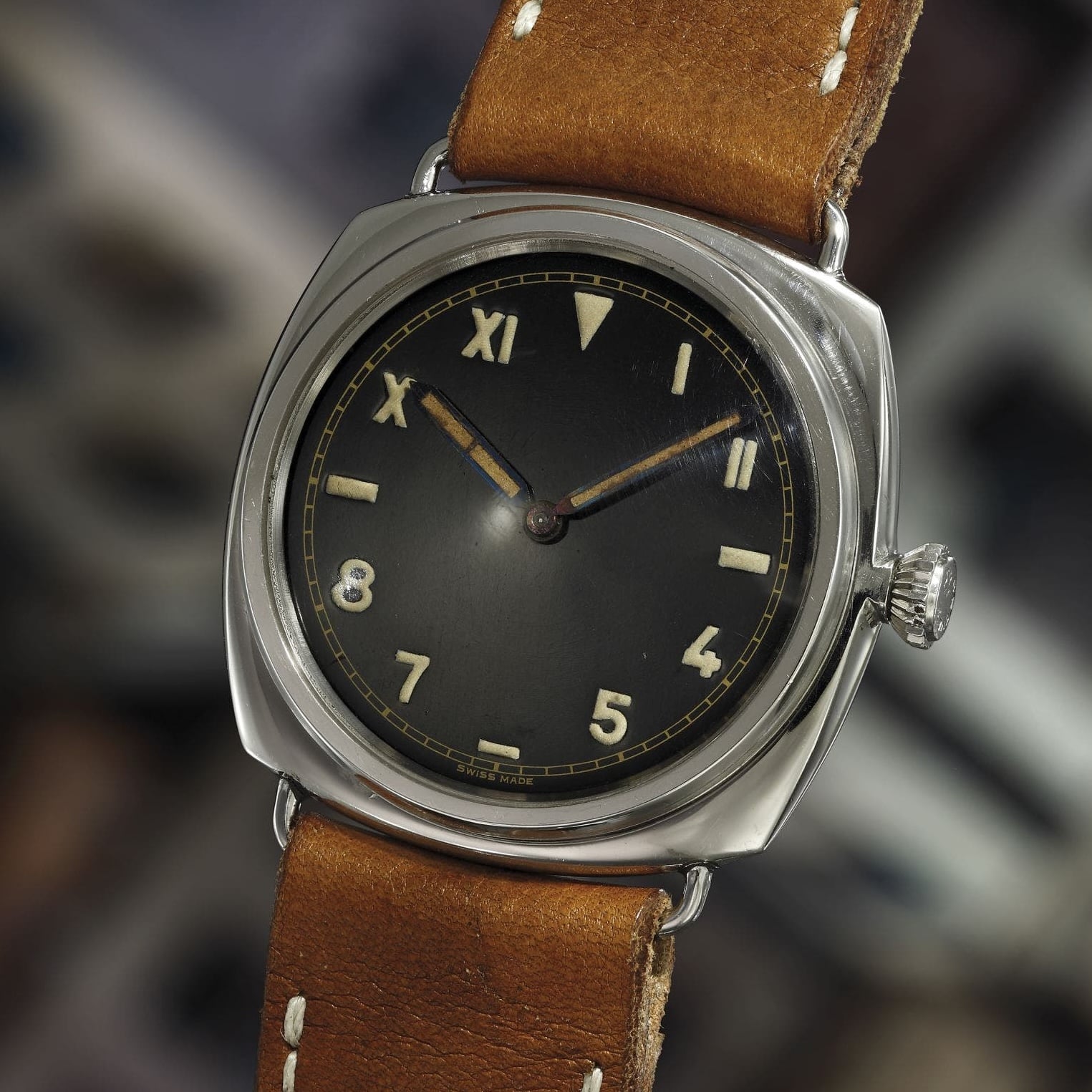
California dials emerged in the 1930s from Rolex (with a patent in 1942) that featured Roman numerals at the top half – 10 through 2 o’clock – and Arabic numerals at the bottom half – 4 through 8 o’clock. 3 and 9 o’clock were represented by horizontal dashes. Modern California dials often have this reversed, with Arabic numerals at the top. Rolex marketed them as “error-proof” dials, as they were easy for military divers to read underwater. A famous partnership between Rolex and Panerai during World War II brought Radiomir models (ref. 3646) with Rolex movements and California dials for Italian Navy frogmen. The California dial remains popular with modern watchmakers like Nomos with the Club Campus line and Panerai with the Radiomir California.
German Bauhaus Movement
The Bauhaus dial design from Pforzheim, Germany brought minimalism with thin sans-serif typography and distinctive clean lines, first produced by dial maker Weber & Baral in 1937 for A. Lange & Söhne and Stowa. This was quite the opposite of the more dramatic Art Deco movement of the era, featuring a “form follows function” design language that spread beyond Germany through the mid-20th century. This was accelerated by the closure of the Bauhaus School in 1933 by the Nazi regime, which labelled it as communist intellectualism. German designers moved throughout Europe and the United States to share modernist industrial design. Examples today include the Junghans Max Bill series, first introduced in 1961, the Nomos Tangente from 1992 and the Stowa Antea collection going directly back to its Weber & Baral roots in 1937.


American designer Nathan George Horwitt was intrigued by the Bauhaus movement, which influenced his Museum Dial with a sterile face save for a single dot at 12 o’clock representing a sundial at high noon. There were no numerals, markers or print of any kind, and dials were typically a deep black, following the Bauhaus principle of form following function. His watch dial was the first ever accepted into a permanent collection at the Museum of Modern Art (MoMA) in New York City, which is where the “Museum Dial” name comes from. The dial is most recognised as the signature look of watchmaker Movado, who adopted the design around 1960.
Gilt Dials
Although introduced in the 1930s, gilt dials really took off in the 1940s as watchmakers like Rolex, Omega and Patek Philippe embraced the style. Gilt dials have gold-toned numerals, lettering and chapter rings against black dials, although sometimes brown dials and/or silver accents were used. They became a symbol of luxury and sport, and true gilt dials were more labour-intensive than conventional counterparts, with a multi-step chemical and galvanic process. The golden age peaked in the 1960s with models like the Rolex Submariner (ref. 5512 and 5513), Explorer (ref. 1016) and GMT-Master (ref. 1675), Tudor Submariner (ref. 7928) and Polerouter and chronograph lines from Universal Genève.
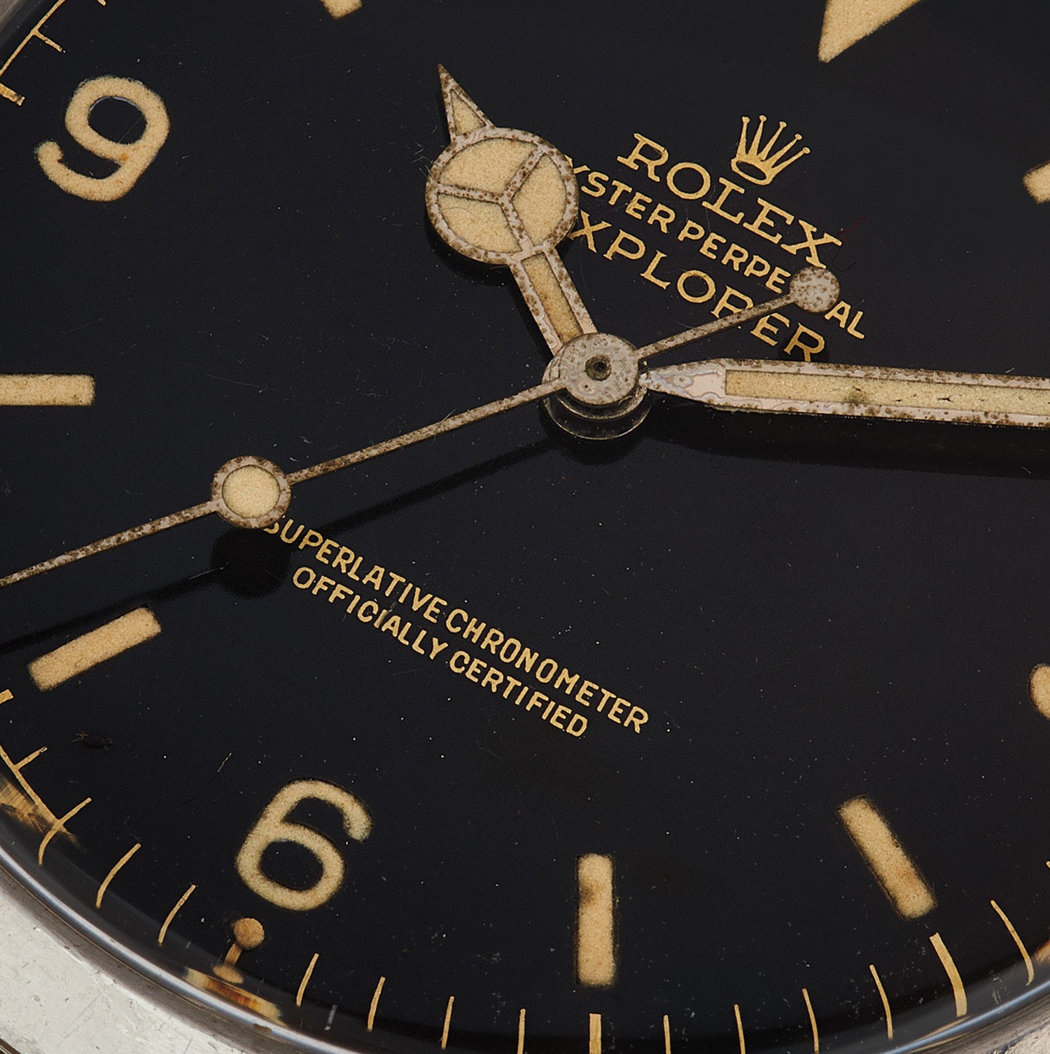
True gilt dials started with a brass blank polished to a mirror finish, and numerals, text and so on were either masked or covered with a soluble protective lacquer to avoid paint. The dial was then dipped in a dark galvanic/black paint bath or electroplated, and the mask or protective lacquer was removed to show the metallic gold underneath. The dial was then finished with a clear lacquer. Gilt dials had depth with a changing character under different lighting conditions that couldn’t be replicated with standard printing. The process was again labour-intensive and expensive, so models shifted to similar aesthetics via more conventional methods in the late 1960s and into the 1970s. The Rolex Explorer 1016, for example, went from true glossy gilt dials to matte black dials with painted text around 1967. Today, the style remains popular with modern production methods like pad printing with gold-toned paint over black dials, as seen on Tudor Black Bay and Oris Divers Sixty-Five models.
World War II
The A-11 “Watch That Won the War”
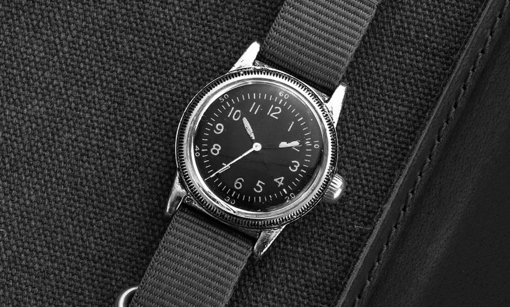
The Second World War brought distinctive and now famous dial designs from American and European militaries. The A-11 became known as the American “watch that won the war” and was issued to both pilots and ground troops (Army, Air Force, Navy, and Marines). Debuting in 1942 from American watchmakers Waltham, Elgin and Bulova, it had to meet a strict, standardised dial specification (spec A-11) that included a black face with contrasting white Arabic numerals, and a white railroad-style minute/seconds track at the perimeter with Arabic numerals every 10 minutes. All hands and hour numerals had radium lume, and the seconds hand was central and hacking from the hand-wound movement. Hacking seconds played a critical role during the D-Day landings when soldiers and pilots synchronised their watches. The FSSC 88-W-800 variant featured a fully lumed dial for the US Navy Bureau of Aeronautics and the British Royal Air Force (RAF), and also the Soviet Air Force in a more limited capacity. Modern A-11 watches are popular from brands like Bulova and Praesidus, although most have contemporary automatic movements.
The Dirty Dozen
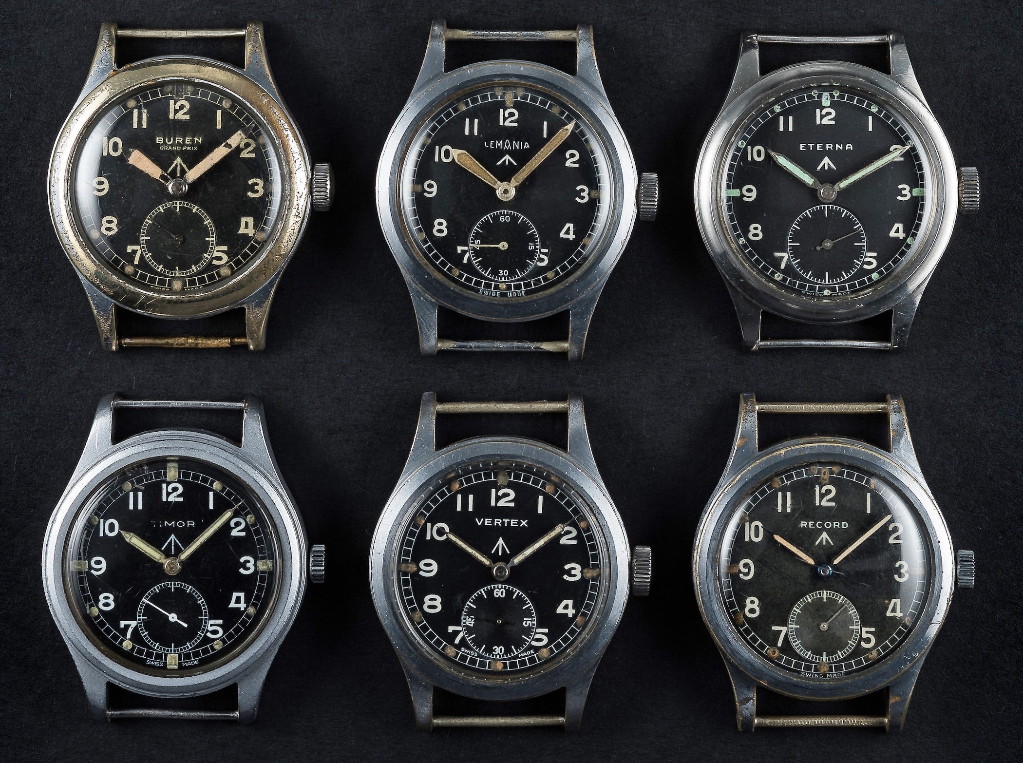
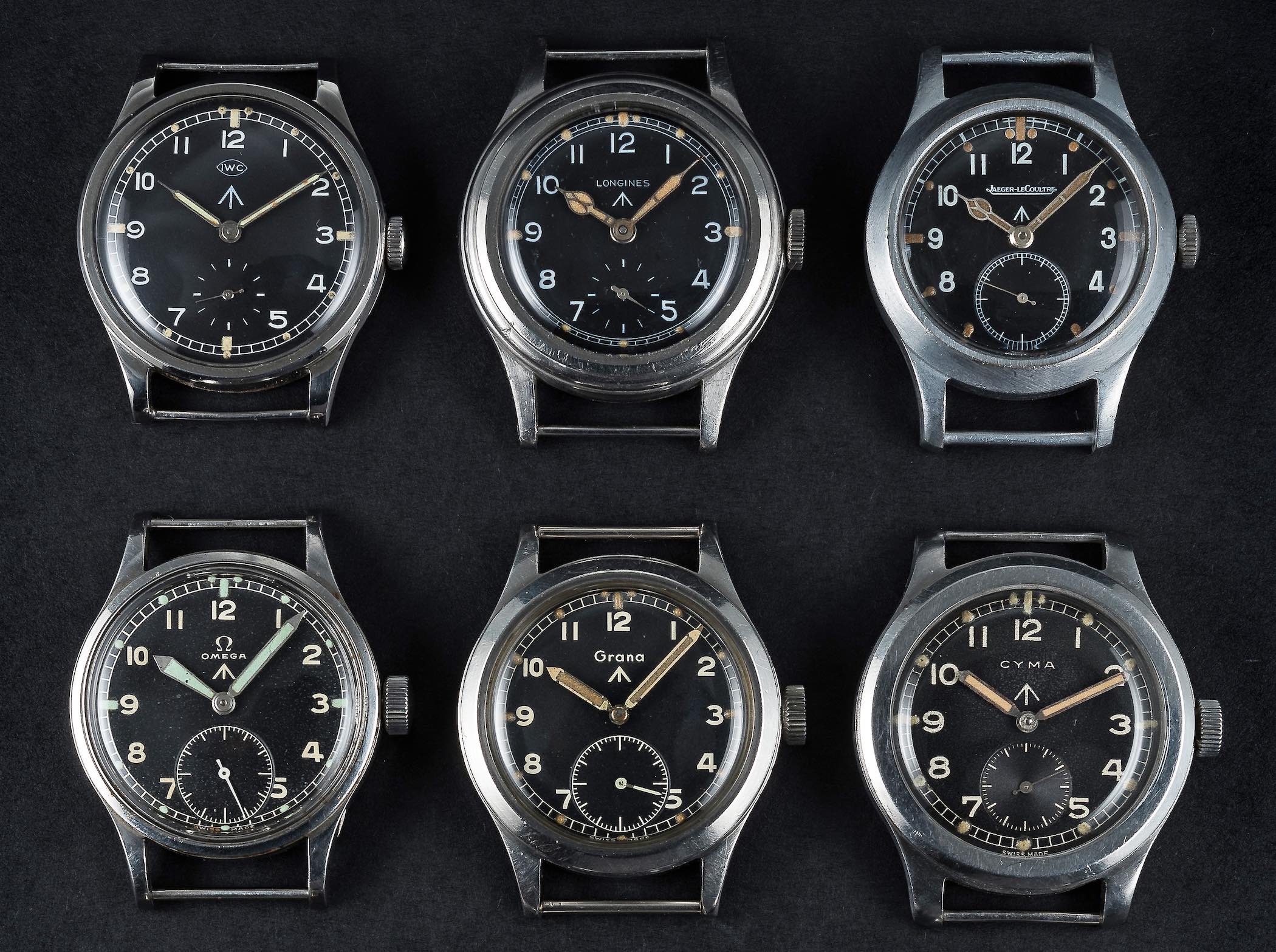
The British Ministry of Defence (MoD) commissioned its own waterproof field watches during the war from 12 Swiss watchmakers, although one of them, Vertex, was British with Swiss manufacturing facilities. All followed a specific dial specification, but there were subtle aesthetic differences among them. They had black dials, bold and contrasting white Arabic numerals, a railroad minute track, a small seconds sub-dial at 6 o’clock and radium lume on the hands and dial markers. Fonts tended to vary among dials – IWC and Longines had a somewhat narrow font compared to Buren or Grana, for example. Both IWC and Longines also omitted the detailed seconds track from their 6 o’clock sub-dials, opting for 12 simple marks instead. The hand styles differed as well, from broad sword hands on IWC, Lemania and Buren dials to cathedral hands on Longines and Jaeger-LeCoultre, and so on. All had an upward-pointing arrow (the Broad Arrow) just below their logo at 12 o’clock, signifying property of the British government. The arrow goes back to the late 16th century, from the Joint Master of Ordnance, Sir Philip Sidney’s coat of arms. The twelve brands were IWC, Longines, Jaeger-LeCoultre, Buren, Lemania, Omega, Record, Timor, Vertex, Eterna, Cyma and Grana (the latter being the rarest of the group). The watches weren’t referred to as the Dirty Dozen during the war and picked up the name after The Dirty Dozen movie opened in 1967.
B-Uhren
In Germany, the B-Uhr Observation Watch (Beobachtungs-uhr) was commissioned by the Reich Ministry for Aviation (RLM) for the Luftwaffe to time bombing runs and for overall navigation. Cases were large at 55mm with oversized onion crowns for easy manipulation with gloves. Two specific dial types debuted in 1940 and 1941, known as Type A and Type B. Type A (Baumuster A) was first with a simple, straightforward black dial and large, contrasting Arabic numerals and a triangle at 12 o’clock between two dots – this was to help pilots determine the dial’s orientation under difficult and stressful conditions. The triangle and sword-style hour and minute hands had radium lume. Type B (Baumaster B) dials came the following year with a very different aesthetic, designed for navigators to focus on minutes. Large hour numerals at the perimeter from Type A were swapped with minutes, 5 to 55 in increments of 5, with a detailed track at the perimeter. The hour numerals were brought into a smaller central ring, and an upward arrow replaced the triangle and twin dots from Type A.
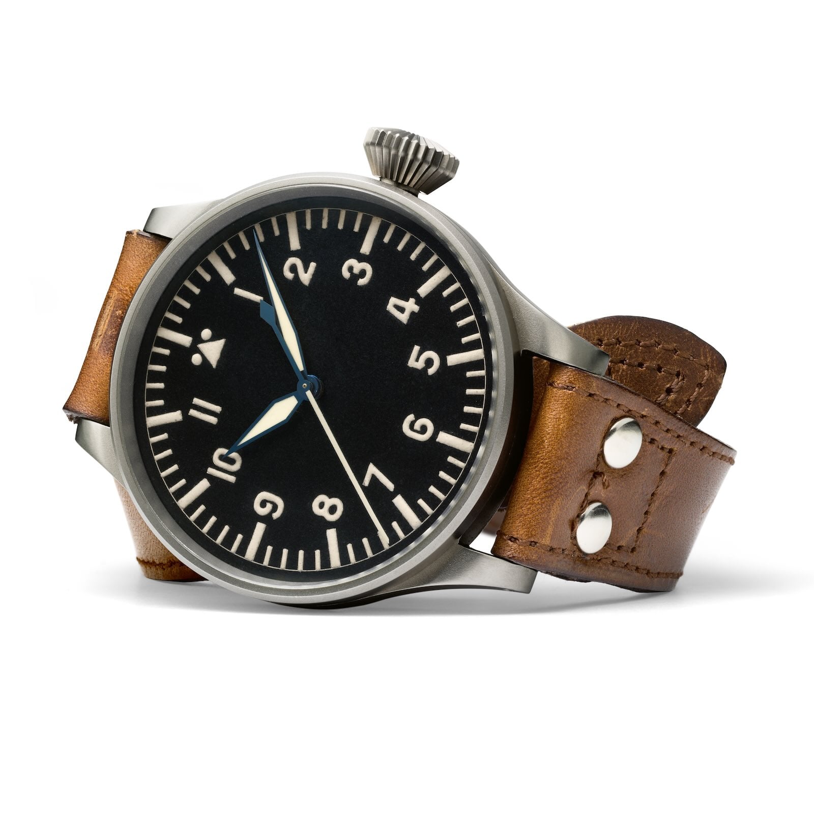
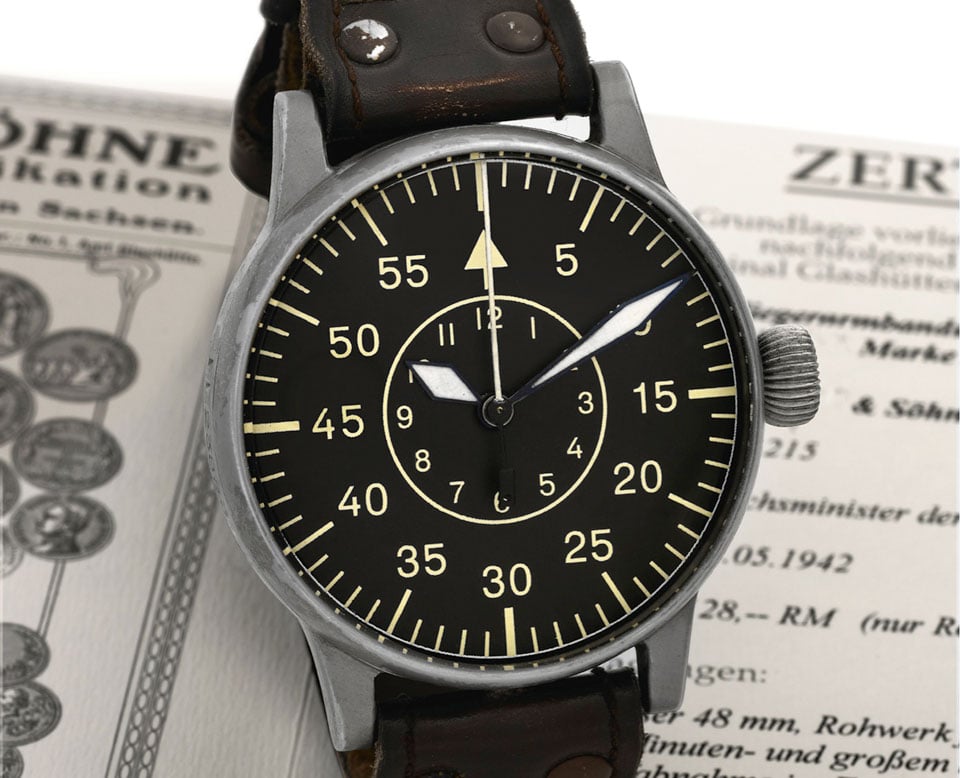
Five watchmakers were commissioned to build both models: A. Lange & Söhne, Stowa, Laco and Wempe in Germany, and IWC in Switzerland. Of course, these are popular today as vintage-inspired models, and four of the five original brands have modern collections, which unfortunately excludes A. Lange & Söhne. It’s notable that IWC produced both the B-Uhren and Dirty Dozen models for both sides of the war (as Switzerland had a policy of neutrality). Other specs included an anti-magnetic soft iron cage and accuracy that met the highest chronometer standards of the Deutsche Seewarte in Hamburg.
Tapisserie Dials
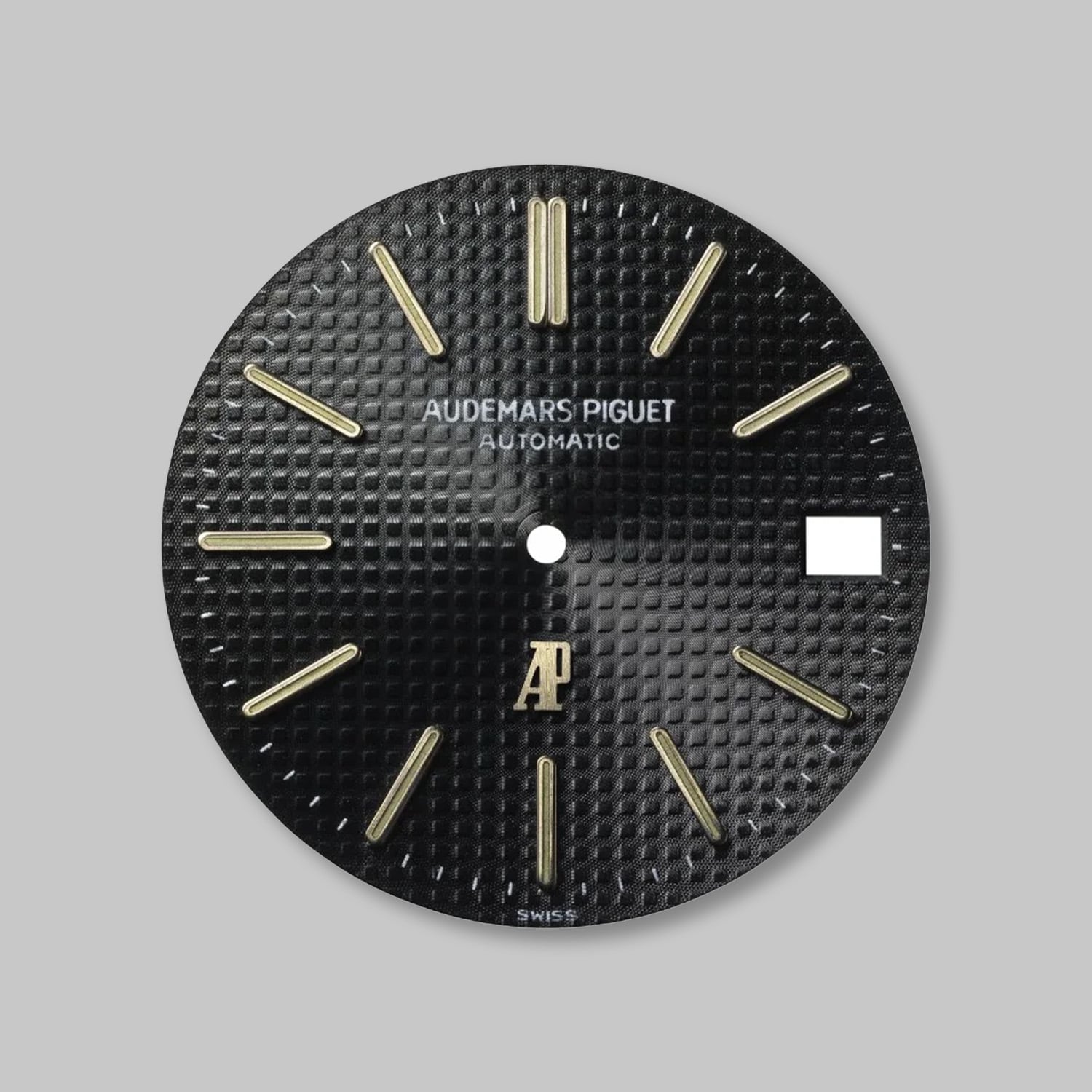
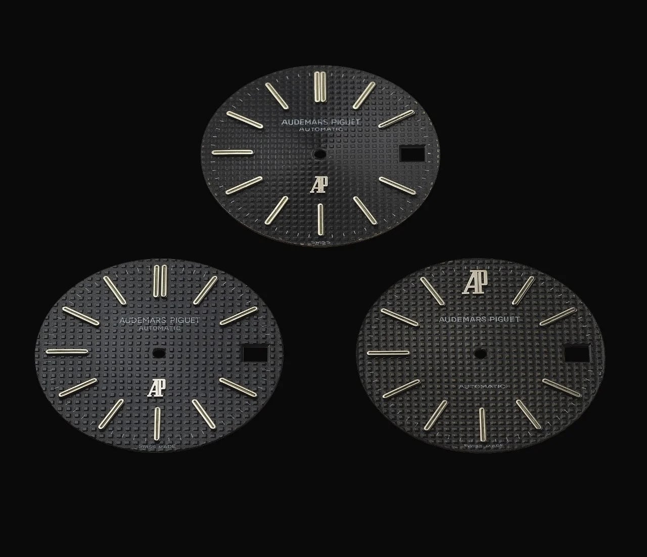
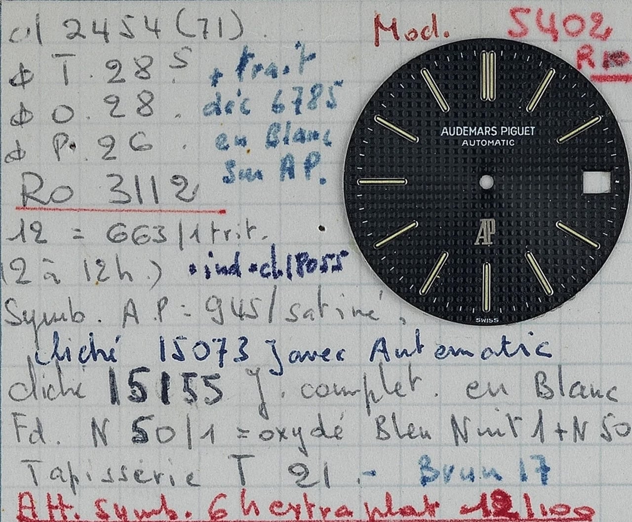
Following the war, Mid-Century Modernism overshadowed the Art Deco era as clean, contemporary styles were in vogue. In 1972, Audemars Piguet introduced the Gerald Genta-designed Royal Oak (ref. 5402) with a Tapisserie pattern, adding a strong dimensional effect to the contemporary, integrated sports watch design. This Clous de Paris motif had a grid-like pattern of raised squares between deep hollows (lozenges), carved into brass blanks with rose engine lathes and pantograph copying machines (first invented in 1895). Royal Oak Tapisserie dials came in several flavours, starting with the original Petite Tapisserie that had the tightest pattern. In the 1990s, the Grande Tapisserie dial was introduced with the raised blocks 50% larger than the Petite counterpart, and it became the main Royal Oak pattern with a flattened area for the AP logo. Also in the 1990s, the Méga Tapisserie was even larger, with waffle-style squares for the Royal Oak Offshore, although these were carefully stamped instead of created by traditional guilloché engraving. This hobnail pattern has been adopted by many watchmakers, and Royal Oak-inspired watches often use it.
Regulator Dials
In the early 18th century, regulator dials appeared in England and France with the hour and seconds hands separated from the central minute hand. These were used for master clocks (the most accurate at the time) at observatories and science labs, and for watchmakers to set and regulate pocket watches when the minute hand was most critical for the task. Chronoswiss introduced the first serially produced wristwatches in 1987 with regulator dials – central minute hand with an hour sub-dial at 12 o’clock and small seconds at 6 o’clock. Called the Régulateur, it really defined the brand and expanded into contemporary collections that pushed the boundaries of the concept with jumping hours, retrograde time elements, multi-level dials and intricate guilloché patterns.
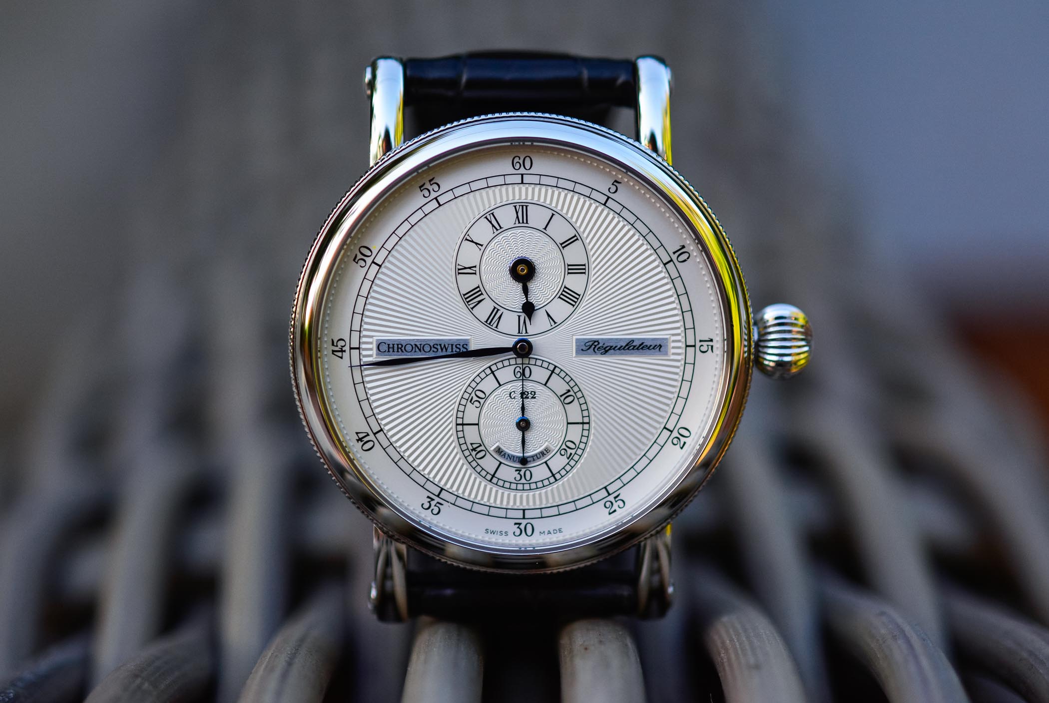
Although Chronoswiss set the standard for regulator dials on wristwatches, many watchmakers have since toyed with the style or truly embraced it. On the high end, Patek Philippe has the Annual Calendar Regulator (ref. 5235G-001 or 5235/50R-001) with a window for the day at 10 o’clock, month at 2 o’clock and date at 6 o’clock. Louis Erard is second to Chronoswiss with a sizable regulator portfolio, including stylish collaborations with Alain Silberstein and Konstantin Chaykin. Midrange Swiss brands like Hamilton offer multiple regulator models including themed watches like the Jazzmaster Regulator Cinema that’s a tribute to its history in movies, while Junghans, Alpina, Garrick and many more have regulator wristwatches as well.
Grand Seiko Snowflake
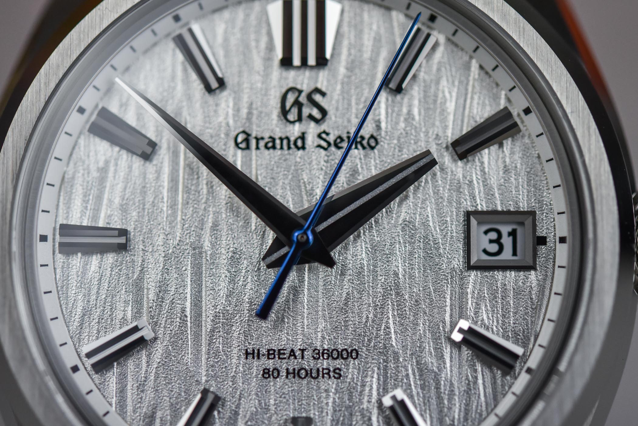
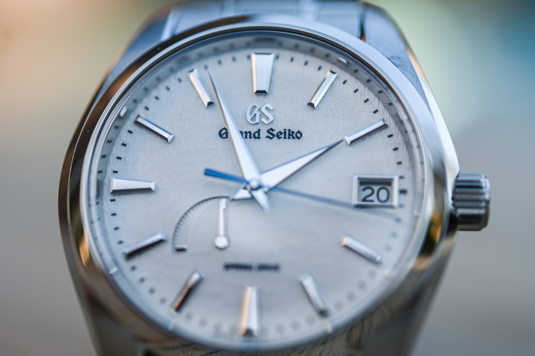
Moving into the 21st century, Grand Seiko created a dial aesthetic to mimic the snow-covered mountains of Nagano Prefecture. The Grand Seiko Snowflake (ref. SBGA011) launched in 2005 for the Japanese market, with the automatic Spring Drive movement introduced a year earlier (calibre 9R65). The dial was designed at the Shinshu Watch Studio in Shiojiri, where Spring Drive is also manufactured. It started with a metal die with small grooves shaved using a tool called a leutor, which was then used to stamp a brass blank under very high pressure (similar in concept to making a coin). Silver plating followed for a pure white finish over the texture that looked like windswept snow. In 2010, it expanded to international markets, and Grand Seiko was gaining traction as a premium brand (stepping out of the shadow of general Seiko). In 2017, Grand Seiko became its own independent brand and introduced the second Snowflake model, ref. SBGA211 without the Seiko name (Seiko and Grand Seiko were both on prior dials). Otherwise, both models were the same, with the Spring Drive automatic, titanium case and Zaratsu finishing. The concept of the Snowflake dial goes back to the 1970s, when a sample dial resembling textured snow was discovered. Ref. SBGA211 (and other variants) has since become a symbol of the brand and its flagship model.


Single Hand Dials
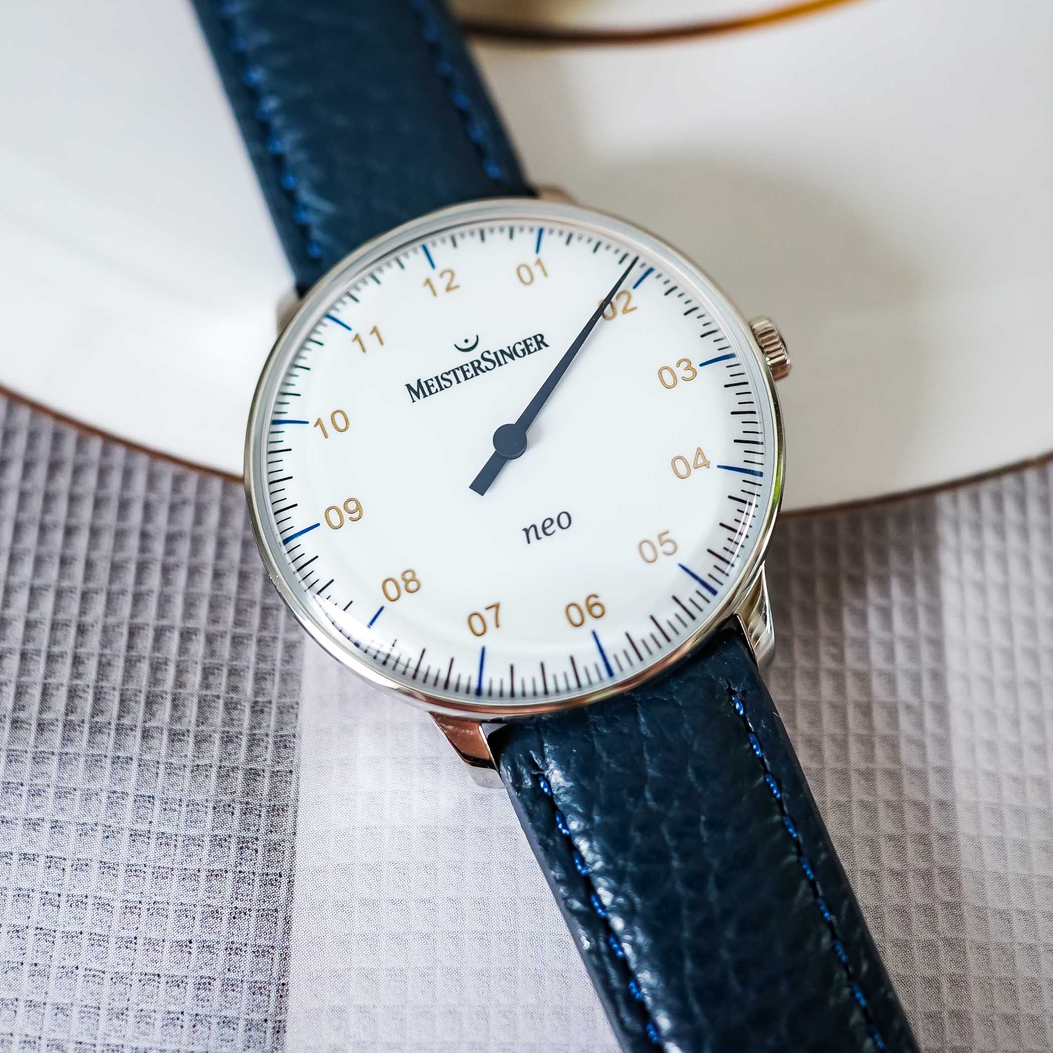
We’ll finish with a trend that goes back to the very beginning, when medieval clock towers had just a single hour hand. One brand in particular has defined itself with the style, not unlike Chronoswiss with regulators. Founded in Münster, Germany, in 2001, MeisterSinger has pioneered single-hand dials for wristwatches and, with very few exceptions, they comprise its entire portfolio. Original influences were ancient clock towers like Westminster Abbey and early pocket watches before the addition of minute hands. The original model was N°01 with a simple yet functional dial of Arabic hour numerals starting with 0 (01, 02, 03, etc.) and a detailed perimeter track. Most models follow this basic formula, but collections have become more sophisticated in recent years.
Just Scratching the Surface
This is just a sample of dial styles that help define different eras of watchmaking, from the early 16th century to the 21st, and it certainly doesn’t comprehensively cover centuries of individual dial designs. We’ve also talked about dial materials in a previous article, so enamel, stone, meteorite and so on have already been covered. Certain functional types like chronographs and perpetual calendars are arguably more about the movements than dials themselves (and there are many variances of each), so that’s for another article as well. What’s interesting is how the 21st-century heritage craze brought many of the above designs back in style, from World War II models like the Dirty Dozen, B-Uhren and A-11 to sector dials from the mid-20th century to Bauhaus minimalism from the 1930s. Watchmakers are always looking for new trends, so a new generation of dial designs is yet to come.