The Ghost-Like H. Moser & Cie. Endeavour Perpetual Calendar Concept Tantalum
Subtle from afar, subtle up-close, this is the most minimalist QP you can get, and I absolutely love it!
Anyone who has kept a close eye on my work for MONOCHROME Watches might have caught on to the fact that I have more than a bit of a thing for watches by H. Moser & Cie. I think what they do is brilliant, although I do not love-love everything in the catalogue. What I admire most is the audacity and creativity to integrate a specific concept into high-watchmaking. Materials, complications, displays and so on, it almost always feels fresh, coherent and very impressively engineered. And you might remember that last year, with the fabulous Endeavour Perpetual Calendar Smoked Salmon, the brand hit peak “Want, want, WANT!!!” for me. Now, though, they have outdone themselves yet again with this year’s edition. So get ready for a very biased, enthusiastic point of view on the ghostly-cool H. Moser & Cie. Endeavour Perpetual Calendar Concept Tantalum.
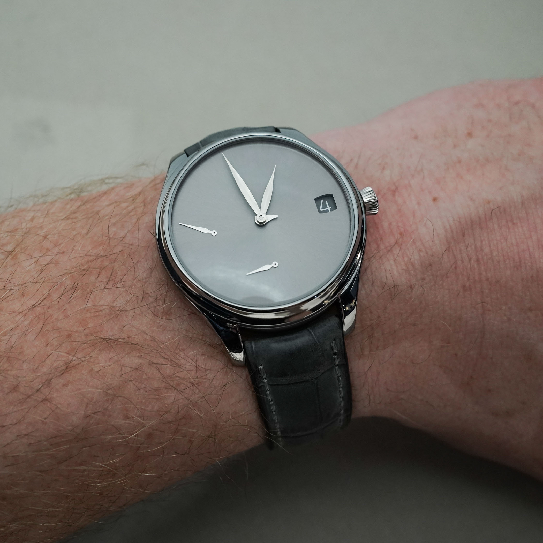
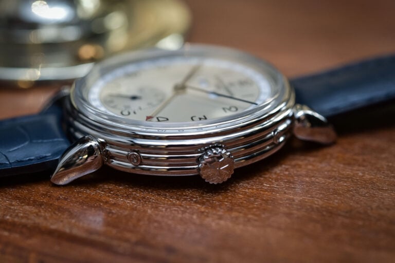
For starters, and for those of you who don’t know me personally (of which there are many, I guess): I’m from the Netherlands, am 2.01m tall and have pretty sizeable wrists. Nothing crazy, but at 18.5cm to 19cm in circumference, I’m a bit above average. That means when it comes to acceptable case sizes, my range of watches is quite broad. In my collection, I go from a 36mm Nomos Club 701.3 to a 46mm Oris Aquis Depth Gauge without issues. The profile of a watch determines a great deal of its comfort, and the short lugs on the Oris, for instance, keep things in check concerning wearability. So with the 42mm width and 13.1mm height of this Moser, I have absolutely zero complaints about size and comfort. But I’m getting ahead of myself, let’s talk looks first!
I have always been a fan of Moser’s unique, minimalist, and ultra-focused approach to the perpetual calendar. I love the complication for its intricacy, but in most watches, I find the style a bit too classical and traditional. Watches that do things with a bit of a twist, or in a more modern execution, tend to resonate with me a bit more than pure tradition-oriented ones. I am also not the biggest fan of a moon phase display, so a QP without one immediately gets a bit more of my attention. So in that respect, the H. Moser Endeavour Perpetual Calendar is already a few steps ahead of the ‘mainstream’ QPs on the market for me.
And then comes the fascination for tantalum, a material that’s rather special in the industry and not seen very often. Where titanium shaves off about 35% in comparison to the weight of stainless steel, tantalum is about twice as dense and thus twice as heavy as steel. This added heft is part of its charm, as I’ve always appreciated the feeling of wearing a watch, without compromising on comfort. But that’s not all, as it’s also about the overall darker gunmetal-like shine and unique blue-ish glow it can have in certain light conditions. It’s a notoriously tough material to work with as well, due to its hardness and high melting point. Therefore, machining and finishing a tantalum component to perfection is more complicated and time-consuming than most other materials, another element in the equation.
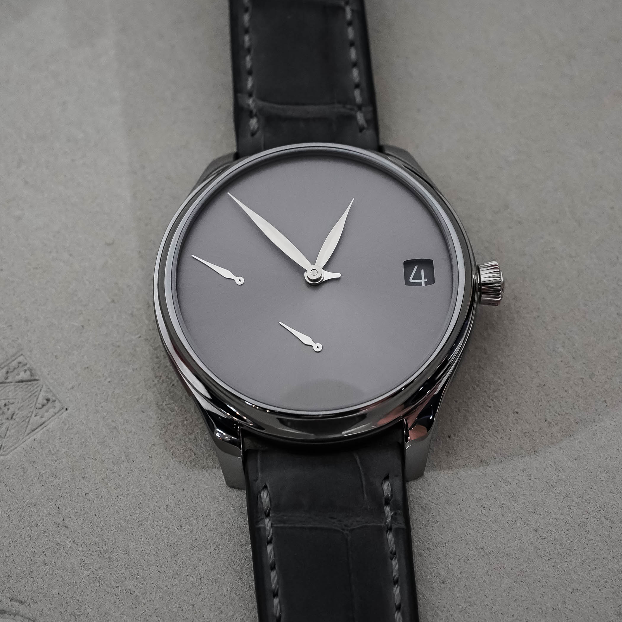
The shape and proportion of the Endeavour case are carefully thought out by Moser as well. It’s not just a simple round case, but one full of details, lines and contrasts. The concave bezel lures you in to follow the caseband and discover the scalloped areas and alternating types of finishing. The shape of the lugs with a touch of negative space underneath is another highlight. The crown sits perfectly in the middle, so it doesn’t cut into your wrist, and the brushed section around is just a lovely touch.
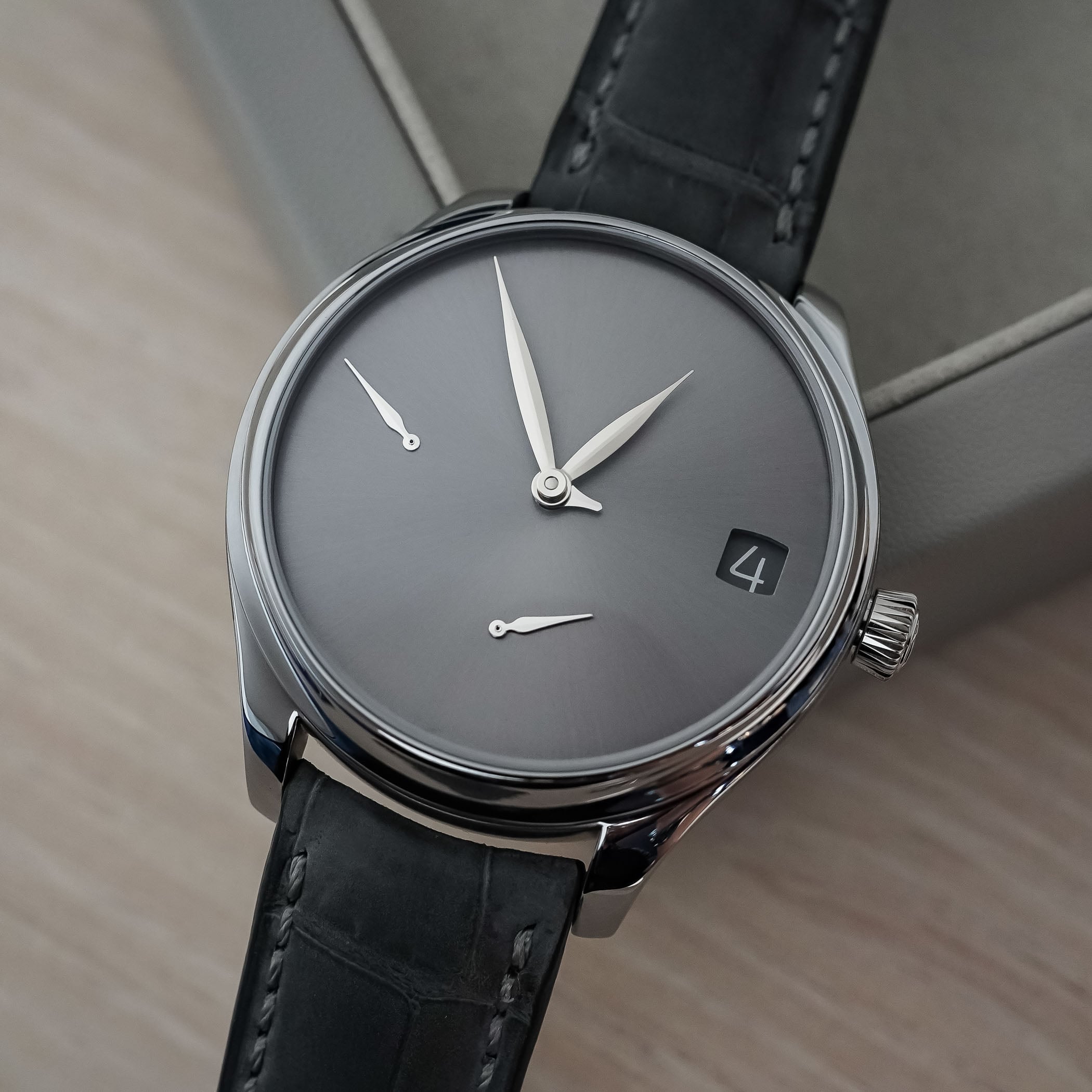
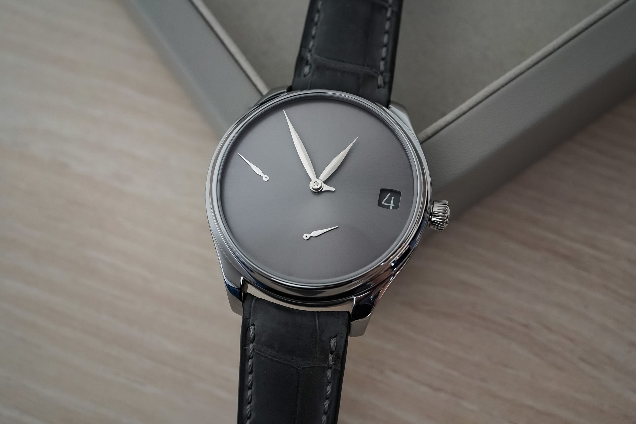
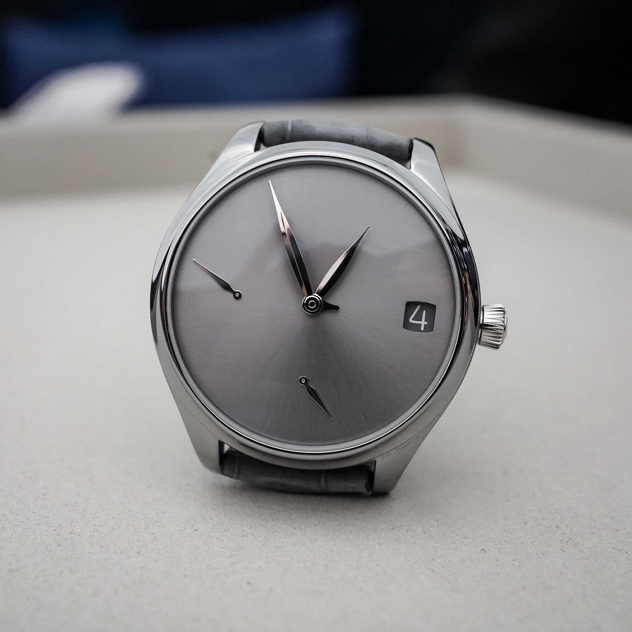
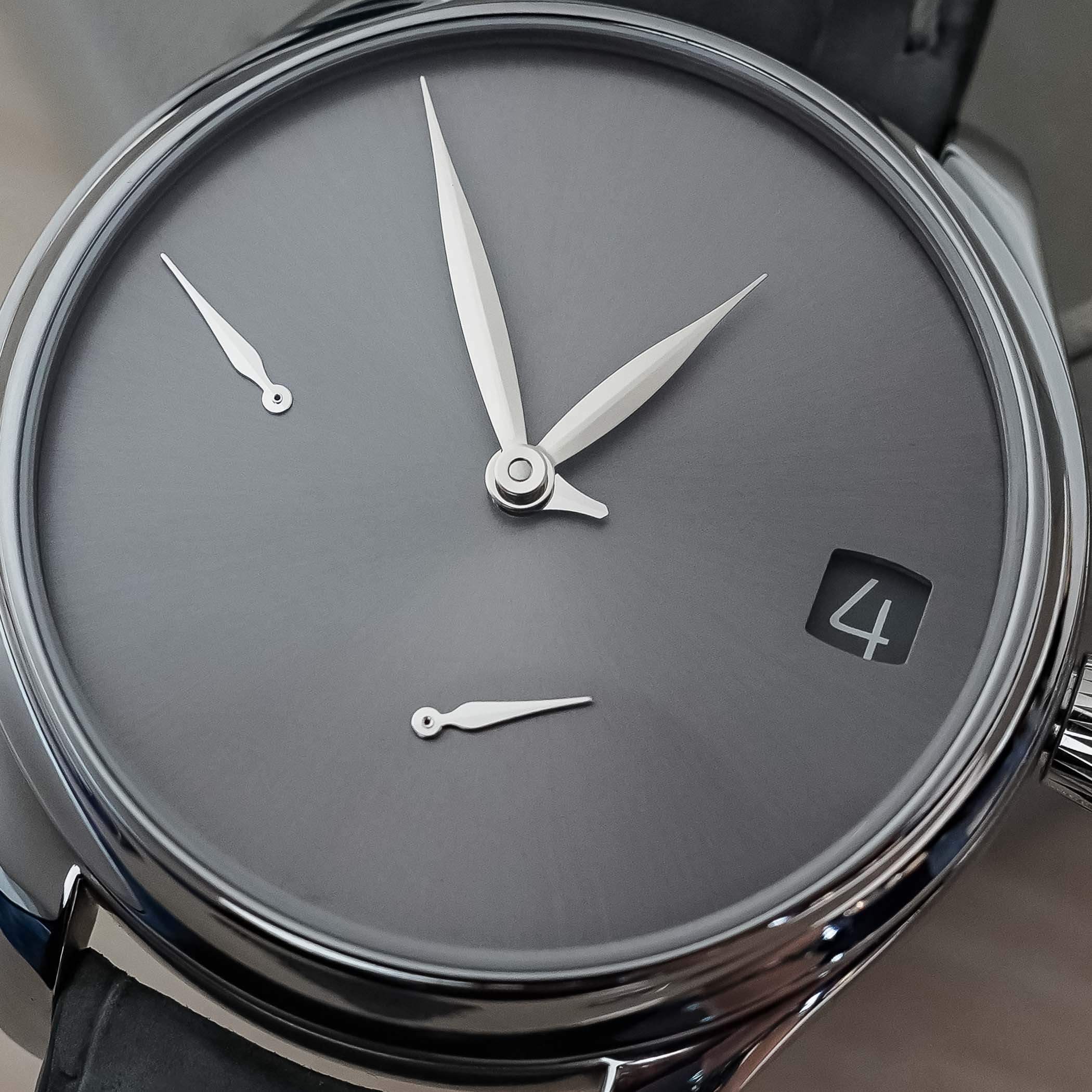
If you then combine this with the minimalist display of Moser’s perpetual calendar models, and add in a monochromatic (there’s a reason for our name) sunray-brushed tantalum dial, things are very much falling into place for me. Moser’s Concept dials, regardless of what collection they’re in, also bring things down to the essentials even more, as they are void of hour markers, logos, scales or any other “intrusive” details. Yet from afar, you instantly know what it is and who makes it.
Time is read through leaf-shaped central hour and minute hands, and the perpetual calendar display is, as said, very minimalist, with only the date window at 3 o’clock breaking the uniformity. The additional hands at 6 and 9 o’clock are for the small seconds and power reserve, respectively. Lastly, on the face of the watch, at least, is a very small central hand peeking out from underneath the hour and minutes hand for the month. As this jumps from month to month on a 12-step cycle, checking the month is actually very easy. Noon is December, one o’clock is January, two o’clock is February and so on… simple, but effective!
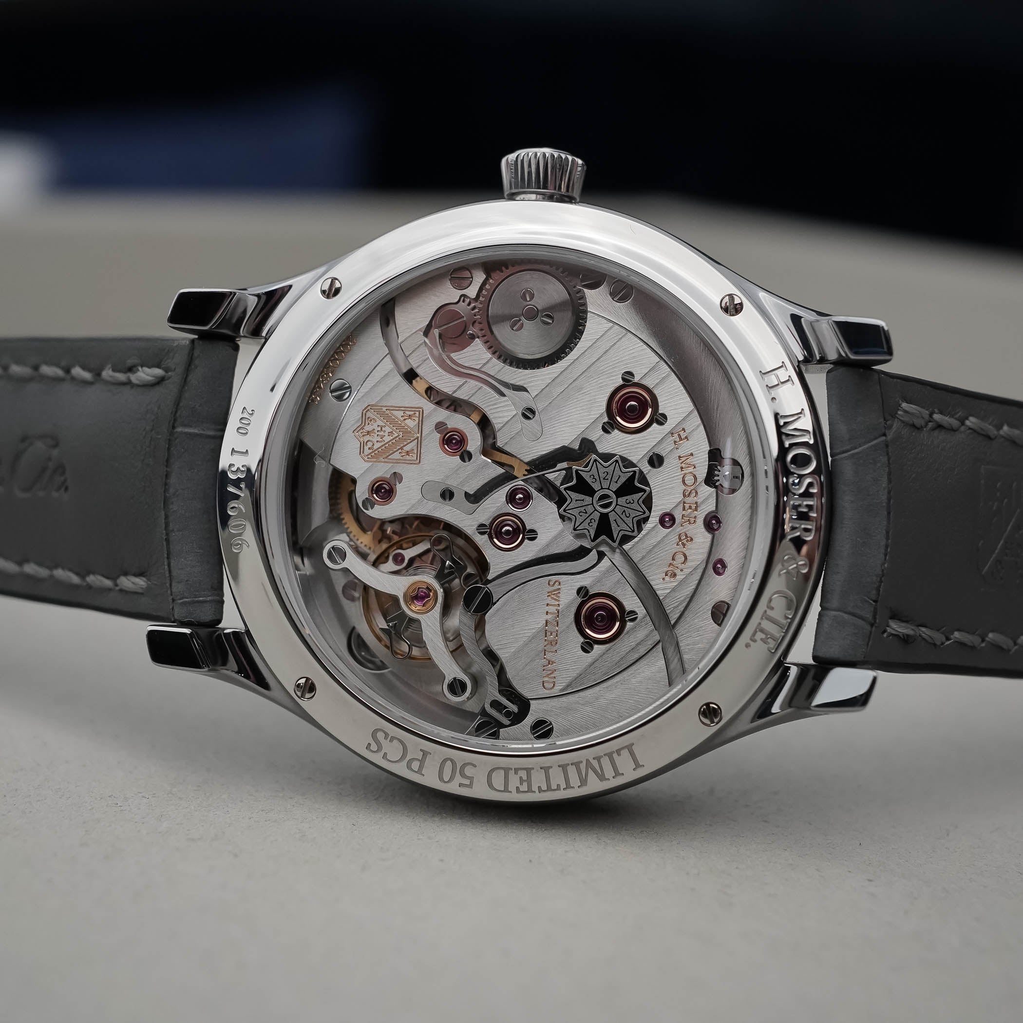
Around the back, the calibre HMC 800 makes an appearance. This is used in all QP editions of the Endeavour, and is entirely made in-house, even down to the hairspring. The final indication can also be found here: the leap year disc. Some might argue that it’s pointless to put it on the back of a watch, as you would have to take it off to check it, but when was the last time someone asked you if we’re in a leap year or not? This hand-wound calibre is beautifully finished, including Moser stripes, which are angled at 45° and are aligned across the plates and bridges. The double-barrel architecture ensures a full seven days or 168 hours, more than enough to put it aside for a day or two and not worry about the QP indications going off.


The Enadeavour Perpetual Calendar Concept Tantalum is a limited edition of 50 pieces and comes on a hand-stitched grey nubuck alligator leather strap with a stainless steel folding clasp. The tone-on-tone look with the case and dial is just great, and despite the bulk of the tantalum case, the watch actually wears very well. Although I only spent a short time with it, it felt balanced and well-proportioned despite the 42mm width, and very finely finished all around. The fact that the caseback and crystal are curved to follow the shape of your wrist does wonders for the ergonomics, to the point you hardly notice the additional weight of the case material. And paired with the brilliantly sober QP display, even more so than the Smoked Salmon edition, and the total monochromatic look, it hits home very hard. There’s just the price of CHF 75,000 to overcome.
For more information, please visit H-Moser.com.
5 responses
It’s a beauty but too much minimalism make it hard to read, so basically useless. The price will help finance cnc machines, so that poor single artisan sweating day and night will have some rest and prices can finally come down. Say what? They already use cnc machines? I see, someone wants to be very smart and someone else lets them. Oh well, myself I won’t let them 🙂
H. Moser & Cie sure do love their 18,000vph movements and 40+mm watches. Perhaps someday we’ll see mainstream series watches with higher beat rates and smaller case sizes.
I can only repeat myself. The should sell their movements to other high end brands and stop doing watches themself. And yes, I had a Moser in the past.
Sometimes less is less (and not more). Lovely movement though
Agree with Iñaki: Sometimes less is simply less, sometimes possibly even too less. Reading the current month might still be possible, but to set the watch with some precision, one probably has to wait for the next quarter-hour. Article pays close attention to the material used, but none to the obviously installed double hair spring, not even in the technical description.