Guy Bove, Creative Director of TAG Heuer, on the Brand’s New Models for Watches and Wonders
Deciphering all the new TAG Heuer watches presented at W&W with the man who designed them.
Guy Bove has been the Creative Director of TAG Heuer for some three years now after working for several brands, including Breitling, the Chopard group and IWC… We took the opportunity of his presence at Watches and Wonders 2022 to sit down with him and learn more about the brand’s latest creations.

Xavier Markl, MONOCHROME – Guy, thanks for having us. What is the underlying theme for TAG Heuer at Watches and Wonders 2022? How is it translated into the brand’s novelties?
Guy Bove, Creative Director of TAG Heuer – For 2022, we are working on three themes. One is innovation, one is quality, and the third is durability. In general, when you look at each model, you’ll tend to see all three themes… innovation on materials or on technology, quality where, hopefully, you’ll notice that we are really working on creating excellent perceived quality in all of our watches and of the movements that we are bringing out. And durability, which you will notice today in the more extended warranty on some of our movements.
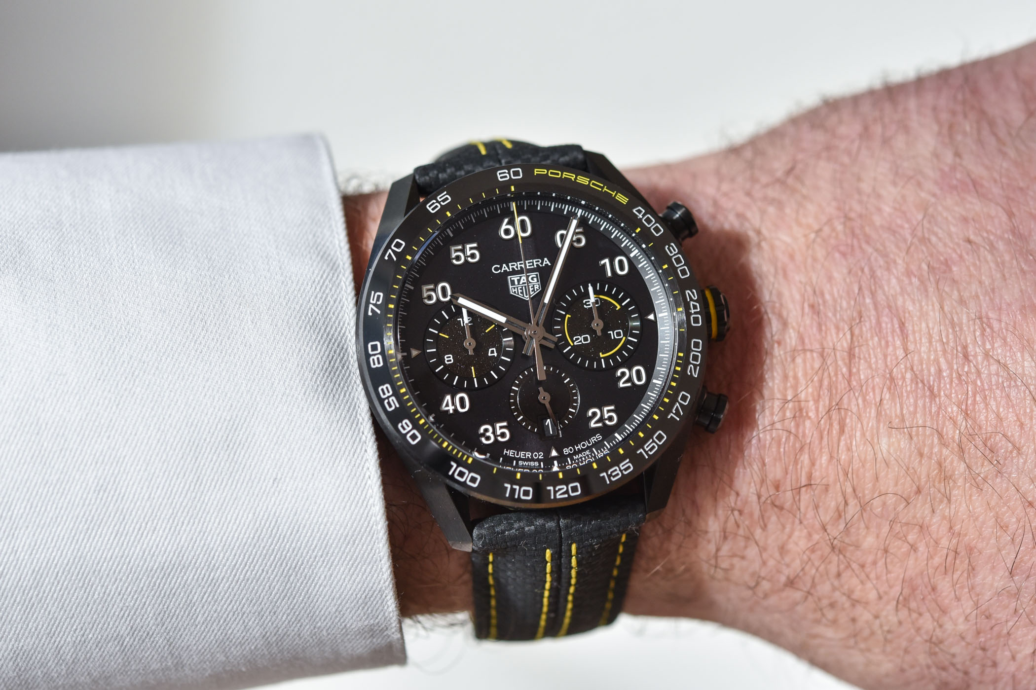
Starting with one of the pillars of TAG Heuer’s DNA, automotive, can you tell us about the new Carrera Porsche edition – How does its inspiration differ from the previous edition and what elements are shared?
The easiest thing is to go back to the first Porsche edition that we did last year, which will remain in the collection, by the way. With that model, we introduced the basic DNA of the collaboration between the two brands. An obvious place to start is the strap, where we have used specific stitching to reflect what happens on the inside of a Porsche car. If you go into the dial, you will first see all the numbers. It is the only Carrera that has applied indexes in the shape of numbers instead of baton markers. This typeface is taken directly from the new Porsche dashboard designs. Behind that, you will see what we call our asphalt finish. We took into the dial what you see from behind the steering wheel. There are a few red hints which remind you of the sporting details we had on our 1970s watches but at the same time also the gauges which you can find on a Porsche dashboard … so there is a strong connection between the two brands. The inner bezel is directly inspired by the cars’ sports chronographs.
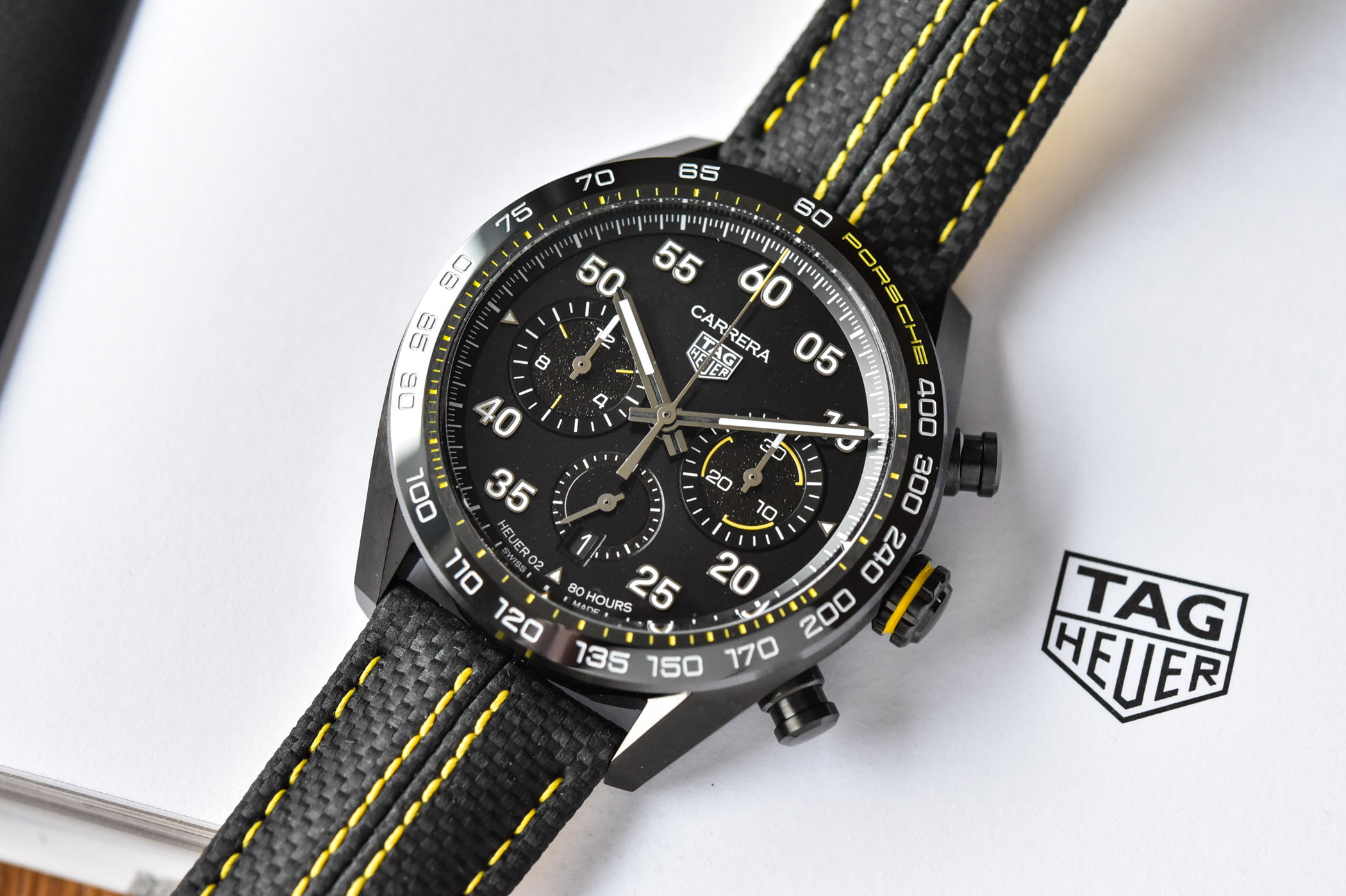
Moving to the new edition, we use a lot of the same details but what we wanted to focus on for this design was the racing side of Porsche. The first one focuses on the “everyday traits” of Porsche. Of course, there are great Porsche streetcars, but this is because Porsche has a huge racing heritage which they can apply to their everyday cars. When we discussed which colour could really bring to life the racing side of Porsche, our colleagues there immediately mentioned their racing yellow! We wanted to bring that to the forefront throughout the watch through specific detailing for example in the yellow stitching on the racing strap. In this new model’s strap, we have embossed a specific fabric pattern that reminds you of the fabric and carbon fibre details of racing seats and interiors. Inside the dial, little details that were red have also moved to yellow. The asphalt dial background has migrated to the subdials. In place of that texture in the dial, we came up with a black lacquer with a slight shimmer designed to look like car paint. On the back of the watch, the column wheel and the engraving on the rotor are now filled in yellow. We have an all-black case, so it is a racing look but uses the same geometry as our steel watch designs. It’s really taken the details that made up the original Carrera x Porsche DNA into the field of racing.
How do you interact with Porsche teams?
We meet with them every two weeks, so there is a lot of ongoing collaboration where we share what we are working on. We get their feedback. We ask them to feed us with insider and specific information about new launches, about the details and stories you only know when you are inside the brand, about previous cars, about their philosophy… It is very collaborative.
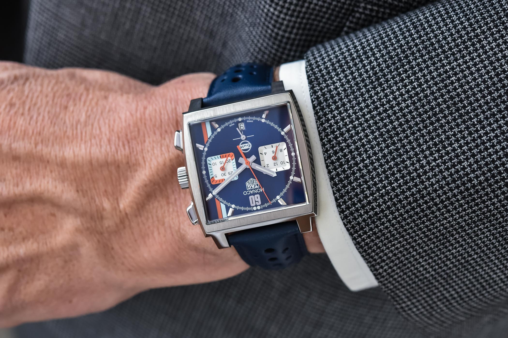
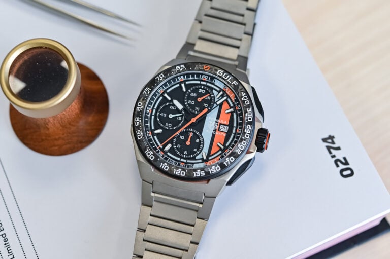
Carrying on with the automotive theme, the iconic Monaco Gulf has returned. What can you tell us about it?
It is every bit a Monaco, but pretty much everything else is new about it. First of all, it is a Heuer 02 movement; the previous Gulf editions came on Caliber 11 watches. So it is the first in-house movement we have put inside the Gulf edition. It’s a great movement that is at the same time very durable and has a very long power reserve of 80 hours on one barrel, nearly unheard of in chronograph calibres.
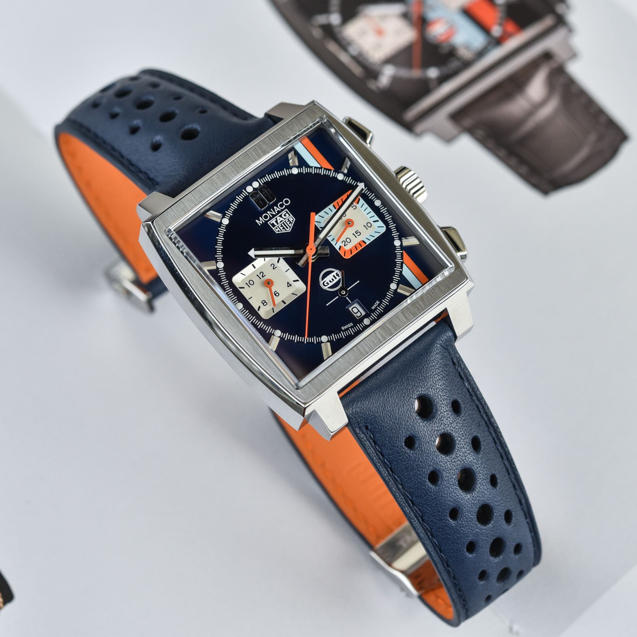
The design code behind all of our Monacos is an interplay between circles and squares. What we did with the stripes this time is that we put them behind the circular central part of the dial to enhance the contrast between the square and the round. We have also moved them over to the side and made them a bit more slender. So we still have the iconic Gulf colours in perhaps a more refined look which at the same time becomes quite striking in the way that they disappear and reappear behind the circle. What is interesting is that you can see them passing behind the circular part of the dial but then they reappear in the subdial. It is quite a difficult area to print, it is not an easy dial to make but we really wanted to play with this idea of animating the minute sub-dial in the same way that we used to play with similar markings throughout the 1970s in our sports watches.
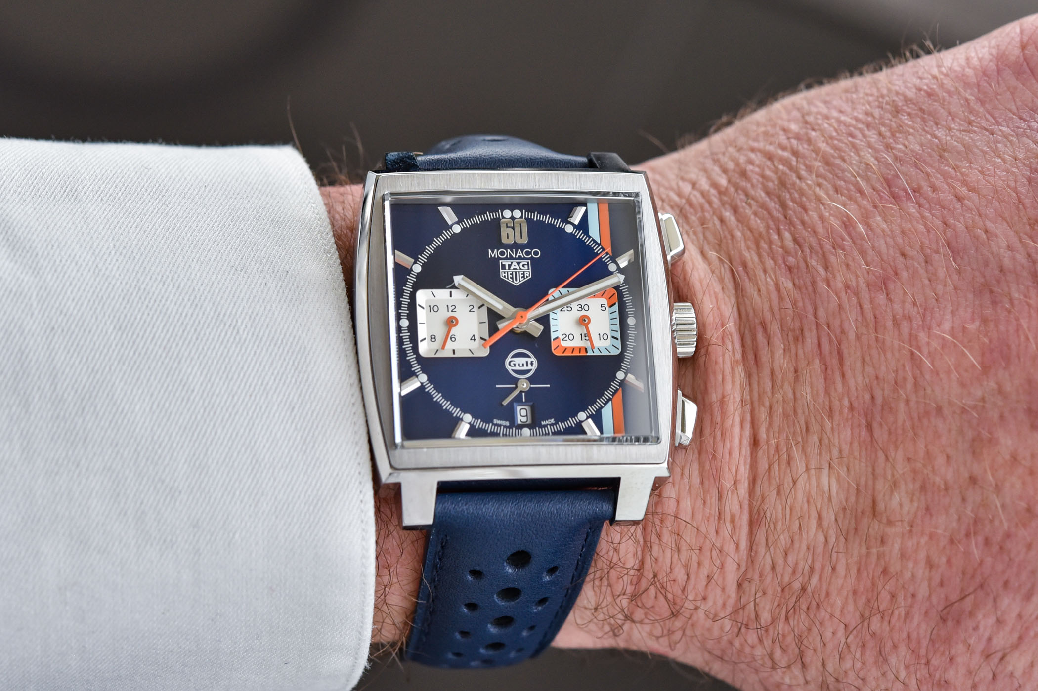
At 12 o’clock, we have replaced our usual baton index with the number 60. First of all, it’s an obvious reminder of the 60 seconds and 60 minutes of the chrono and timekeeping functions but it is also a reminder of the car numbers on the racing stickers on the race cars that inspired this collection. On the front of the strap, we have the Gulf navy blue in a matte finish, with our racing pattern that our aficionados have come to associate with our race-inspired Monacos. When you turn it over you have a bright Gulf orange liner. Orange also goes into the printing on the rotor and to the column wheel on the back.
It is a sporty Monaco, but it also emphasises the incredible quality and attention to detail we are focusing on around the brand. It is our classic Monaco, but everything is different about it.
Moving to dive watches, you are launching new Aquaracer models. What are you trying to inject into the collection with these models?
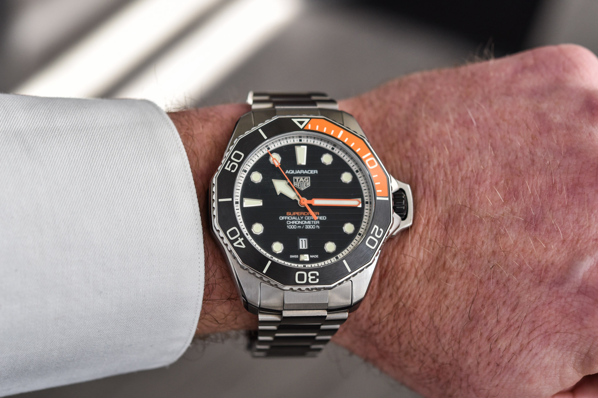
Aquaracer is an evolution of about 40 years of diving and tool watches. We wanted to recapture some of what started this whole and hugely important part of TAG Heuer’s history, and you can see that in the general look and feel of the product. For instance, you can see it in the hands, in the markers, in particular details like the knurling that we have brought into the turning bezel.
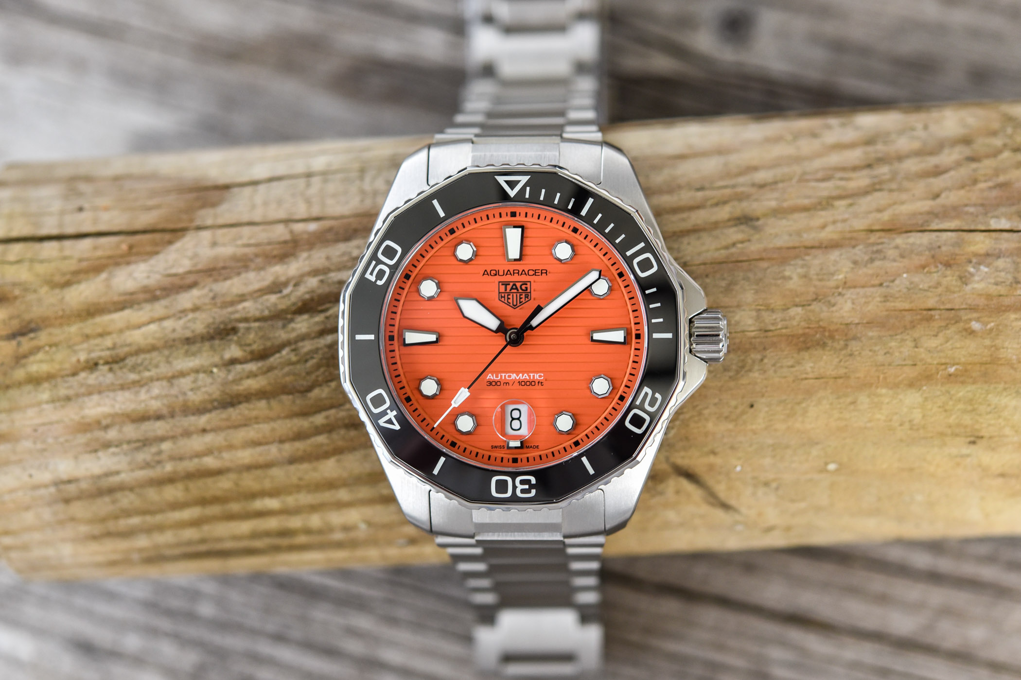
So we have reinterpreted a few different things within this collection, one of which is the orange colour in this new addition to our Aquaracer Professional 300 line. If you go back to the first model in the history of our diving watches, the reference 844, some of the models were launched with an orange dial, which became known among collectors as the ‘orange diver’. We are not recreating the 844 Orange Diver; we are saying ‘today we are showing the evolution of the 40/50 years of our dive watches’, but we can clearly say that we are happy to reinterpret some elements from the past.
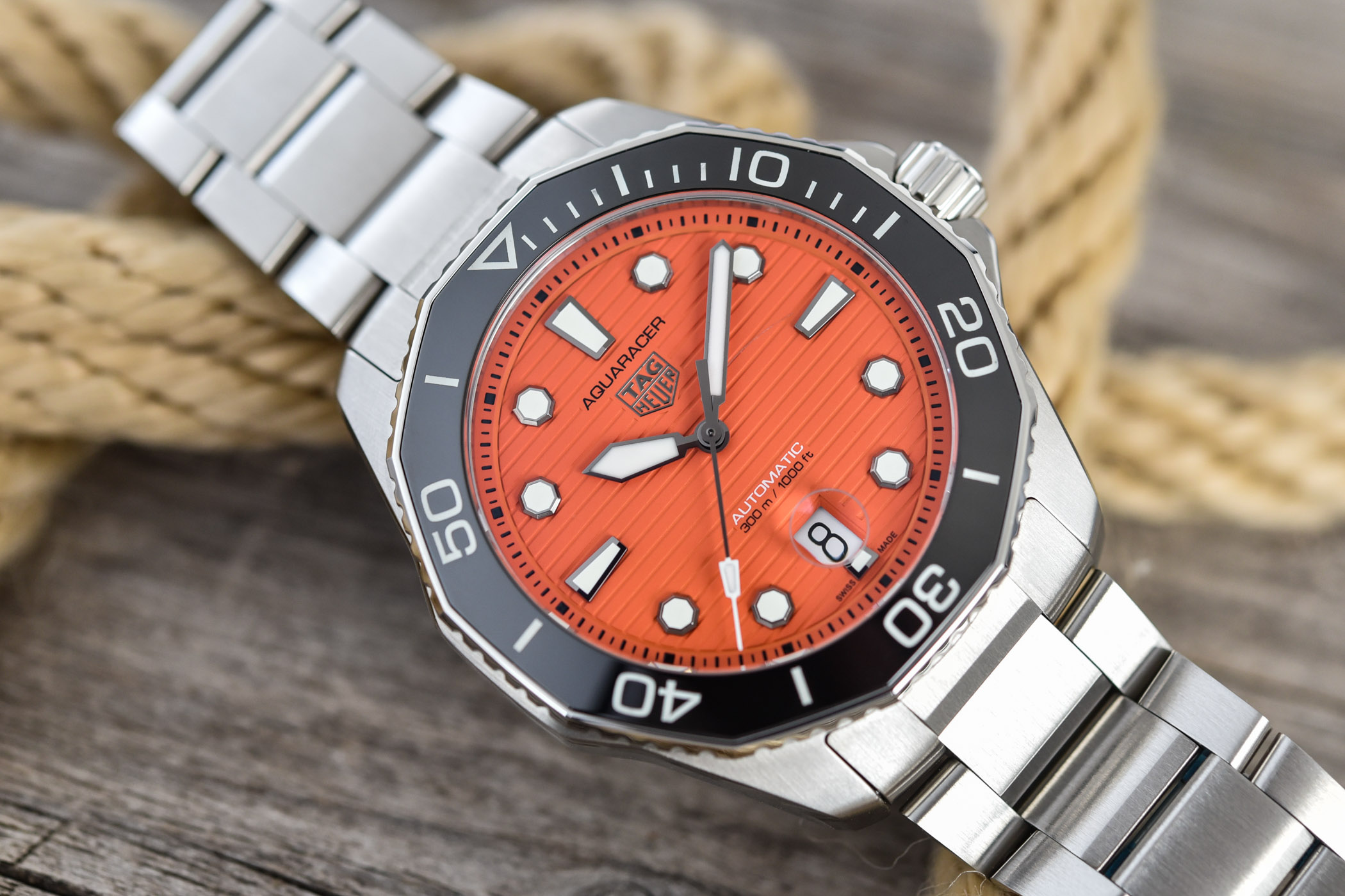
The orange dial of our Professional 300 model brings a very fresh touch to the collection. It is a watch that has very strong DNA. You can recognise it from a long way away. I really like the design because I find it is a very strong looking watch that is up to the job like all of our watches are. At the same time, it has a very durable look and very high-quality finishing standards, which help to give an extremely wearable and timeless look which we have now paired with the super fresh orange colour on the dial. I have just tried it on myself, and I think it really works well not only with a pair of jeans but also under a suit – it really stands out, but at the same time, you know it is a serious watch.
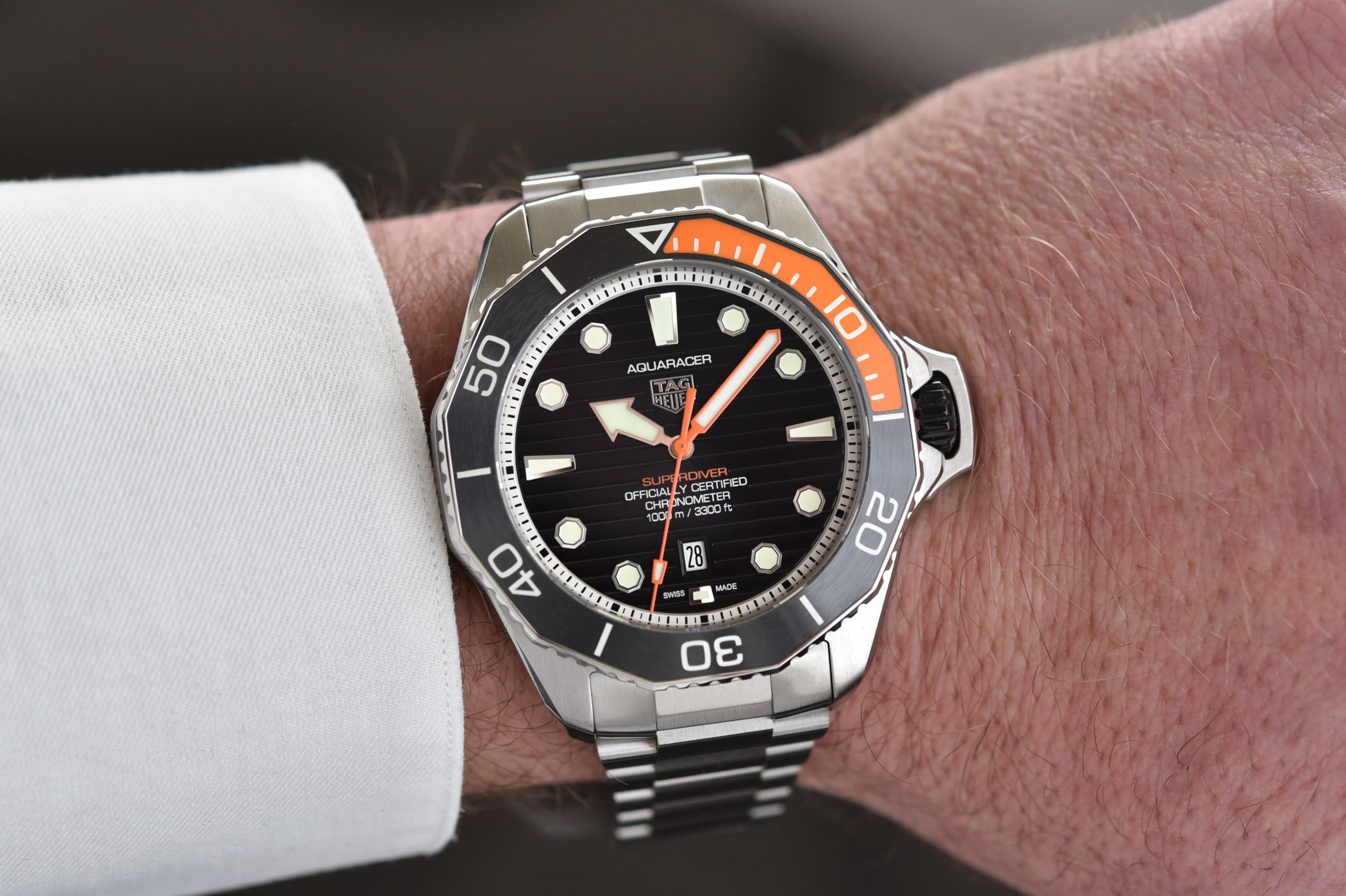
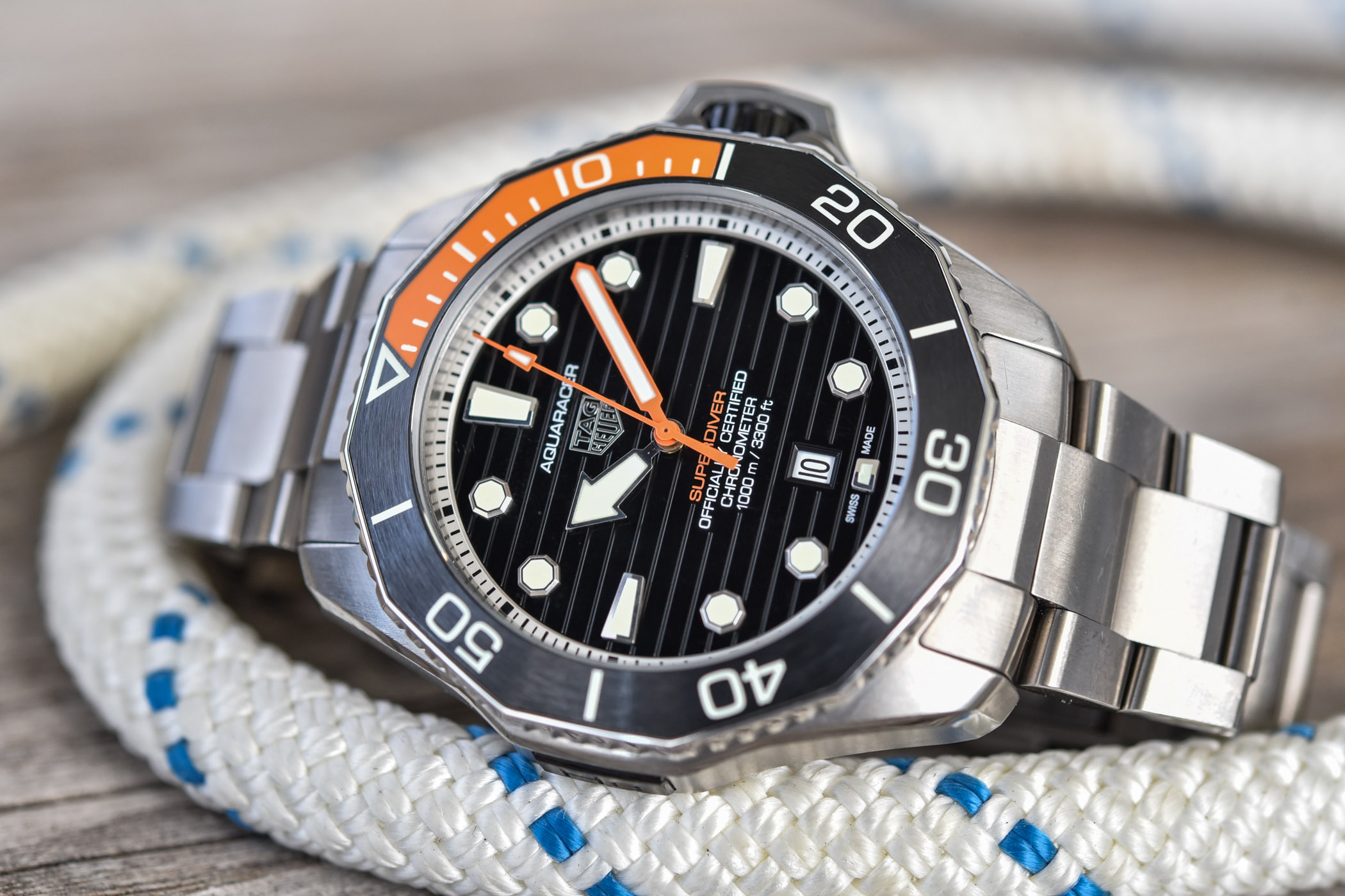
We have also taken this orange colour, which is, as you know, the time-honoured colour code of diving, into the Professional 1000 Superdiver. It meets both the first and second levels of the ISO 6425.2018 standard, the saturation diving norm for professional dive watches. This brings a series of innovations to our Professional dive watch: for a start, it is designed to go down to 1,000 metres. We test all of the watches to 1,250 metres. It needs to meet specific luminescence criteria, and we have fitted it with professional-grade Luminova to ensure that it remains bright for long periods of time. To go down to 1,000 metres, we had to come up with a specific lacquer and develop a specific orange colour for the orange part of the bezel to make sure it does not crack or get expelled under great pressure. So there is technical innovation in there. On the dial design, we based the watch very closely on our Professional 300. We extended the front edges of the hour hand towards the back to create an arrow shape to further differentiate the hours and the minutes. The minute track is silver instead of black so that you can instantly tell the seconds and minutes scale apart for the hour markers for legibility. This also gives a more refined yet sporting look to the watch which is fitting for our sportiest piece in the collection which is also the most expensive model we make.
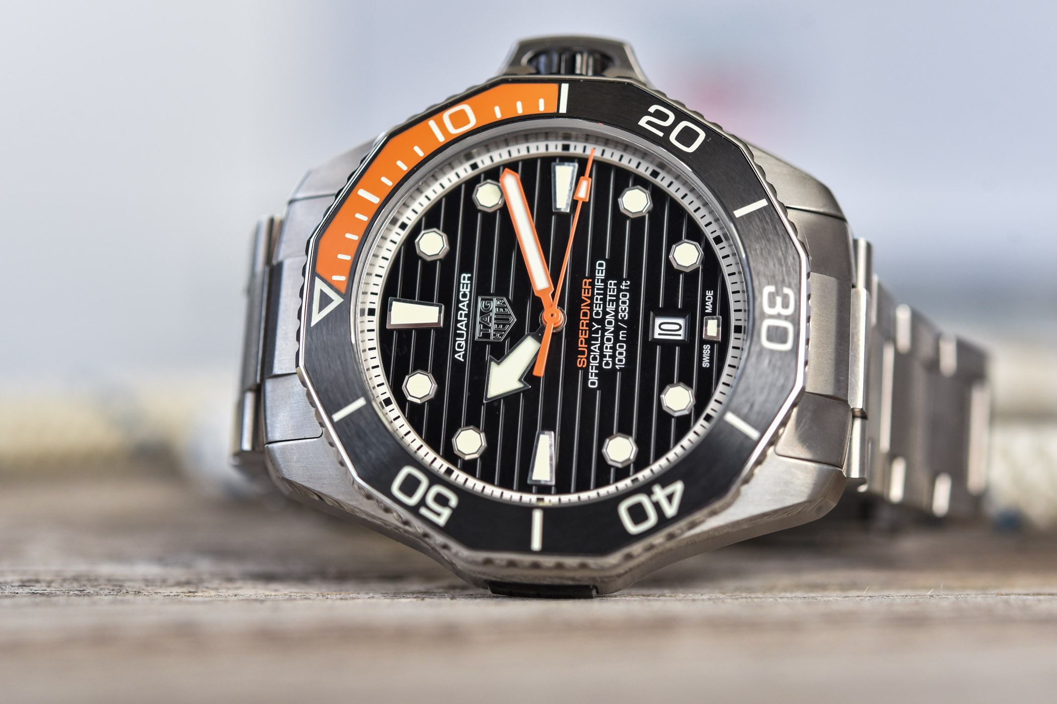
We focused on the crown with a new protector. It moves inwards and outwards with the crown, which means the crown is always protected. When the crown is pulled out, you can see this orange line which contrasts with the blackened crown to remind you not to go into the water at that point – the outer compression seal is not closed when the line is visible. We designed and tested several models and iterations of the protector; this winning version looks great, protects the crown perfectly, yet it has no impact on the user-friendliness of the crown, which surprised even us! You can also see that black cover over the helium valve. It brings a more modern look to that side of the watch as well, which balances the work we did on the crown protector.
All in all, it is closely based on our professional 300 models and is based on the same DNA, but it is perfectly designed to meet professional saturation diving criteria and to go down to 1,000m. To achieve this, we have played with a lot of details to make it an even better dive watch. It meets the 6425 specs and, of course, it has our new movement inside, which raises the warranty to five years instead of two years. So, we are really talking about quality and durability. This is yet another way we can bring added value to our customers.
What about the Solargraph?
Here again, we are talking about bringing innovation, quality and durability. It is an excellent movement. We wanted to innovate in the field of our quartz movements, and to do this, we worked closely with La Joux-Perret. The Solargraph movement works on any light source. Ten seconds of light is enough to start the watch; two minutes of exposure to light is enough to run it for a day. After about 20 hours, you have enough power to run it for six months. If you pull the crown out, you have three and a half years of battery life in store. You never have to change the battery. It is really the perfect quartz movement – the precision of quartz with the durability and hassle-free usability of an automatic mechanical movement.
There is quite a bit of innovation on the dial too. It is a complicated affair made of two main parts – the top part allows us to carry over the fine finishing from our mechanical watch dials, and this top half is paired with a reflective lower surface which ensures that the movement remains invisible yet is able to be charged by light passing through the dial layers. The result is totally invisible, high-end and durable technology which means you never have to think about changing batteries, running flat or losing time.

Coming to the outside of the case, it is DLC-coated steel, which makes it the only black timepiece in the Aquaracer Professional 200 series. In the bezel, you can see a black carbon insert. It is not just carbon; the resin is loaded with luminescent material to make it glow in the dark. This black bezel allows us to use bright luminescent markings which also makes it the only Professional 200 to have a bezel that is readable in the dark. By day, the entire dial and bezel markings and graphics are super visible to the extreme contrast between the pure white markings and the matte black backgrounds; this carries over to the nighttime where you will discover a beautiful light show with blue seconds and minutes hands and markings on the bezel, contrasting with the green hour hands and indexes and green luminescence inside the veins of the carbon texture. We called attention to the luminescent colours and to the environment that this watch works perfectly in, like glaciers – you will see that we communicate a lot around hardcore outdoor sports like ice climbing! – with the touch of pale blue on the seconds hand that brings some of that glow into the dial.
You also announced the Plasma project? How was this a laboratory for innovation at TAG Heuer?
We wanted to rethink how we use diamonds and specifically how a brand that focuses on the avant-garde will be able to innovate around high-end diamond timepieces in the future. What kind of diamonds? How can we bring innovation to the world of diamonds? How can we use them to explain to our fans that we are serious about making high-end watches combined with innovation and future technology?

The entire development and design team has done a tremendous amount of work sourcing the different experts who could help us in this quest. There is nothing easy about the process, from creating a diamond to cutting it in the complicated ways that we have done to actually getting it inside one of our watches; there are many things we had to innovate. It is a long and steep learning curve.
We used two types of diamonds. One is monocrystalline, which is the fairly large diamond block, a single one of which for instance makes up the crown … a very big one! You can see all the different shaped and sized diamonds placed around the body of the watch. There are not the same diamonds; they are differently shaped, they have different proportions and volumes, they are placed at different angles, some of them come over different facets of the case. Each one of them had to be studied on its own to be facetted and set perfectly. This is not at all the same thing as setting them around a bezel! So, as you see, in new cars with a camouflage design (for test runs on race tracks), we decided to use the diamonds to come up with a pattern that would both hide and reveal different parts of the case. We also had to look at the case itself – if you put a diamond in front of a black surface, the result is pretty lacklustre. So we decided after testing lots of metals to use anodised aluminium for the case. It allows us to have a pure black outside but to let us polish the spaces which receive the diamonds in order to allow light in to make the diamonds come to life. So there is material innovation even here.


The diamonds are set using an invisible setting, so we had to machine out the inside of each of its holes to receive the diamond, clasp the diamond and fit it perfectly!
The crown itself was a challenge; to fit such a huge diamond into the shaft of the crown was not easy… We have inset our shield logo inside the diamond. We almost have a holographic look with the shield inside the diamond, with the logo connecting the high-tech diamond outside to the manufacture movement inside.
Inside the dial, there is further use of diamonds. All the markers are diamonds. We had to make the solid block of diamond on each index capture the shininess of a diamond, which involved further studies with our diamond-setting specialists. And then, of course, there is the dial itself which looks as if it is sprinkled with diamond dust. In fact, it is itself one solid block of diamond in a polycrystalline structure, creating a solid diamond plate that is about 30mm across and about half a millimetre thick. So, it is an impressive diamond on its own, and it shows off a very different look we can achieve while still using diamonds.
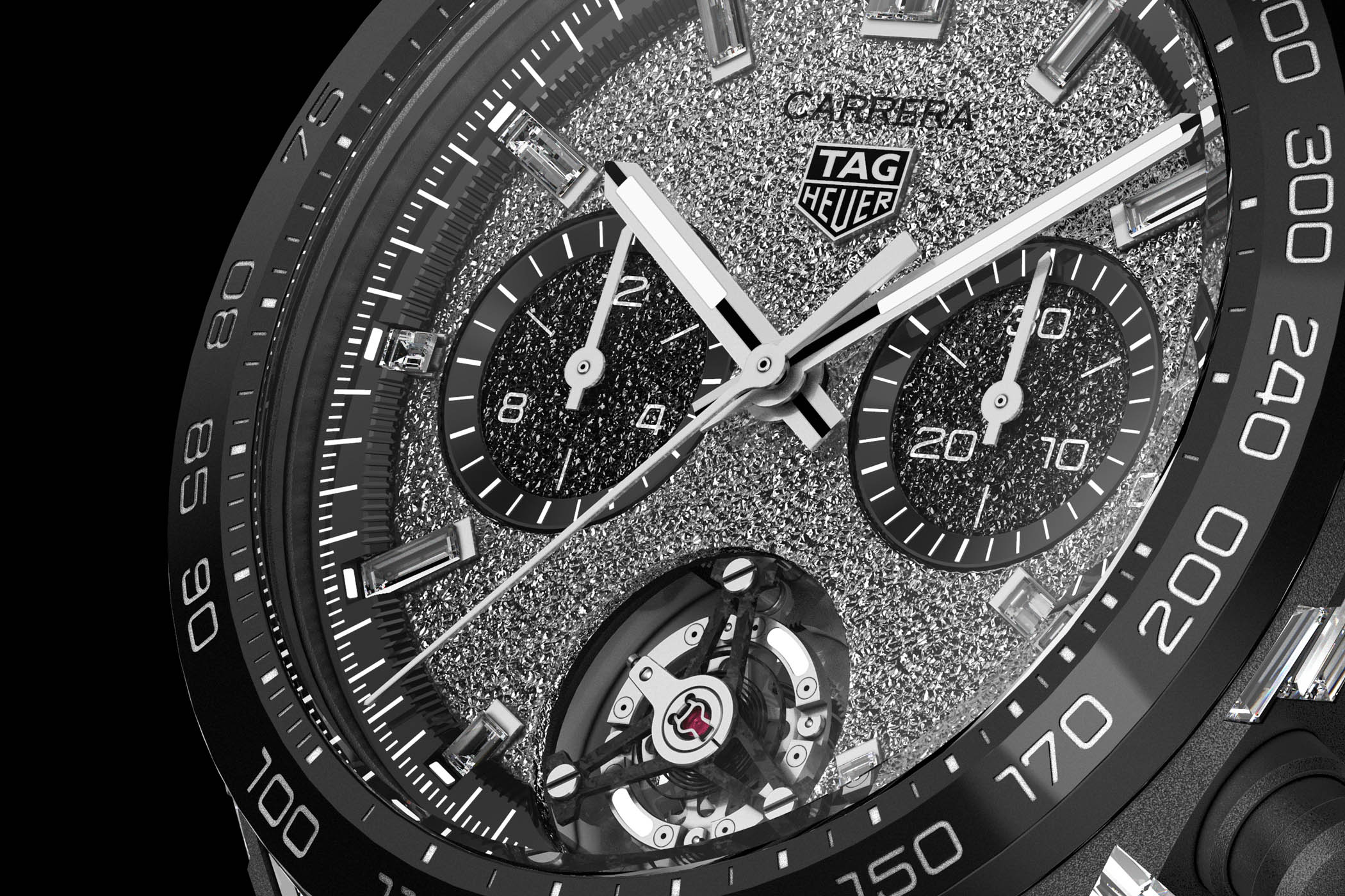
And then, when you go into the black sub-dials, you have polycrystalline diamonds again. We have white and black diamonds playing against each other. This is a further nod to Carrera’s origins, where we produced several panda and reverse panda dials during the 1960s and 1970s. So, we have taken the ideas from our past but reinterpreted them using completely new materials to come up with a very modern look.
Last but not least, there is a carbon hairspring which we have been working on for several years, as you know. All the diamonds are based on carbon, so we wanted to carry this into the hairspring. The movement carries on the designs launched on last year’s Only Watch Monaco, where we reinterpreted our checkerboard pattern in a completely hand-finished way and debuted a new rotor design – you can see both of these details again in the Carrera Plasma.
Of all the new novelties, which one is your favourite or which is the star of the TAG Heuer 2022 collection?
My first watch was a TAG Heuer Professional 2000, which eventually gave rise to the Aquaracer collection. With every 1000m watch in our history, we have exemplified the design style of each time period. So I have to say, I really like what we have done on the 1000 Superdiver to exemplify the new Aquaracer diving watches with a very refined yet very sporty look and feel. The Superdiver!
For more information, please visit www.tagheuer.com.
1 response
I love TAG watches put lately the prices they are asking for them is just far too much. For these Gulf models going north of $6,000 USD while my newly purchased 41mm Datejust at a Rolex AD was just $7,600 USD, there is no logic in paying this much for a TAG. Plus the resale value of a TAG is horrible.