The New Kudoke HANDwerk 3 And Its Original Display of The Time
Independent watchmaker Stefan Kudoke has chosen an extravagant approach for his new watch.
Stefan Kudoke and his unique and intricate timepieces incorporating elements of traditional watchmaking with modern designs and super-fine execution have been known to collectors and watch enthusiasts for quite some time before his Kudoke 2 watch won the Petite Aiguille at the 2019 Grand Prix d’Horlogerie de Genève (GPHG). The high-profile success brought wider recognition and increased demand for the Kudoke creations, Kudoke 1 and Kudoke 2, that represent the HANDwerk Collection, not to forget that Stefan Kudoke is also famous for his KUNSTwerk engraved and skeletonised watches produced in limited numbers. And he is busy making unique, bespoke watches that fall into the YOURwerk collection. So it is understandable why we had to wait four years to lay our hands on a new, just recently released Kudoke 3.
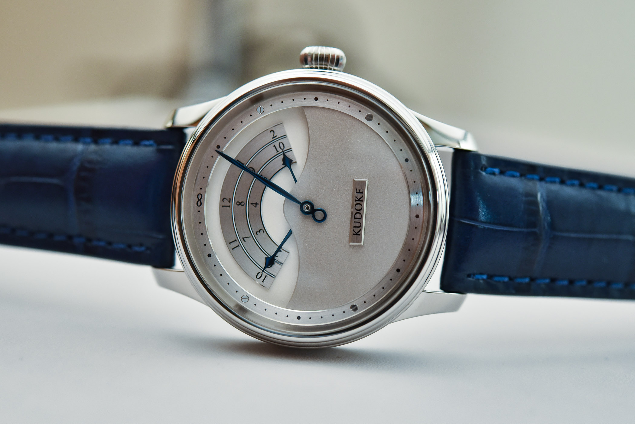
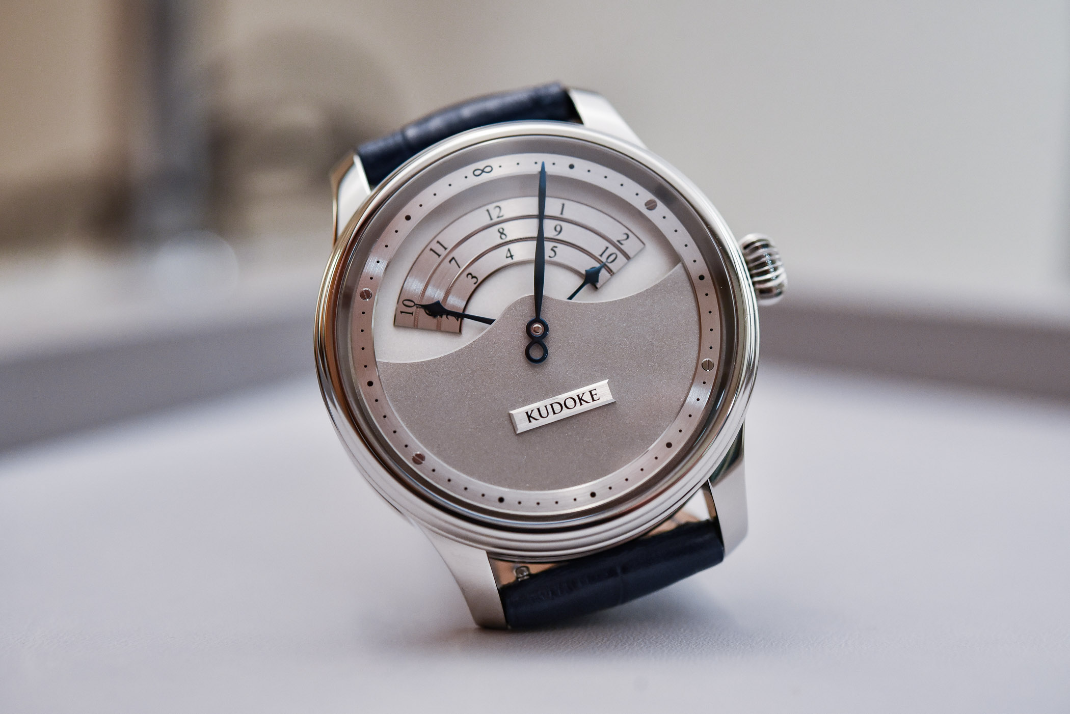
Kudoke 3 is another fine timepiece from the German watchmaker that continues to pursue the design and aesthetics introduced in Kudoke 1 and 2. It is launched in the same 39mm round polished case, just a bit thicker for a reason. At first, watch N°3 looks more complicated than the previous references in the HANDwerk collection. However, the two-level dial, several heat-blued hands, and the triple-scale register are only exercises in creativity, and not in complication.
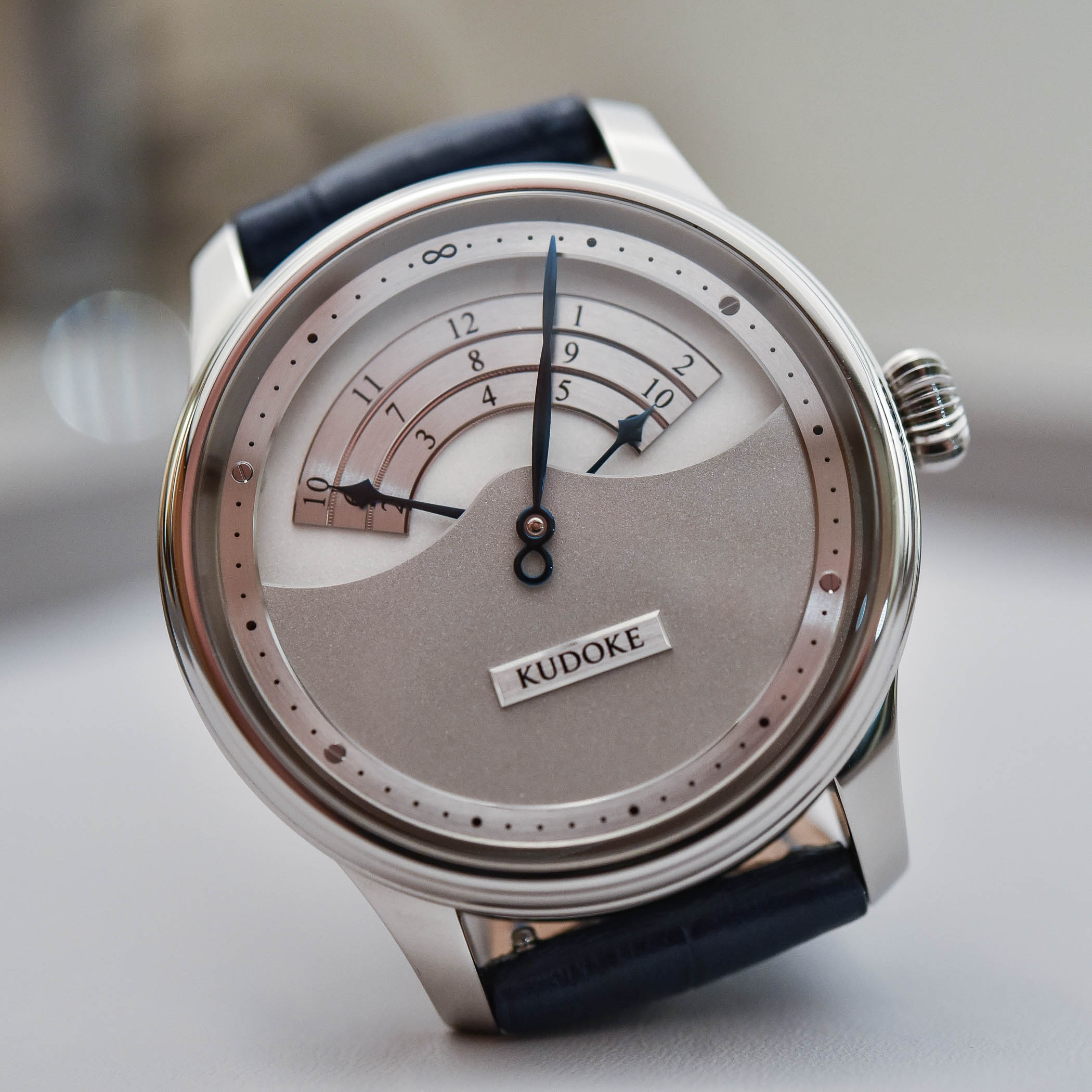


Kudoke 3, in principle, is a traditional time-only watch, with hours indicated by a three-pointer hand (the brand calls it a three-arm hour hand), moving between the two levels. The arms are of different lengths; when one gets closer to the hour scale’s end, the shorter or longer next one shows up on the starting side of the scale. When it is 2, 6 or 10, you’ll see two arms simultaneously. The minutes are indicated by the hand with an infinity symbol; the same infinity sign marks 12 o’clock. It certainly takes time to get used to the unusual display, but functionality aside, the watch is original and quite pleasing.
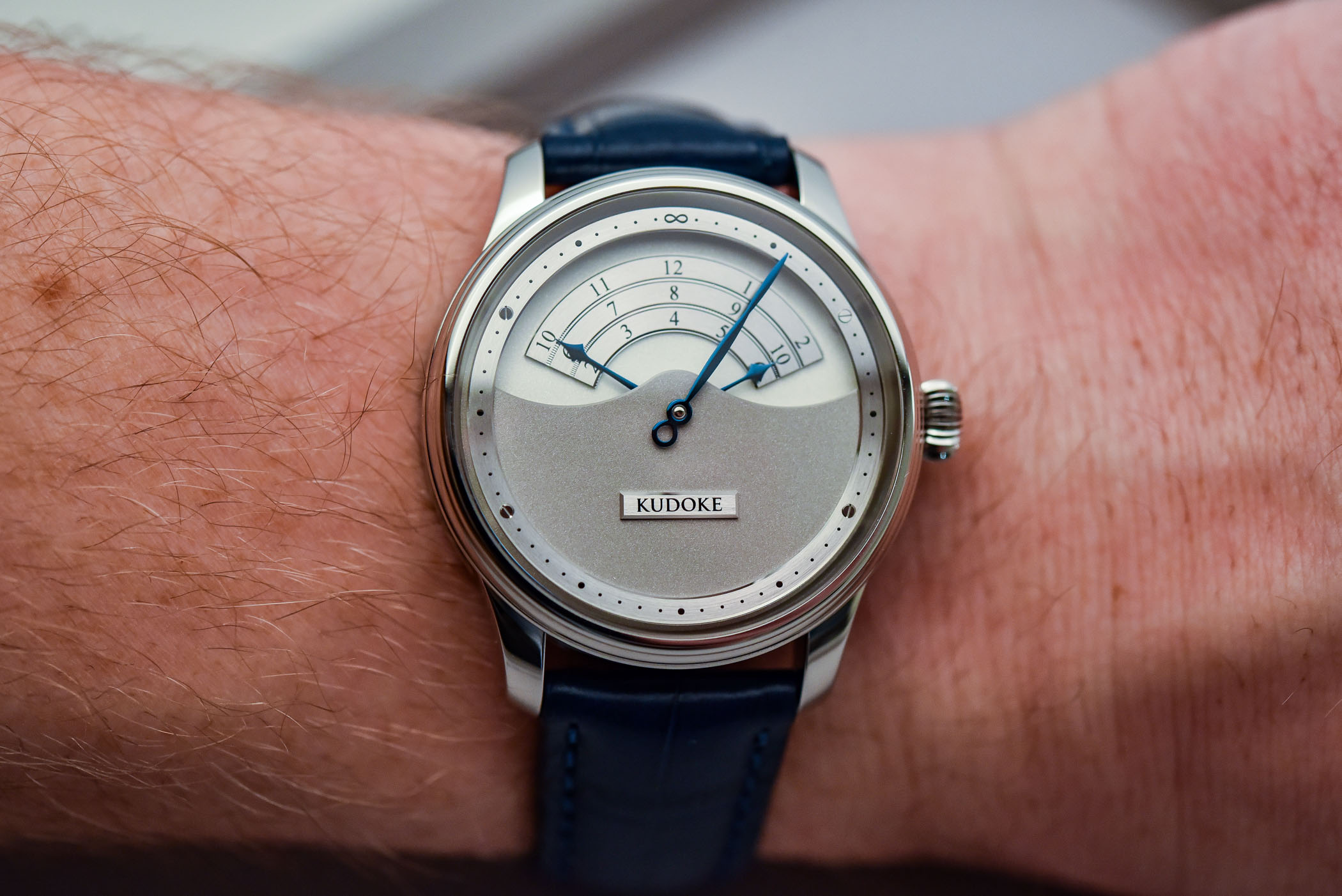
The three-scale unusual hour display of Kudoke 3 is applied to the lower silver-plated dial level. Its shiny finish matches the minute chapter ring on the top level and the plaque with the Kudoke logo. The upper dial plate, the minute ring and the lower plate are held together with the four screws, positioned at 10, 20, 40 and 50-minute marks. The dial construction and presentation make it look very three-dimensional and deep. Surprisingly, the watch is just 10.30 mm thick. The stainless steel case is well-proportioned and would sit comfortably on any wrist.
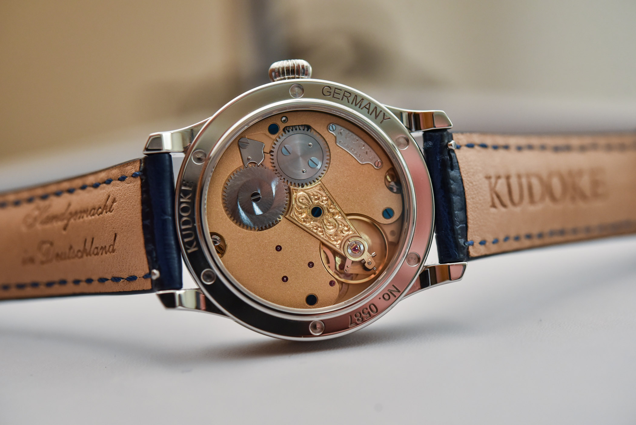
Kudoke’s onion crown is large enough to set the watch and wind the movement, which is the proprietary Kaliber 1. This calibre, introduced by Kudoke in 2018, was developed with Habring2 and is based on the Austrian couple’s A11. The large hand-engraved balance cock and the frosted finish on the movement are remarkable; the movement’s elegant execution is for all to see through the sapphire caseback.

For the launch, the Kudoke 3 is offered with a “simple” movement decoration, but Stefan Kudoke and his growing team welcome requests for a fully-engraved version. Also, if the stainless steel case seems too dull or restrained to you, ask for the rose gold; it is available as a special order. The price for the stainless steel version is EUR 9,350, taxes excluded.
The watch is available directly from Kudoke, please visit www.kudoke.eu for more information.
4 responses
The price destroyed any interest! If you’re thinking about it, you may as well get the Habring. It’s less expensive and every bit the watch this one claims to be, albeit without the carnival style dial and hour hands. It astonishes me that these brands get away with their knucklehead pricing. I can’t imagine anyone in their right mind going for what seems like such a con.
The infinity symbol is off. The point of infinity, 8, and the center of the watch don’t align, at least for the watch presented in photos. Otherwise it’s fine, it deserves to be here 🙂
i must say, i’m a little disappointed it’s not a jumping hour.
that 3 sector presentation is much less interesting.
i loved the 1, liked the 2, this one seems un-necessarily quirky, which is strange for the style of the brand.
also, the 13 y.o. inside me still thinks that they should find another arrangement for the balance bridge…
is there something like male genitalia in the caliber back window. Awful !