A. Lange & Söhne Lange 1 Daymatic “25th Anniversary”
The eighth birthday gift to celebrate the 25 years of the Lange 1 is a white gold rendition of the Lange 1 Daymatic with blue trimmings.
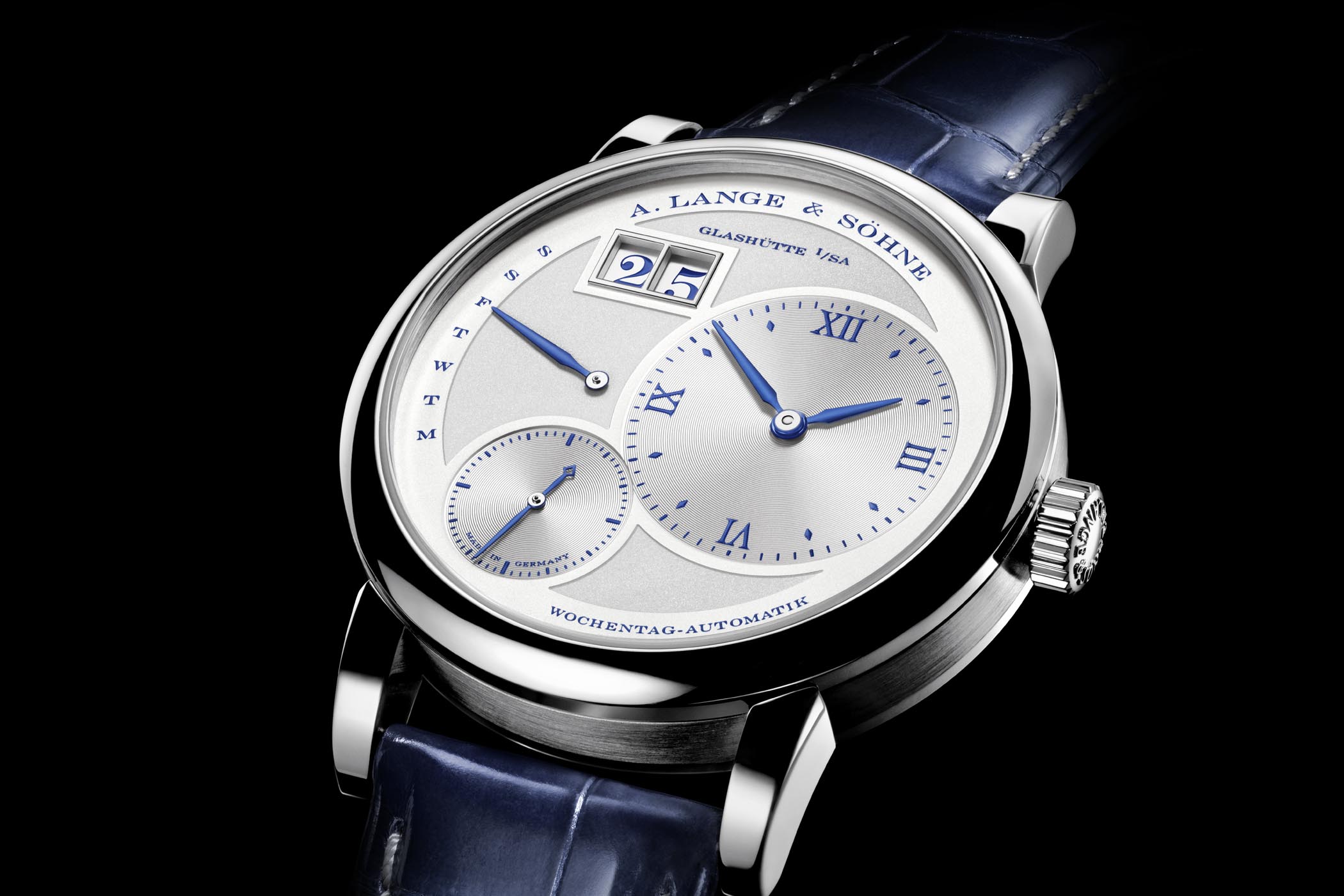
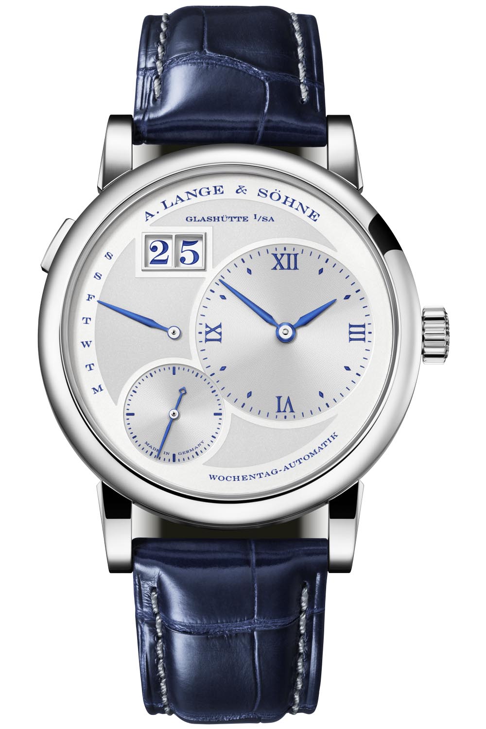
Like all the seven watches presented over the past seven months to fête the Lange I, the Daymatic is dressed for the party in a white gold case with blue trimmings on the dial. As you know, the Saxon brand is celebrating the quarter-century of its foundation watch with not one but ten models. A limited-edition of 25 watches, the Lange 1 Daymatic bears the hallmark features of the iconic Lange 1 – outsize date, off-centred dials, beguiling asymmetry and power reserve indicator – but with a twist: the layout of the Daymatic dial is a mirror image of the Lange 1, with a few tweaks. The hours and minutes, the subsidiary seconds and outsize date have all switched places and, in a gesture to make it more practical and wearable on a daily basis, the engine powering the functions is automatic.
Back to front
The Lange 1 Daymatic made its debut in 2010, 16 years after the epic unveiling of the Lange 1 in 1994, the watch that has come to define the brand. Although at first glance, the Daymatic appeared to be a perfect mirror image of its elder brother, there were some subtle differences. The Daymatic – measuring 39.5mm in diameter with a case thickness of 10.4mm – was 1mm larger and 0.6mm thicker than the Lange 1.
The real differences between the twins concerned the layout of the dial with the indications of the Daymatic arranged on the opposite side of the dial and the incorporation of a self-winding movement. Designed to be a more practical, everyday watch, other salient differences were the replacement of the power reserve indicator on the Lange 1 (manual-winding) with a retrograde day of the week indicator on the left, and the use of lume on the hour, minute and day hands. You can read all the minutiae of the differences between the twins in Frank’s comparative article here.
What’s new?
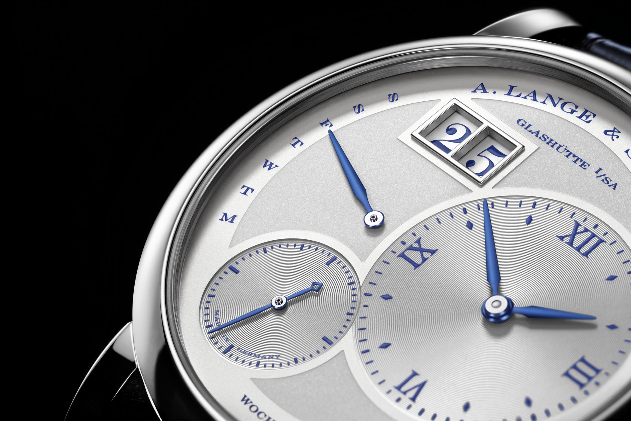
As you can see, the “25th Anniversary” Edition is basically an aesthetic modification. The dial is silvered with well-differentiated finishes to exalt the functions and all the indications are blue, including the numerals of the Lange outsize date. The perimeter of the dial is a lighter tone of silver bearing the brand name, the days of the week, and the German words for weekday and automatic (Wochentag-Automatik) in blue. Once again, Lange pulls off a dial with an extraordinary sense of harmony and proportion, albeit with an asymmetrical layout. The background of the central part of the dial is a slightly darker shade of silver and has a sandier texture than the perimeter. The hallmark off-centred hours and minutes dial and the smaller subsidiary seconds are snailed in their interiors and are slightly recessed for additional depth and volume. Like the outsize date window at 11 o’clock, the hours and minutes and small seconds counters are framed by the lighter tone of silver on the perimeter highlighting the functionality even further. Another difference over the regular Daymatic models is the absence of lume on the hands, an elegant touch in line with the limited-edition, highly collectable nature of these watches.

The beauty of the Lange 1 Daymatic is the position of the hour and minutes dial. Placed on the far right, you can check the time without having to roll back your cuff to expose the time like on the Lange 1.
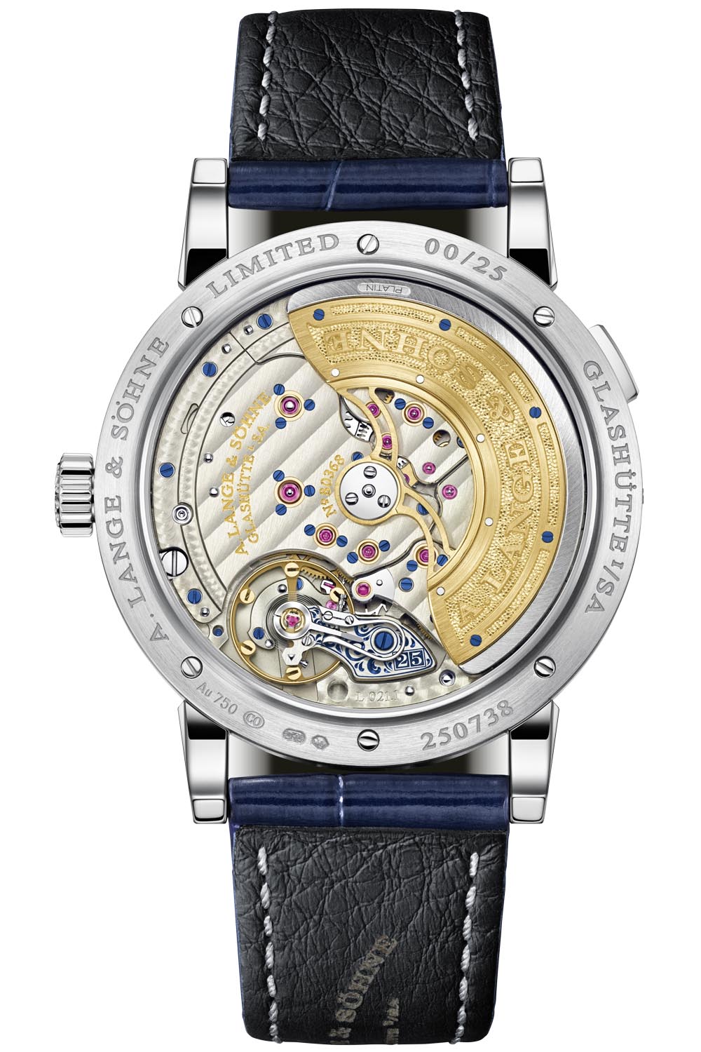
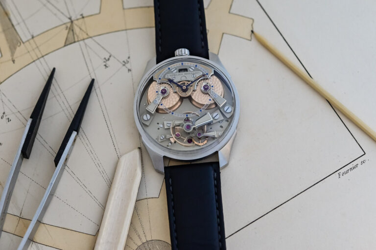
Automatic Calibre L021.1
The sapphire crystal on the caseback reveals Lange’s in-house, self-winding movement with its large gold-coloured rotor (with a peripheral centrifugal mass in platinum) gliding over the bridges and balance. Fleeting views of the hand-engraved balance cock reveal a floral pattern and a miniature rendition of the outsize date window with the number 25 in its interior – all filled in with blue, naturally. Fitted with an in-house balance wheel and hairspring, the maximum power reserve is of 50 hours. Details like the Glashütte ribbing on the bridges, the perlage on the main plate and the profusion of screwed gold chatons and blued screws conspire to create a spectacular movement.
Price and Availability
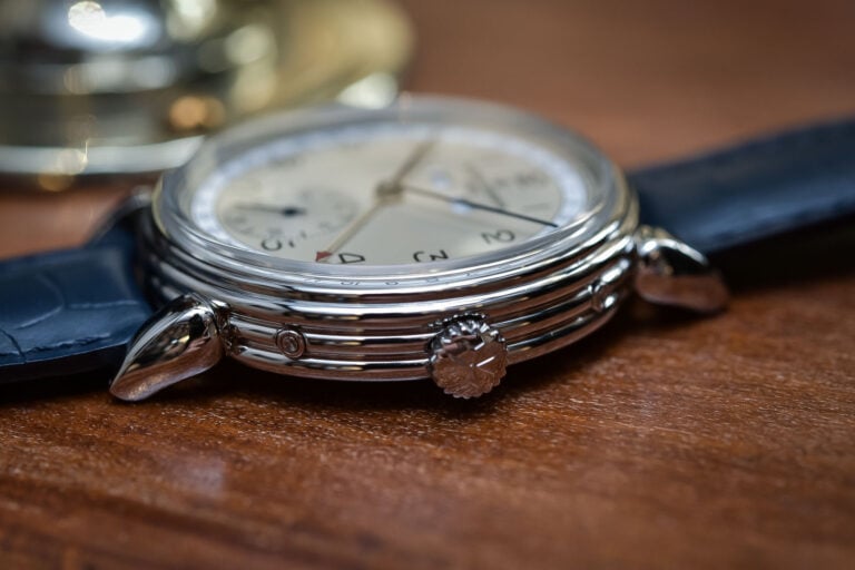
As mentioned, the Lange 1 Daymatic “25th Anniversary” is a limited edition of 25 watches and is presented on hand-stitched blue alligator strap with a white gold prong buckle. The watch will retail for EUR 44,200.
More information at alange-soehne.com.
8 responses
I think I know which watch is going to win the Grand Prix d’Horlogie for date windows this year
🙂
Yuck. That is all.
Completely agree with you Gil. This 25th anniversary series is irrelevant, quite ugly for a Lange and seems like done quickly. In French I would say baclee.
I don’t understand either of these comments. This is the same basic model Daymatic but with blue accents. If you like the standard issue I don’t know why you wouldn’t like this one. I saw the Lange 1 anniversary edition in the metal and it was stunning. The blue accents really makes the watch pop.
I wouldn’t want a Lange to ‘pop’! At the least it looks inconsistent with Lange’s usually well-balanced aesthetics; at the most the blue-gone-crazy makes it look toyish, like a child’s first pretend grown up watch.
The movement is achingly beautiful, though.
Perhaps “pop” was the wrong choice of word. It creates contrast in a way that is similar to the blue steel hands and markers of the IWC Portugieser Chrono. That watch doesn’t look toyish. It creates a nice contrast that makes the watch more legible. If there is anything that I would pick a nit about Lange’s standard offering is that sometimes the watch is hard to read under certain lighting conductions because it is so monochromatic (in white gold anyway). I take your point about this edition looking “toyish” but I always think it is a mistake to judge based on a rendering. I think you need to see these editions in the metal before making a final judgment.
That’s definitely a fair comment about seeing them in the metal. There is a tendency for some brands to get the blue colour wrong in their official pics; the VC Overseas blue dial website pics give the impression it has a light-coloured sunburst metallic look, but in reality, it’s like a lacquered enamel deep, dark blue.
Actually, I just searched to see if I could find varied pics, and Horobox has some good ones of the base Lange 1 25th edition which admittedly elevate my opinion of it.
*whisper* Still prefer the normal white gold version. */whisper* BUT, I shall try to see it up close.
This isn’t their best looking watch and at least 43,000 over my budget so it’s a no from me