The New Bremont Terra Nova Collection of Field Watches
Four vintage-inspired field watches with contemporary specifications expand Bremont’s repertoire of adventure-ready tool watches.
With a passion for aeroplanes and watches, Bremont Watch Company was founded in 2007 by the English brothers Nick and Giles. Adventure is the overriding theme at Bremont, and its rugged tool watches are designed for airborne, seaborne and land exploration. The latest collection from Bremont’s Henley-on-Thames headquarters is the Terra Nova, debuting with four watches inspired by military pocket watches of the early 20th century. Bremont is now in the hands of CEO Davide Cerrato, and the Terra Nova collection he has overseen could be regarded as his trial by fire. Sharing a robust cushion-shaped case, oversized crowns, vintage details and excellent legibility, the Terra Nova debuts with a time-only model, a time-and-date, a compass bezel with power reserve and a chronograph.
Shared Traits
Replacing Bremont’s earlier Terra Nova collection, the new models embrace the simplicity, ruggedness, functionality, and practicality of yesteryear military field watches. By studying early 20th-century pocket watches, Cerrato’s idea was to inject the collection with an authentic sense of historical provenance reinterpreted with 21st-century design and specifications.
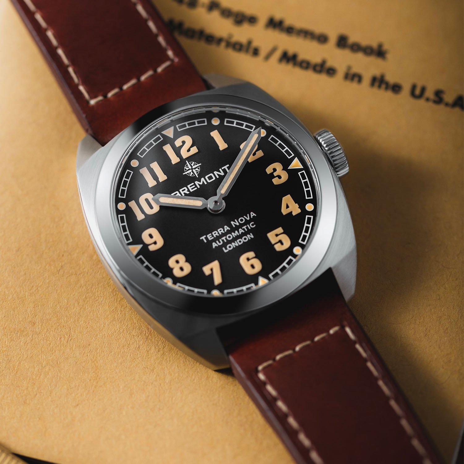
To evoke the look of military field watches, all four models share a stainless steel cushion-shaped case with a slim profile and tapered lugs. The caseback is sealed and decorated with a charted map of the globe, ensuring the 100m water-resistance of the case. Referencing field watches of the past that were often operated with gloved hands, the large push-in crown is engraved with the brand’s new Wayfinder compass rose symbol. Visibility is enhanced with the application of 3D Super-LumiNova block numerals, while the faceted pencil hands add a vintage touch.


All four models have a linear gradient dial, a ‘broken’ railway minutes track with applied 3D SLN indices, and a newly developed quick-release system to swap the stainless steel bracelet for a leather strap. The more complicated models are also offered with black and grey NATO-style straps woven on 18th-century French Jacquard looms (does this remind anyone of Cerrato’s stint at Tudor?).
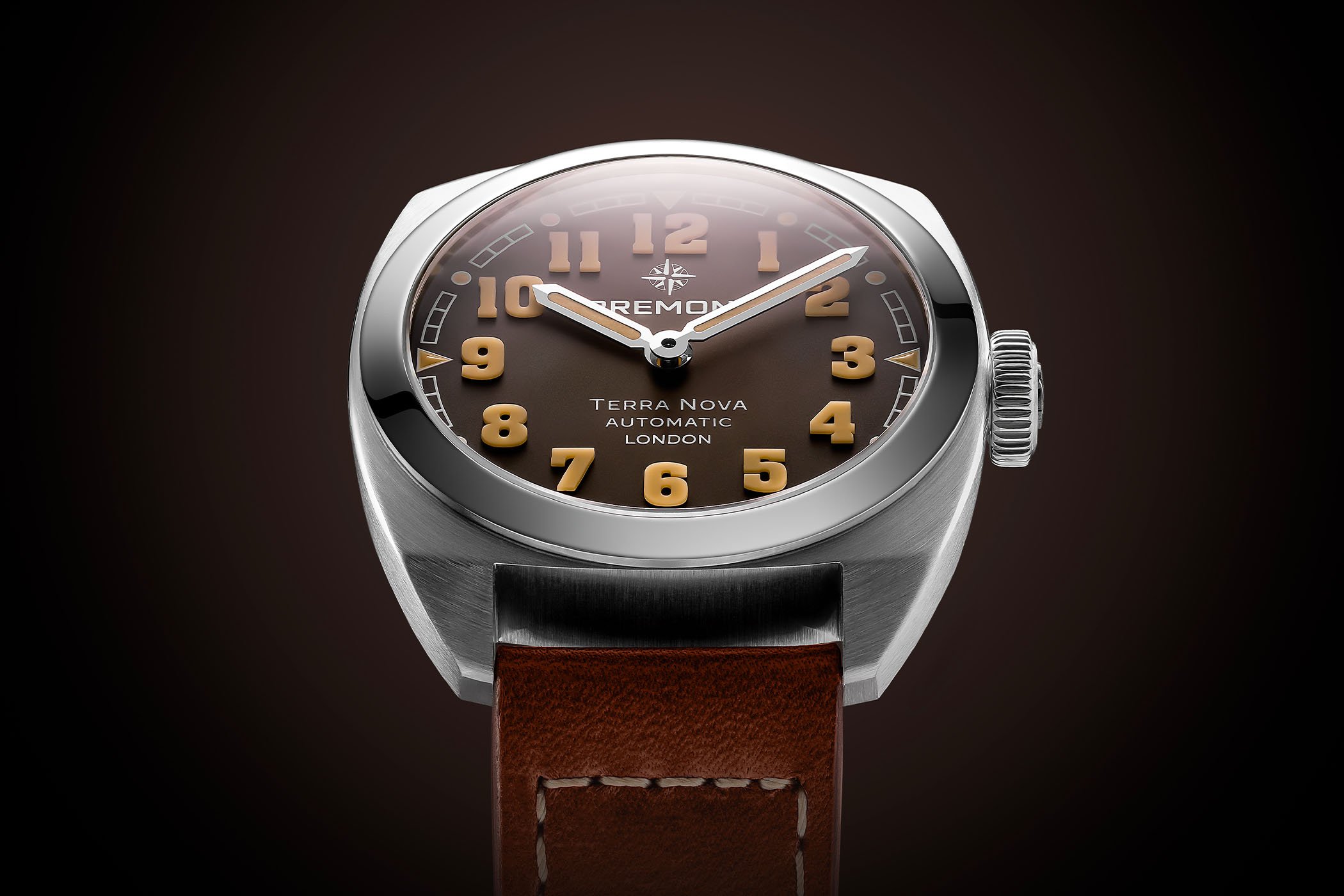
Terra Nova 38
The most straightforward watch in the lineup is the Terra Nova 38, with hours and minutes. The two-piece stainless steel case has a diameter of 38mm, a thickness of 10.7mm and a length of 44mm. Its rounded cushion-shaped case features a large portion of satin-brushed areas in keeping with the utilitarian spirit of the collection. The bezel and crown, however, stand out with their polished finish. With its low profile and shortened lugs, the case is ergonomically designed to sit flush on the wrist.

Available with a gradient anthracite or white dial, the oversized Arabic vintage-inspired numerals are cut from blocks of beige vintage-tone Super-LumiNova and emit a green glow in the dark. The pencil hour and minute hands and the 3D indices (dots and triangles) at every hour interspersed on the railway minutes track are also filled with Super-LumiNova. The words Bremont, Terra Nova, Automatic, and London are stamped in contrasting colours on the dial, and the new Wayfinder symbol is featured at noon. A domed, anti-reflective, scratch-resistant sapphire crystal protects the dial.


Powered by the automatic calibre BE-36AE (Sellita base), the movement beats at 28,800vph and delivers a modest 38-hour power reserve. The Terra Nova 38 can be paired with the newly developed stainless steel bracelet, which has slightly arced links echoing the rounded case and a quick-release system, or with a more traditional brown leather strap with white stitching and a pin buckle.
Quick facts: 38mm x 10.7mm – stainless steel, brushed and polished – sealed caseback – anthracite or white dial with 3D Super-LumiNova numerals and indices – automatic movement – 4Hz – 38h power reserve – quick release stainless steel bracelet or leather strap – EUR 3,300 on steel bracelet – EUR 3,000 on leather strap
Terra Nova 40.5 Date
Progressing slightly in complexity, the Terra Nova Date is a three-hand-and-date model. Displaying identical finishings to all the Terra Nova models, the larger 40.5mm diameter of the stainless steel case is coupled with a thickness of 11.11mm and a length of 47mm.

Available with an anthracite or green gradient dial, the new Terra Nova Date models feature the 3D Super-LumiNova block numerals and indices with green emission (vintage SLN on anthracite dial, white SLN on green). Fitted with a central seconds hand in a coppery tone to contrast with the polished rhodium-plated hour and minute hands, the Terra Nova Date features a date aperture at 3 o’clock with a white background.


Powered by the automatic calibre BE-36AE (Sellita base), the movement beats at 28,800vph and delivers a modest 38-hour power reserve. The Terra Nova 40.5 Date has three strap options: a quick-release stainless steel bracelet, a brown leather strap, and a NATO strap.
Quick facts: 40.5mm x 11.11mm – stainless steel, brushed and polished – sealed caseback – anthracite or green dial with 3D Super-LumiNova numerals and indices – automatic movement – 4Hz – 38h power reserve – EUR 3,550 quick-release stainless steel bracelet – EUR 3,250 leather strap – EUR 3,250 NATO strap
Terra Nova 40.5 Turning Bezel Power Reserve
This model stands out with its notched, bi-directional rotating compass bezel engraved with the cardinal signs. Other features of this model are the small seconds counter at 9 o’clock, a direct reference to vintage field watches, and the power reserve gauge at 6 o’clock.
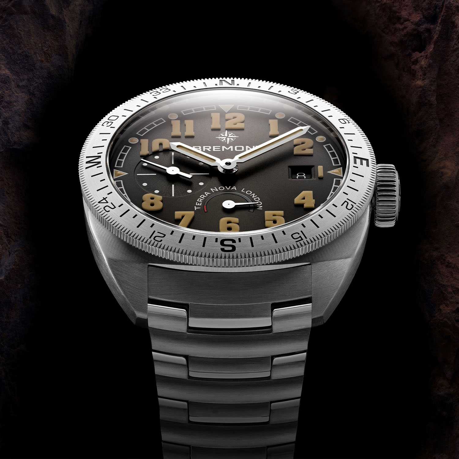
The stainless steel case has a diameter of 40.5mm, a thickness of 11.91mm and a length of 47mm. The dial, available in anthracite or blue, features 3D Super-LumiNova numerals and indices (vintage SLN on the anthracite, white SLN on the blue). Where it differs from the simpler models is the incorporation of a recessed and snailed small seconds sub-dial at 9 o’clock and the arced power reserve indicator at 6 o’clock. There is a date window at 3 o’clock with a dark background on the anthracite dial and a white one on the blue dial.


Powered by the automatic calibre BE-79AL (Sellita base), the movement beats at 28,800vph and delivers a power reserve of 41 hours. The Terra Nova 40.5 Turning Bezel Power Reserve also has three strap options: an interchangeable stainless steel bracelet, a black or brown nubuck leather strap, and a NATO strap.
Quick facts: 40.5mm x 11.91mm – stainless steel, brushed and polished – sealed caseback – anthracite or blue dial with 3D Super-LumiNova numerals and indices – automatic movement – 4Hz – 41h power reserve – quick-release stainless steel bracelet EUR 4,450 – nubuck leather strap EUR 4,150 – NATO strap EUR 4,150
Terra Nova 42.5 Chronograph
The most complicated model is the Terra Nova Chronograph. It has a notched, bidirectional, rotating black polished ceramic bezel and stopwatch functionality. Like the Terra Nova Turning Bezel model, the bezel of the chronograph is engraved with the cardinal signs. The 42.5mm stainless steel case has a thickness of 14.8mm and features satin-brushed chronograph pushers flanking the crown.

Only available with a black dial, the oversized Arabic numerals and indices are cut from blocks of vintage-tone Super-LumiNova. Arranged horizontally across the dial, the two sub-dials – 30-minute elapsed times at 3 o’clock and running seconds at 9 o’clock – are recessed, snailed and have white markings and glossy white hands to match the peripheral railway minutes/seconds track. The pencil hour and minute hands are also treated with SLN, and the central chronograph seconds hand is gold-plated for contrast. There is a date window at 6 o’clock with a dark background.


The Terra Nova Chronograph is powered by the calibre BE-50AV (SW510 or 7753 architecture), delivering a more robust power reserve of 56 hours. Again, the Terra Nova Chronograph can be matched with three strap options: a quick-release stainless steel bracelet, a brown leather strap or a woven NATO-style strap.
Quick facts: 42.5mm x 14.8mm – stainless steel, brushed and polished – sealed caseback – black dial with 3D vintage Super-LumiNova numerals and indices – automatic movement – 4Hz – 56h power reserve – quick release stainless steel bracelet EUR 5,950 – brown leather strap EUR 5,650 – NATO strap EUR 5,650
For more details, please get in touch with bremont.com.
12 responses
If the dial text were smaller and better proportioned. There would be something here.
Looks like Bremont is totally lost. Struggling for an identity, these pieces look cheap and like a mishmash of other styles.
I don’t love this design direction at all. Not enough space on the dial for all that printing. Feels like an under-designed micro-brand at a $500 price point, not the high quality and rigorous designs I expect from Bremont. New logo is not great either.
First impressions are these look cheap and clumsy. Not a fan of the logo change either. Interested to see if these sell well or help expand the customer base as intended… Or flop!
Absolutely terrible mistake having Mr Davide take the reins. Nick and Giles should have put him on probation with 1 model release before handing him the crown jewels.
0. There is close to zero coverage fr w&w. Either everyone hates him or lack of preparation.
1. He ruined the logo (as he does, case in point Mont Blanc turd logo). Worse font, much less classy in general
2. The originally subtle London on dial is now so huge/loud its crass and gimmicky.
3. The removal of the trip tick case (diver) which was unique to Bremont – probably a cost saving measure
4. The new hand designs are worse off in general. (Subjective) Again far less classy and reeks of cost reduction
5. Completely pivoting from the original vision of all-english movement, as a north star and brand ideology in general.
Bremont is now basically competing on the same level as Christopher Ward and Farer. And with its basic no frills drop shipped (albeit swiss) movements, subpar design, its gonna lose, badly.
Basically if Bremont was stuck on a desert island Mr Davide just used the last flare to light his bbq. And when it all goes to crap he’ll prob change jobs again.
I feel so strongly about this because this guy has single-handedly ruined the foundations painstakingly built by Nick and Giles over the decades.
Too much text, and with logo, takes up too much space on the dial, distracting from what really matters, and taking away from its intended purpose, or what should be its intended purpose. Makes the watch look cheap and like a “wanna be”, and not worth the price being charged.
What has become of Bremont?
Personally I think they look great. Loving the chronograph!
I’ll pass and keep looking out for their older models on the second hand market.
I really dislike the change in direction. I was thinking about buying a Bremont. Would have gone for the triptick case. I was mostly waiting for. British mechanism. Now, I won’t bother. The new logo looks a lot like micro brand Technotempo’s logo. Terrible step down market.
Every time you think Bremont has hit rock bottom, they just dig deeper! What is wrong with this brand?!
As a long term fan of the Bremont brand who has toured the Wing and been inspired by listening to Nick’s vision I was eagerly awaiting the rebrand. As a Tudor owner, I hoped Cerrato would work his magic and I would finally find my fit in the Bremont collection. However, the unveil at Watches and Wonders is a carcrash that has emerged as a cyclical cash grab to pivot towards the US and an urban market. Whilst this may, ultimately, prove successful for the new owners in terms of the bottom line, it seems to fly in the face of the pioneering Bremont spirit. The new iterations look as though the new designers have taken a Hamilton field watch and a Panerai Luminor and tried to apply this to a fast fashion, mass produced production process. In the process they have created something hugely generic completely lacking the Bremont DNA. As far as the rebrand logo goes, when you have to explain this, I think failed to hit the mark (apart from all the NATO officers out there!). As a fan of the brand, this seems like the crossing of the rubricon; the new management have engineered a new trajectory that, judging by the comments on instagram on their own posts, is not aligned with their core demographic.
First posted on FT.com “ Bremont changes design language to seek a wider appeal”
https://www.ft.com/content/40e06076-423b-4d45-aef9-ff8d9a7ed793