Santos de Cartier Large Model now with Gradient Blue Dial
Cartier's vision of the luxury sports watch now in a cool gradient blue edition.
The revamped Santos was the star of the SIHH 2018 for Cartier and for multiple reasons, it was a success. Well designed, well equipped, well executed and relatively fair when it comes to the price, Cartier gave this iconic shape a slightly sportier (or let’s say more modern) touch and some nice details, such as a clever strap/bracelet system. Just ahead of the SIHH 2019, this model appears in the collection with a new dial. White is too shy for you? The new gradient blue version might be the answer.
Cartier introduced an entirely new collection at the SIHH 2018, based on the iconic Santos watch – a watch born in 1904 as the first true wristwatch on the market (not a converted pocket watch). Let’s be honest, when you have more than 100 years of history behind you, you can’t mess up with the codes. The new Santos did not undergo a radical design revolution but was given a thorough update, more in line with modern expectations. The case, still square-shaped, with 8 screws on the bezel, was slightly reinforced to have more presence. The bracelet, part of the design of the watch, was also better integrated (and now features several clever devices – more on that latter). Al in all, we could almost see the Santos de Cartier as the brand’s vision of a luxury sports watch (almost).
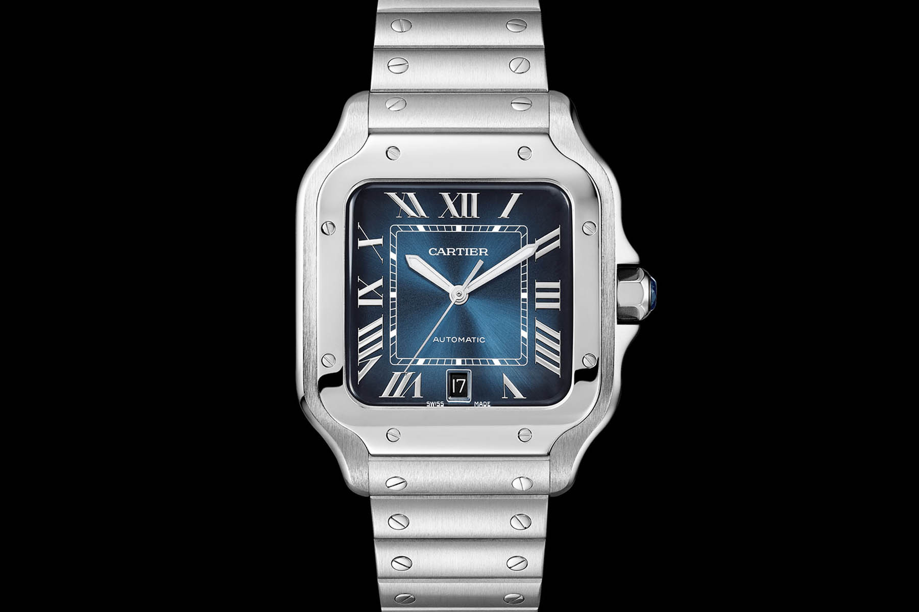
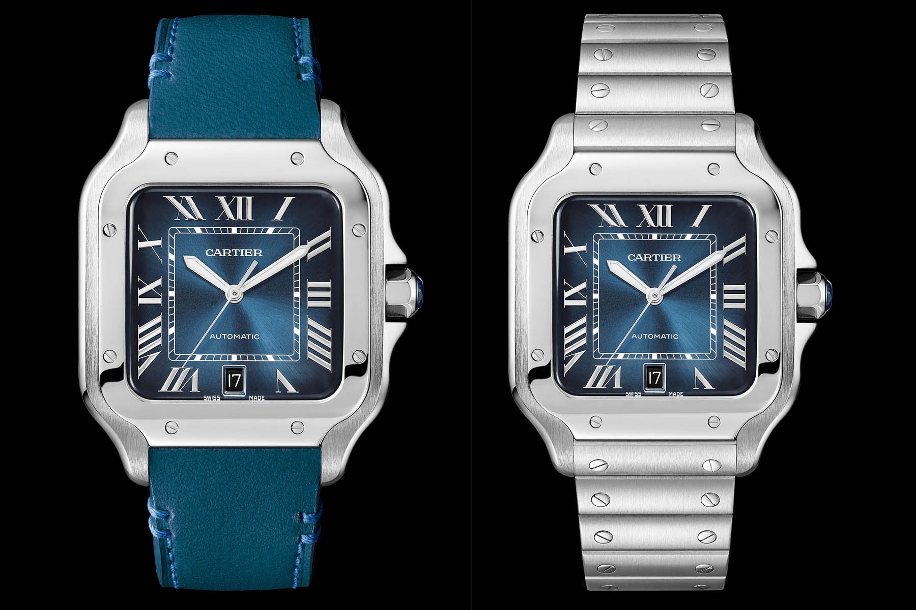
Presented in multiple versions, the flagship remains the Large Model (which isn’t that large either) with a classic white dial – the model we reviewed here. Deeply Cartier in style, considering the sporty approach, some thought it was a bit too shy and too discreet. Problem solved with a new version that appeared in the collection recently, the Santos de Cartier Large Model with Gradient Blue Dial – ref. WSSA0013.
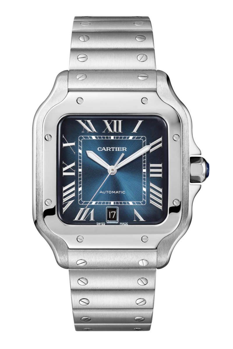
If the case and movement have not changed at all, the new dial adds a relevant touch of colour to this watch. Playing on the trend for gradient blue dials – as seen at H.Moser, AP or Patek already – the Santos becomes more casual. Contrasting with the blue background are silvered Roman numerals and hands. Also, Cartier had a good idea to feature a black date disc.
The proportions remain pleasant, with a case that measures 39.8mm in width and only 9.08mm in thickness. Powering the watch is the calibre 1847 MC, first introduced on the 2015 Clé de Cartier. This entry-level, in-house produced movement is automatic, ticks at a modern 4Hz frequency and boasts 42h of power reserve. Nothing extraordinary, but a movement that will do the job perfectly.

One of the main updates of this new Santos de Cartier was the integration of a clever bracelet/strap device. The watches are all delivered with both a bracelet and a leather strap (here, matching with the dial). Cartier has fitted a quick release button on both the straps and bracelet, meaning that no tool is required to switch. The bracelet also comes with an ingenious system to adjust the length of the bracelet developed by Cartier and known as “SmartLinks”. By depressing a small oval push-piece on the underside of the links, the bar is released without the need of a screwdriver. Push, release, remove the extra link, insert it again and that’s it.
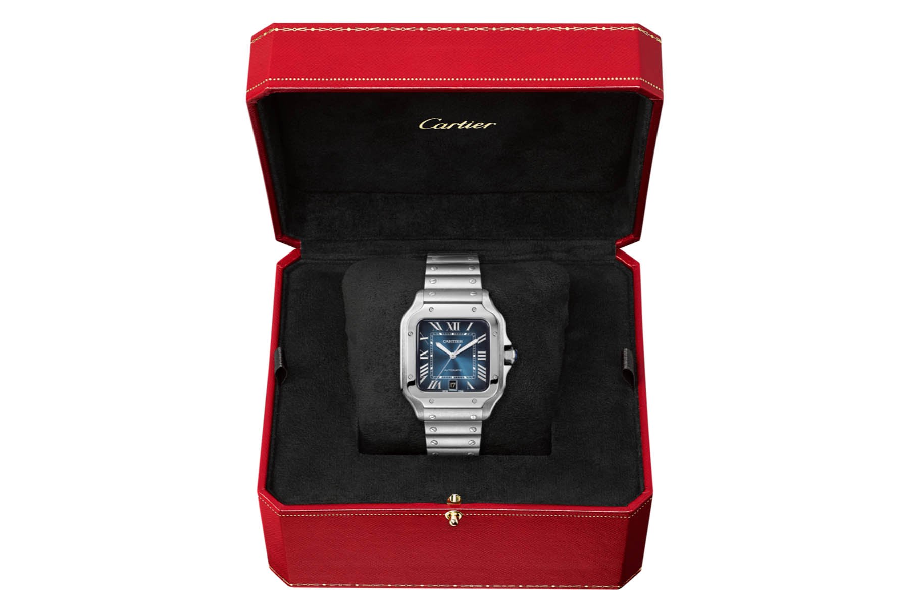
The Santos de Cartier Large Model Gradient Blue Dial ref. WSSA0013 is now available in stores and on the e-commerce website of the brand. The price is the same as the white dial version, meaning EUR 6,600. More details at cartier.com.
5 responses
I have checked the dial color in real and it disappointed me because of being to close to black.
I tried on the watch again last night and the face is no where near black. It’s a gorgeous watch and I do plan on purchasing it this summer. I’m only 3 weeks into my ownership of the redesigned Santos De Cartier with the white face and I can’t stop looking at it. It’s so modern with the new design. The old version was much too clunky looking.
I have to agree that the Dial is too dark for checking the time
I hope the blue is as per the picture since the tone is mainly my reason for purchasing one .
@Calvin – we didn’t have the chance to see it in the metal, but you can see live images here at SJX https://watchesbysjx.com/2019/02/cartier-santos-gradient-blue-review.html