MeisterSinger Lunascope – The Single-Hand Watch goes “Astronomical”
The one-handed German brand introduces its first astronomical watch.
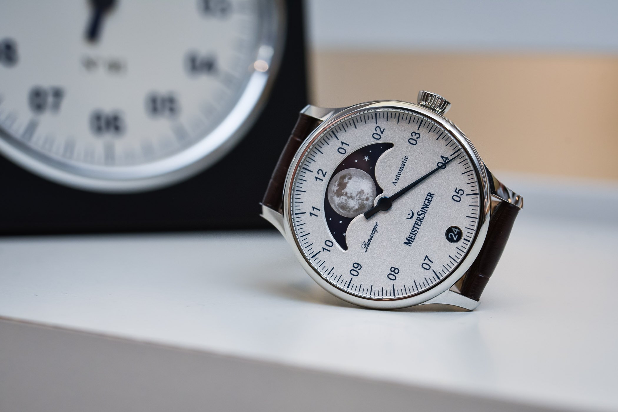
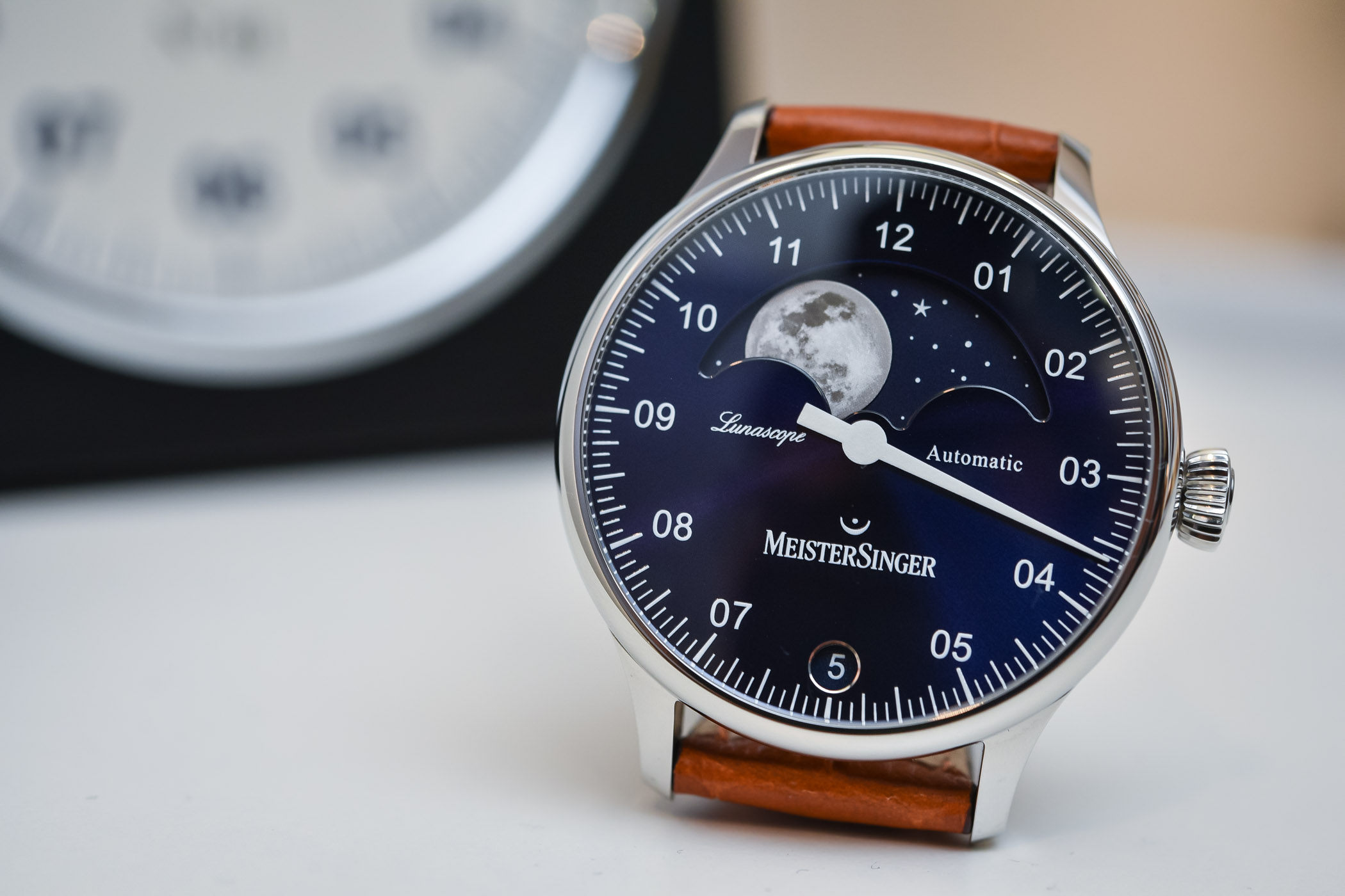
MeisterSinger, the German brand famed for pioneering the single-hand watch trend, has just introduced its first astronomical watch – the Lunascope. Occupying the top half of the dial is an oversized moon phase display, set against a dark blue, starry background. It’s a direct contradiction to the brand’s usual minimalist aesthetic but surprisingly, it actually works pretty well. We spent some time getting hands-on with the new model, here are our thoughts.
From a practical point of view, a moon phase display is about as useful as a one-handed watch, which is why this combination works so well. According to MeisterSinger, the company crafts mechanical watches for “people who aren’t interested in counting seconds, but see the bigger picture and simply want to stay on track”. Accuracy to the nearest second is not the goal here, but rather a general indication of the passage of time. Ironically, the moon phase module used by MeisterSinger is designed to be accurate for the next 128 years. Not bad when you consider the relatively modest price point.
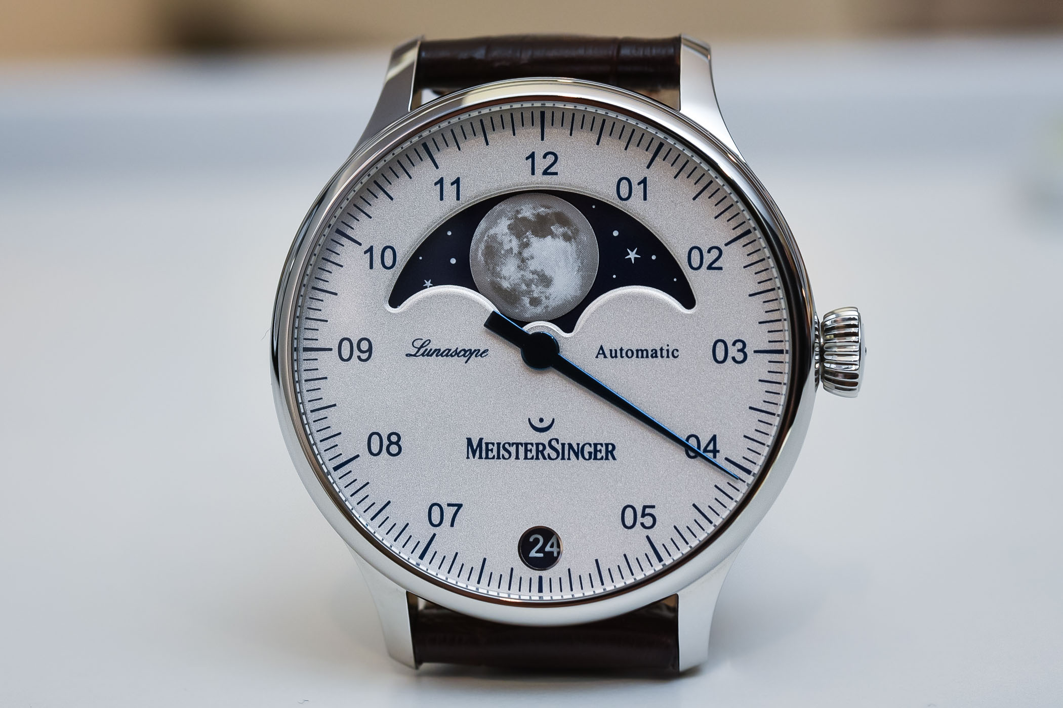
The watch is offered in a slender stainless steel case from MeisterSinger’s Pangaea family and measures 40mm in diameter, although the slim bezel does make it look larger on the wrist. Two versions are available, one with a sunburst dial that matches the same dark blue of the moon’s background and the other with a silvery opaline dial which makes for a bit more contrast. Both dials have a circular date window at 6 o’clock, with the date disc in the same blue as the moon phase background and the numerals in the same font and colour as the hour indices. Again, there is more contrast with the silvery opaline dial, but I think I prefer the more subdued style of the blue dial version.


The time display is classic MeisterSinger. A single hour hand indicates both the hour and the minute simultaneously, with the latter being grouped into 5-minute segments. The font is familiar, very Bauhaus in style and easy to read, if a little harsh in this setting. The result of bringing all these elements together is something akin to a dress watch, that’s not quite dressy. That being said, MeisterSinger has always been about appealing to a niche audience.


On the wrist the Lunascope wears comfortably and is quite eye-catching. The quality is good, not great, but in-line with what you would expect at this price point. In some ways, it reminds me of an entry-level version of Arnold & Son’s stunning HM Perpetual Moon, although quality and execution are obviously incomparable between the two. I wouldn’t go as far as to say that the MeisterSinger took inspiration from the HM Perpetual Moon, but the design is quite similar. In any event, imitation is the highest form of flattery, as they say.
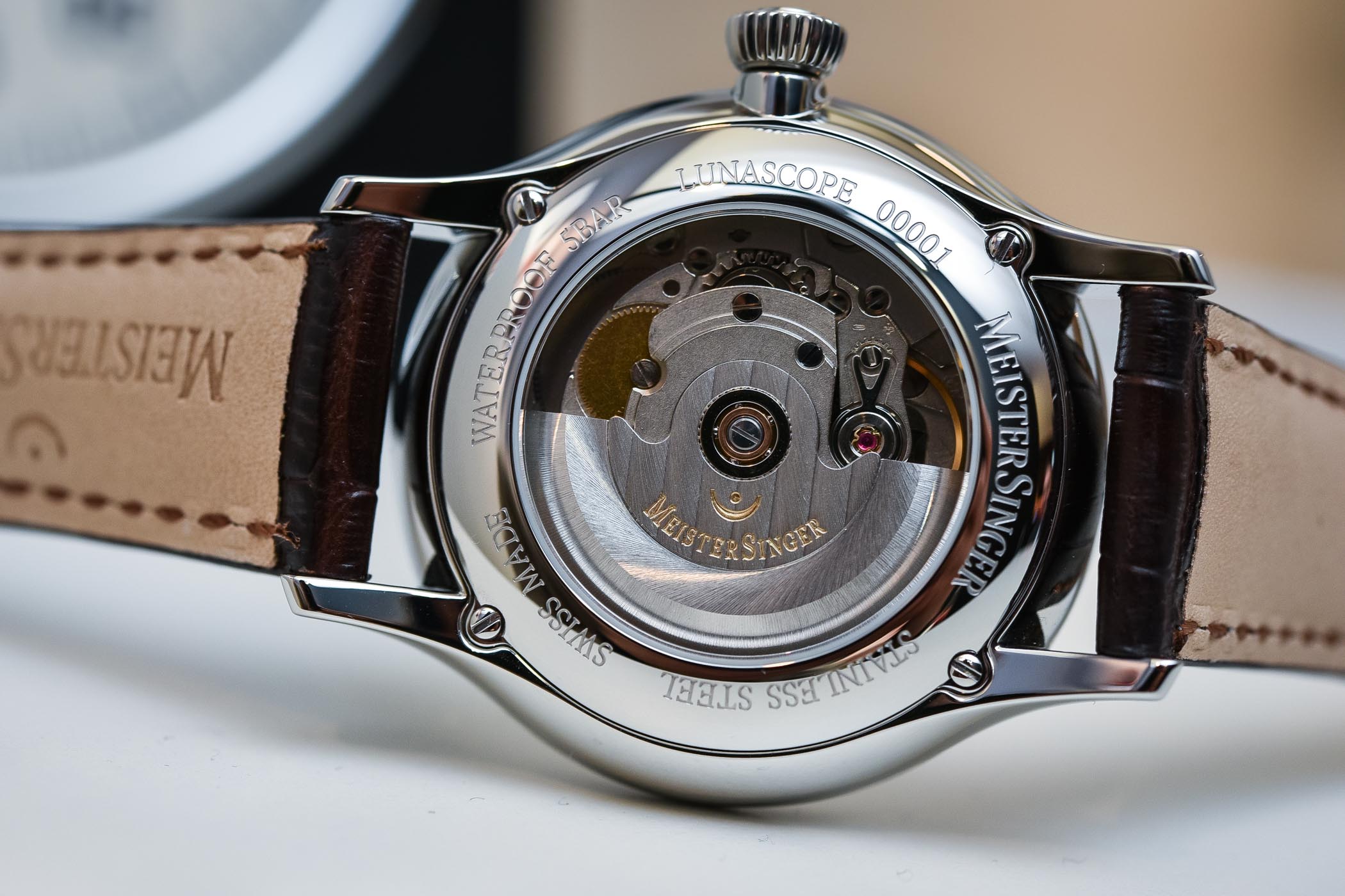
Both versions of the Lunascope are powered by a standard ETA 2836 movement, which has been modified to include the MS moon module on top and, of course, display the time using only the hour hand. Offering a 38-hour power reserve, the movement is visible through the sapphire exhibition back. The blue model comes with a calfskin watch strap in cognac and the silver-opaline dial version is fitted with a dark brown leather strap (with a faux crocodile grain). Both models are rated water-resistant to 5 bar or 50m. Available from MeisterSinger retailers now, pricing is set at EUR 2,990 (inc. VAT). More details on www.meistersinger.com.
4 responses
These are really nice watches!
They remind me of http://JasonHyde.com watches, they are also very pretty and hand made.
Mixed feelings regarding the super moon.
Also incredibly similar to the Christopher Ward Moonphases, same movement same 128 year modification, same colors, date window location etc.
Lunar mindfulness is quite important to some people, for a variety of reasons, some metaphysical. This watch is a mixed bag for me as well. While I love the primacy of the moon display, the case is simply too big and looks even bigger on the wrist. The font on the dial makes this watch look like a medical device of some kind….and the one hand reinforces the impression this is for blood pressure and not time keeping. Love the low price, but remember this isn’t a perpetual calendar and maintaining synch between the moonphase and date can be distracting for busy people.