The New De Bethune DBD Season 2 And Its Brilliant Digital Display
Freeze, somebody bring me back some money, please.
It is a fact that the majority of high school graduates around the world can not tell the time from traditional dials. I remember reading a few years back that the Brits began replacing analogue clocks with digital ones in schools, with urgency to do so in the rooms where the exams for the certificate of secondary education were held. Students could not understand what time it was or how much time they had left to complete the test, which stressed the already tense teenagers. Many of them, I am sure, ended up in the tech sector, making millions. For those who have money but can’t master the minute and hour hands, I have since long ago a favourite, the De Bethune Digitale, which was recently released as a minimal re-edition DBD Season 2.
In 2006, De Bethune presented the DBS Digitale; I was immediately in love and still am. When unusual designs, odd shapes and time indications reigned the watchmaking scene, the Digitale, with its fantastic case, Art Deco digital display, high-grade materials and thorough decoration, stood out for sheer functionality. The new edition, a collaboration with renowned artist and music producer Swizz Beatz, introduces a few changes to the classic that was a limited edition of 39 pieces in rose or white gold. I would prefer a re-launch of the original, especially since the DBD Season 2 gave up the rotating orb moon phase indicator with the starry sky on the caseback, and the dial colour is not salmon but a rather intense burgundy. After flipping, touching, and feeling the watch, I admit I get the collab idea, including the fabric strap. Let us see if you agree.
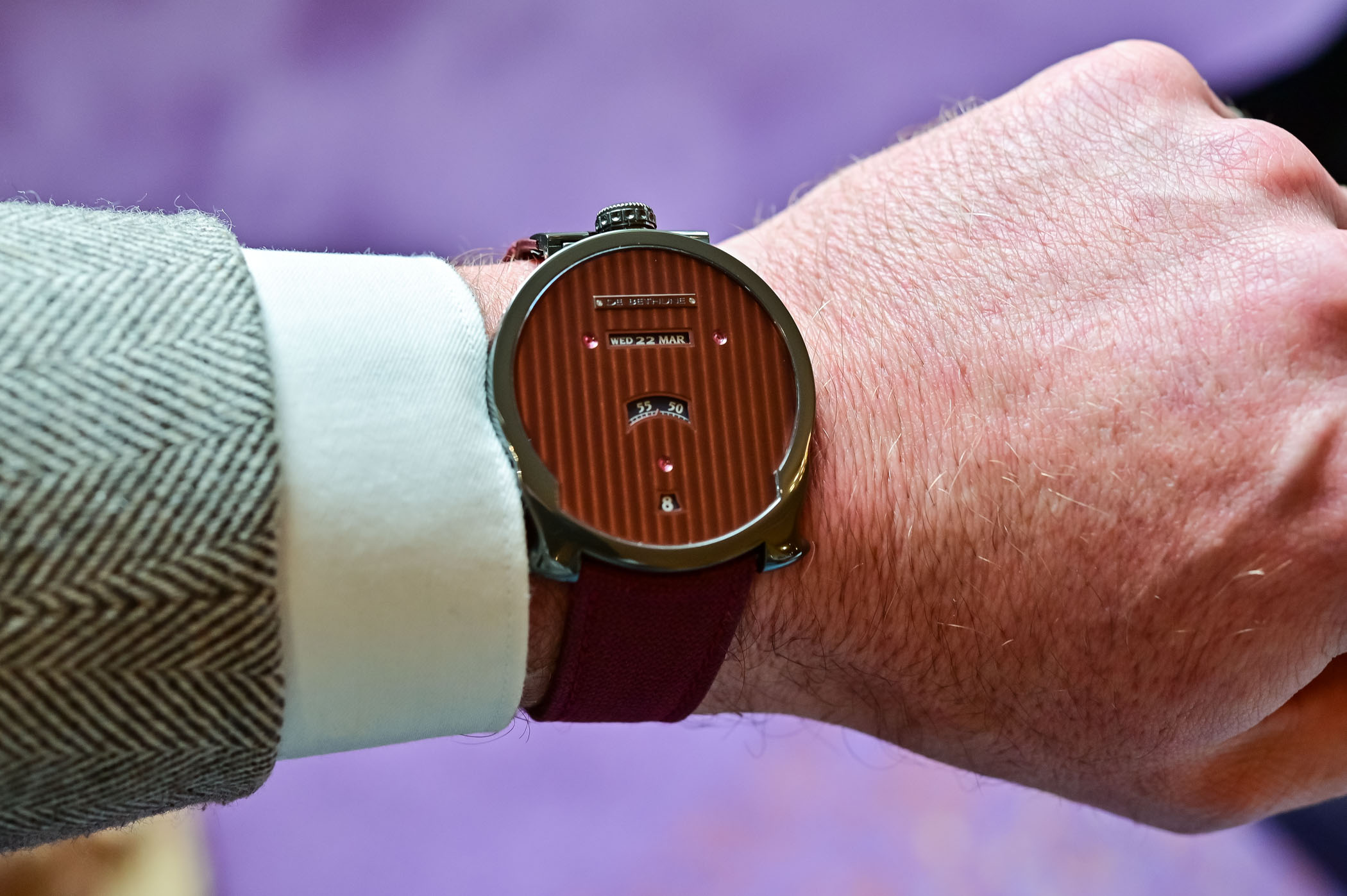


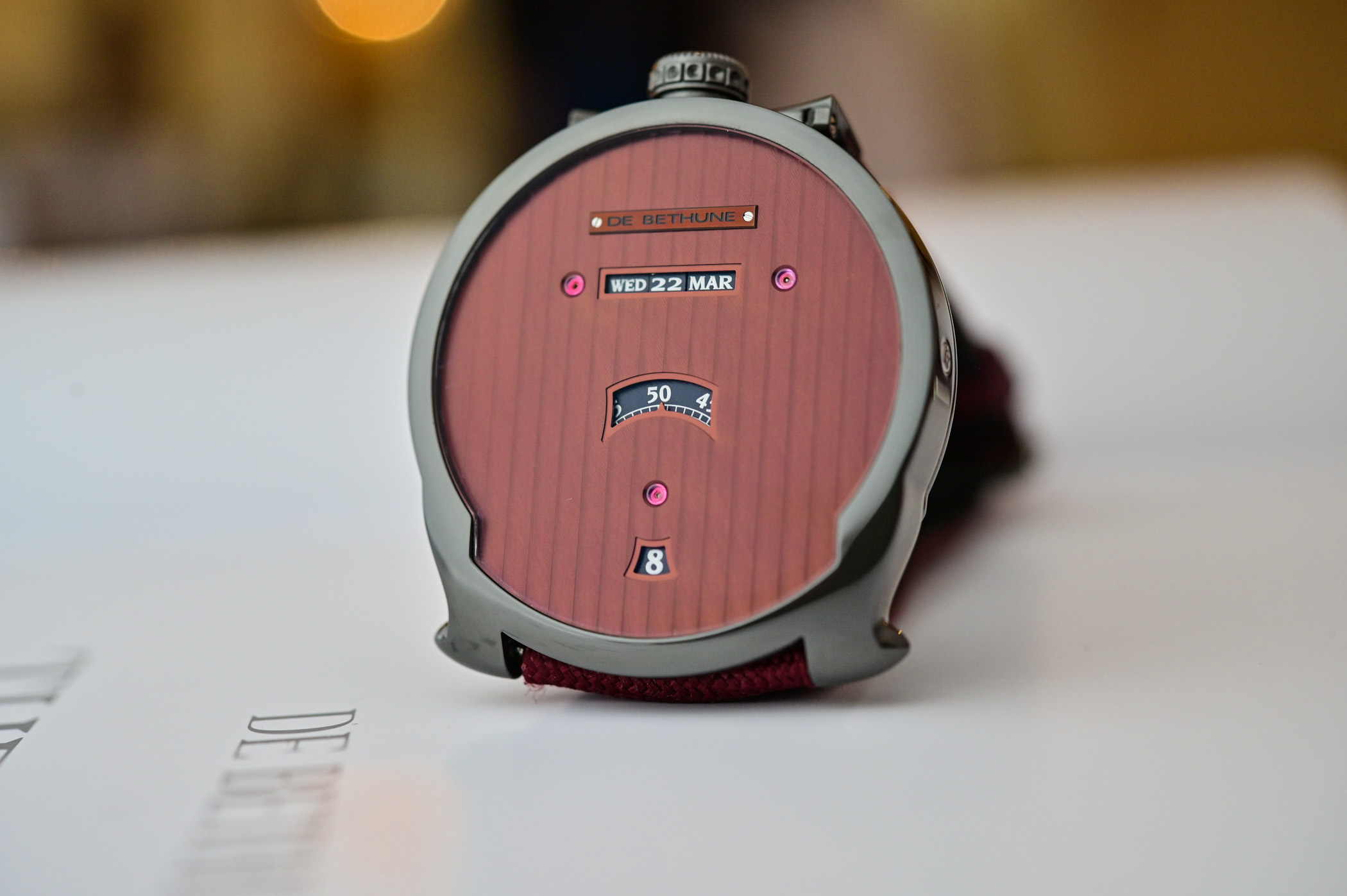
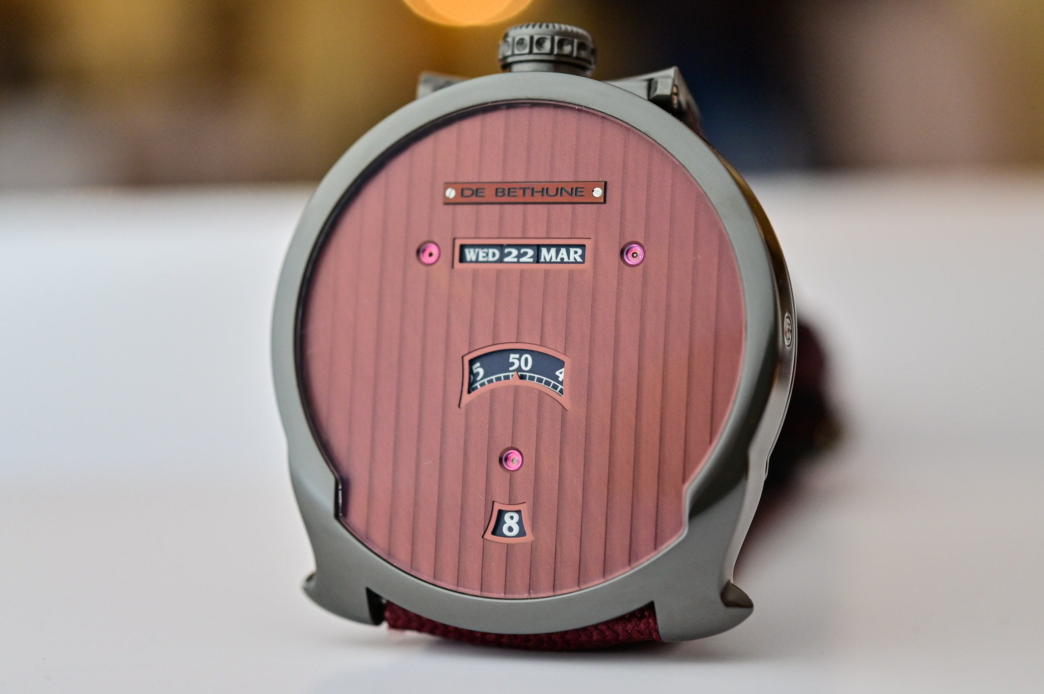
The DBD Season 2 has an anthracite-coloured zirconium mirror-polished 42.6 mm case, with the crown at 12 o’clock and also distinguished by the lug design. The upper lug is hinged and attached to a metal tab to fix the strap, and the bottom lugs are strangely shaped. The case seems big and wears big, too, but not at all uncomfortable. The burgundy dial is decorated with vertical Geneva stripes, with many surfaces to enjoy the play of light as the apertures occupy little space. The windows to display the time and day-date-month are small; it is not a watch to read with a glance. The calendar aperture sits below the screwed-on De Bethune plaque, a single-line window with two visible jewels on the sides – pivots for the wheels. The semi-circle window for the minutes is at the centre of the dial, with the minutes disc crawling at a calculated speed, and the jumping hour aperture is at 6 o’clock. The numbers and letters are silvery-white on an anthracite background; the dial looks rather severe in poor lighting. The austerity of the dial is what makes it beautiful, though.
As mentioned earlier, the De Bethune DBD Season 2 drops the signature spherical moon phase on the blued titanium sky with gold stars on the back, so the transparent caseback reveals the manually wound DB2044 calibre. As usual, with movements created by Denis Flageollet, it is technically superb and beautifully executed, and you do not need to be a specialist to appreciate the presentation. Still, it is good to know that this calibre is equipped with the latest titanium balance with white gold inserts that beats 28,800vph; it has a silicon escape wheel and De Bethune’s patented triple pare-chute shock absorbing system. Last but not least, the 5-day power reserve is ensured by the self-regulating double barrels – visible under the delta-shaped barrel bridge.

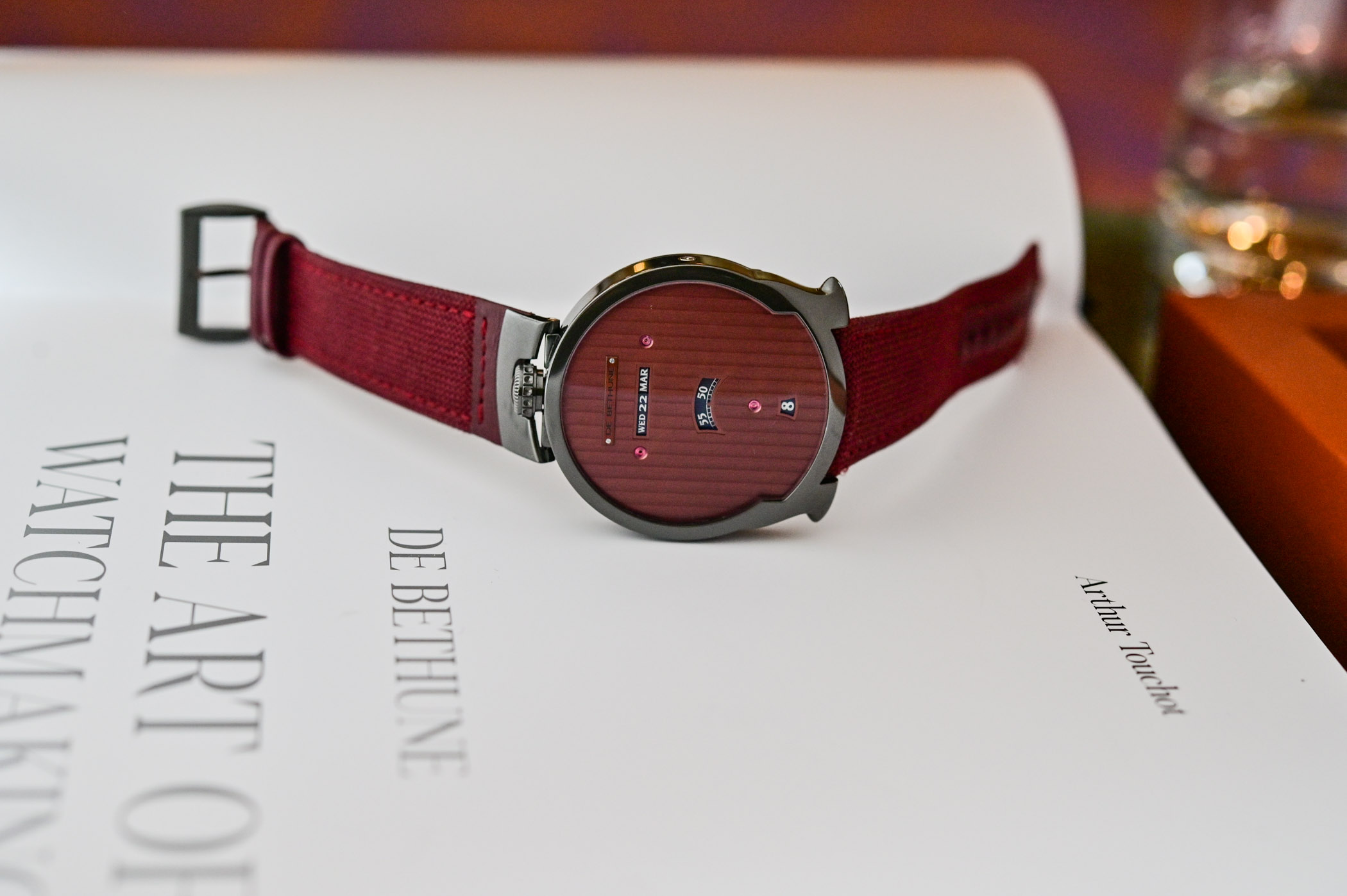
The new De Bethune DBD Season 2 is offered on a burgundy-coloured fabric strap, with an additional black leather strap, “extra-supple.” The fabric strap is practical, but it is not in harmony with the elegant presentation of the DBD, and the watch is only 30m water-resistant. Perhaps it is the green thing that 13 owners of this limited 13 pieces edition will dig better. The price is USD 130,000, so “On to the next one” for me. or visit www.debethune.ch for more information.
9 responses
No powqer reserve indication? No thanks.
Oh dear: I obviously need to go to Specsavers (for non-Brits, I should, perhaps, mention that that is a company that does eye-tests and provides customised glasses!).
Sorry to say this, but this looks like a crowdfunded microbrand watch in the sub 1k range…
Agree this does not look well-designed and without knowing the provenance I would also guess this was a small brand trying something different and overreaching. The case shape looks like a compromise rather than an aesthetic statement , the dial looks like printed cardboard in these shots with far too much empty real estate next to those tiny letters and numbers. The visible jewels on the dial are not aligned which, once you notice, is very distracting. The crown is perhaps the most interesting thing here but next to the lack of detail elsewhere looks over-designed and fussy. Can’t imagine who this would appeal to.
This watch is the definition of “dead behind the eyes.” Too empty, dark, sunken hollow. The dial desperately needs a “lumen” treatment of semi-smoked sapphire (or some other extremely high-tech debethune proprietary technology, maybe you can polish a titanium plate so thin that it would become translucent to some degree or create a titanium mesh or some automaton shutters) to let us see some of the magic happening inside. Otherwise just wear it face down and stare at that beautiful hunk of a bridge.
To me, it looks as if someone designed this without giving much thought to what it would look like – or even how easy it would be to read the time. I find more visual interest and harmony in the dial of my burgundy-dialled Orient Kamasu. But the workmanship is undeniable…
Tiny numbers inside a toilet seat.
This may be the worst watch ever produced.
In a clear cut case of “I concur”, I must admit this is the ugliest watch I’ve seen in a long, long time. The movement side may be cool, but the colour is dull, and it doesn’t know if it wants to be a pacman ghost, a toilet seat, or a satellite dish.
This oversized carbuncle is one we could have been without.
Einfach nur schön!