The New and Improved MONOCHROME Website
Cleaner, more modern, with more features... Still MONOCHROME

After a few months of intense work, discussions, tests and designs, we couldn’t be prouder to present the 2020 version of MONOCHROME. Refreshed, cleaned, more interactive and more dynamic, with new sections and improved navigation, this is the new face of your “Online Magazine Dedicated to Fine Watches”. But no worries, it is still MONOCHROME all the way!
What’s new? First of all, we wanted to discreetly bring back our somehow forgotten but beloved “Monochrome Brown”, which has been used for years at MONOCHROME, changed to a full black-and-white scheme and now back in the game. This is our signature colour and we’re proud of it!
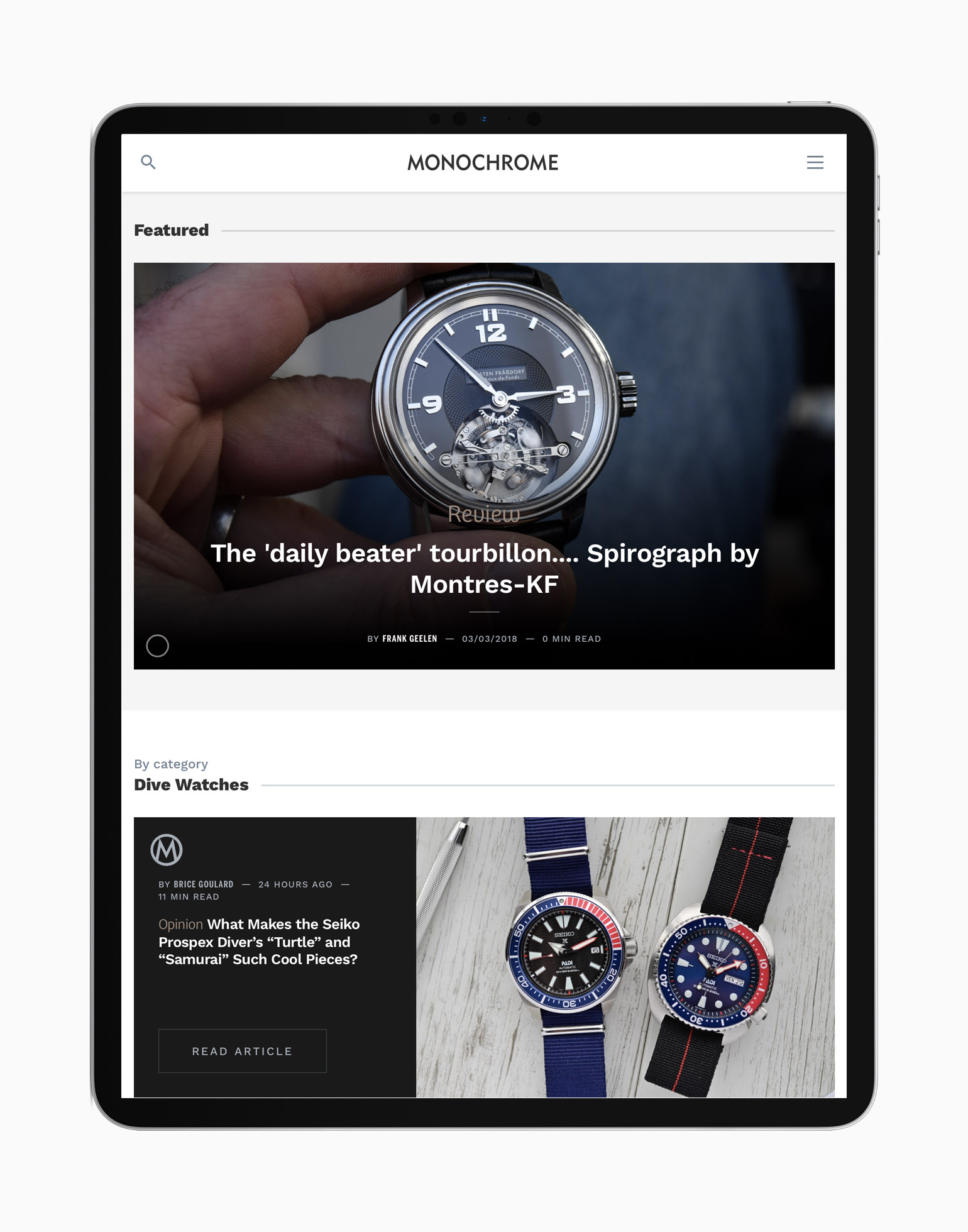
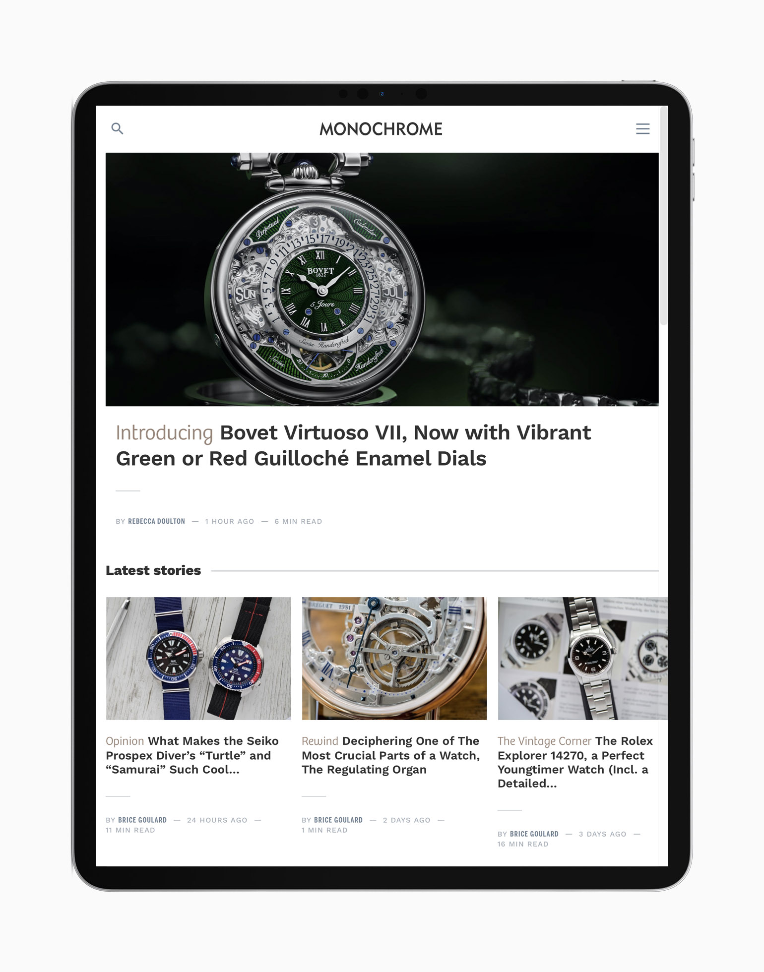
Besides this visual detail, we’ve worked intensively on the new homepage. This is where you’ll be able to navigate, discover, enjoy. There are more stories, more sections, more cool content available at a glance, and we’re pretty sure you’ll find something new or old that you’ll like on the new MONOCHROME. This new website has been, as you’d expect, developed with mobile devices in mind, and you’ll find a “Latest stories” section on top, where you can scroll left and right for more content.
We’ve also added some new sections to this homepage: “Featured” where you’ll find one of our favourite articles of the moment (or an older article we wanted to highlight), “categories” (dive watches, chronographs… this will change regularly), “Video” with a selection of our coolest in-house movies, “featured brands” where we’ll put some of our prefered brands centre stage and, last but not least “top stories” with the most-read articles of the week. With that in mind, this gives you the opportunity to enjoy some great content, accessible from a single and clear page.
In addition to the homepage, we’ve added multiple “brand pages” with historical content, context, timelines and selections of stories – for instance, A. Lange & Söhne, Rolex, Omega and many, many more of them here. Also, because there are no fairs or shows this year, we’ve created a new section “New in 2020” where you can find all the new models launched this year. Finally, we’ve improved the MONOCHROME-Shop too, with a new design and great images to help you choose your favourite watch accessories.
Some things have been improved too behind the scenes – we’ve worked on the way the images will display, so you can enjoy MONOCHROME photos even when your mobile connection isn’t super-fast, we’ve added some new fonts, some new contrasting colours, and upgraded multiple things in our system to offer you the best experience possible – more intuitive, faster, easier.
Hope you enjoy this new MONOCHROME, especially during these times of confinement for many of us around the world. Stay safe, stay home, read MONOCHROME!


4 responses
Hi Monochrome team, you have done better job than Hodinkee. I can see that you’re focusing much more on watches while they focus more on money now…… Keep up your great work!
Thanks so much!
Monochrome is my favorite Watch site and my nearly unique source of information along with my retailer in Lausanne.
And you are still improving! Thank you so much for the quality and quantity of work deployed by your team.
@Lucien – Thanks a lot for your kind words!