Urban Jürgensen Reference 1741 Perpetual Calendar
Classic, elegant, discreet but still full of insane details... Urban Jürgensen at its best.
If you’re a recurring reader of MONOCHROME, you should now know all about Urban Jürgensen – and if you don’t, we encourage you to have a closer look here, as this independent watchmaker truly deserves the attention of haute horlogerie lovers. Recently, we had the chance to have quite an exclusive piece from this manufacture in our hands, the Reference 1741 – a classic, elegant and discreet perpetual calendar that is packed with all the brand’s savoir-faire. So let’s have a closer look at it.
Details, details, details…
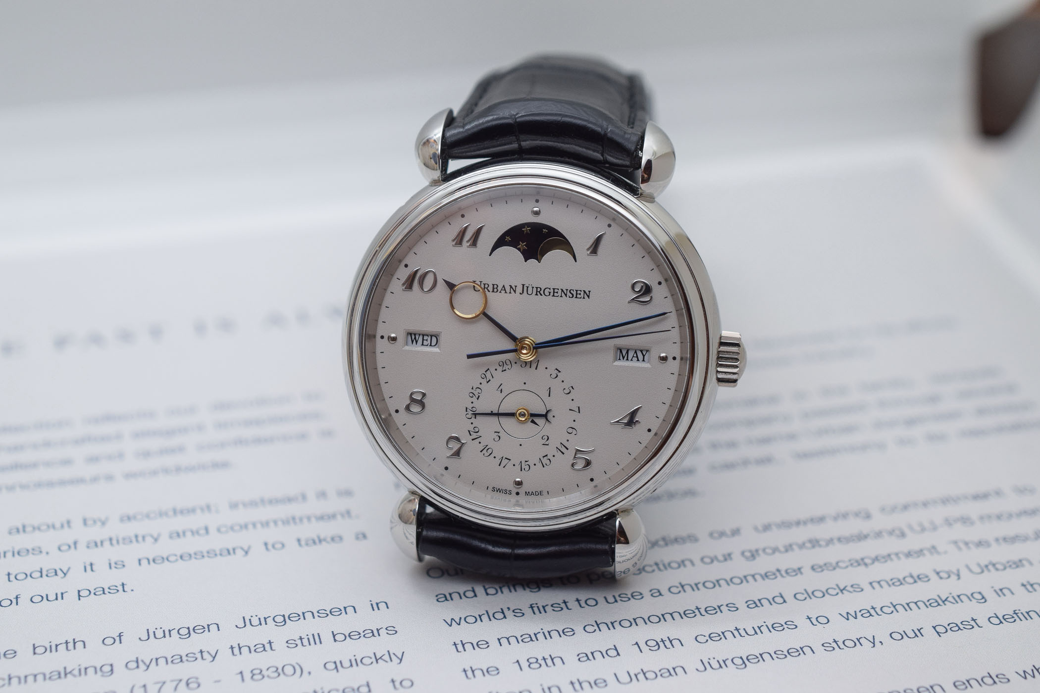
As with every watch manufactured by this small watchmaker, the Urban Jürgensen Reference 1741 is a feast for watch aficionados. It is all about hidden or discreet details that together create a truly achieved and balanced object. Everything seems right where it should be and no part feels superfluous. Details, all around.
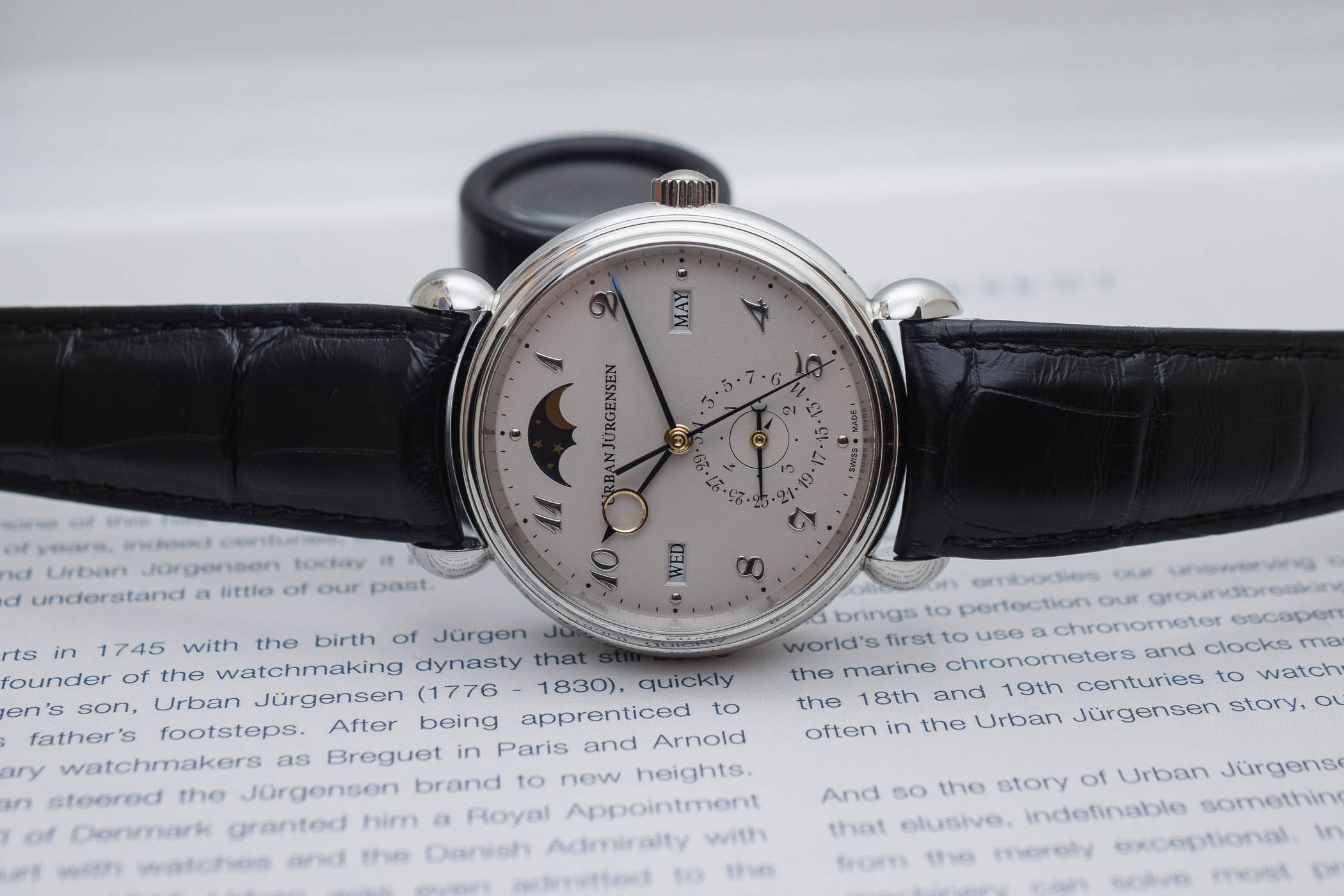
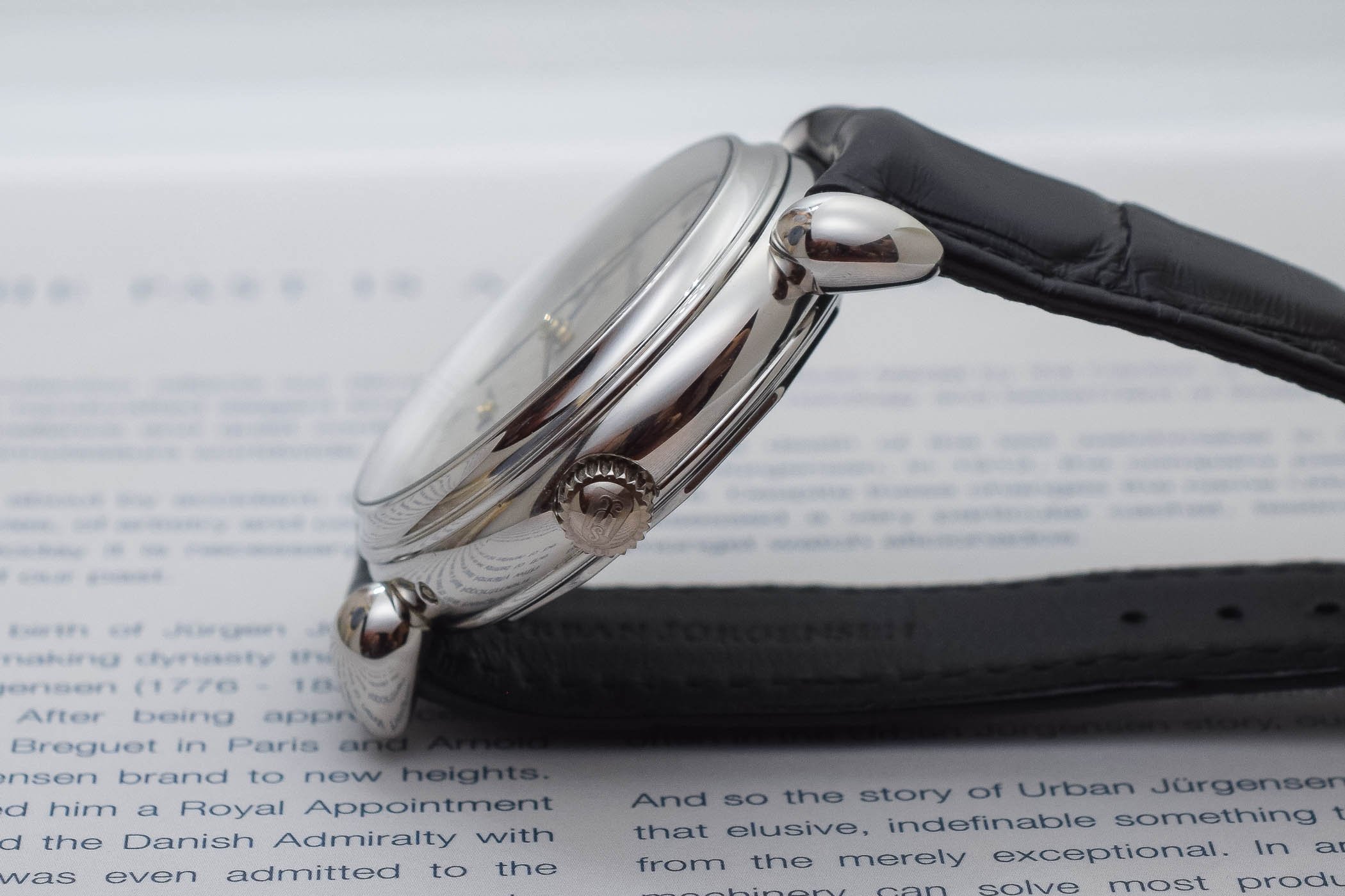
While the overall shape of the case is a classic, round, 3-part platinum affair, some of the angles give a hint that there is a lot more going on. The polishing is, as you would expect, flawless. The bezel has a convex profile, which adds nice reflections and distortions, and is far more complex to polish than a flat or concave surface. The true beauty of the case lies, however, in the lugs. The rounded “teardrops” give the case its unique personality. What fewer know is how they are made: individually forged and finished, intense care and skill are required from the case maker to solder them on to the case.
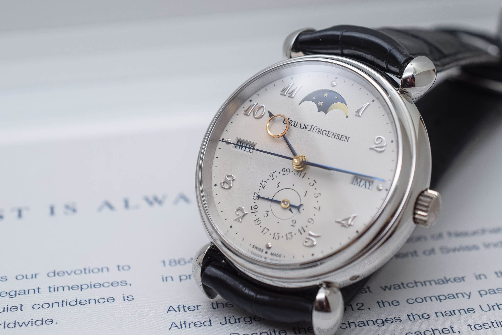
Then comes the dial. At first and from a certain distance, it appears just as a flat, silvered surface. A closer inspection reveals a fine, grained texture, known as grenage. It is a dial-making technique originating in the late 1800s that is rarely used these days, mainly due to its complexity. This handmade process, done dial by dial, begins with a plate of solid silver which is then engraved with ultra-fine markings. The engravings are hand-filled with lacquer. After hardening, the surface is diamond paper-polished to leave its residue in the grooves. The grenage layer is then built step by step as “a secret mix of silver, salts and other ingredients” and is hand-brushed on to the individual dial. By electrochemical reaction, the surface emerges as a pearled/frosted finish. The result is unique, refined and subtle.
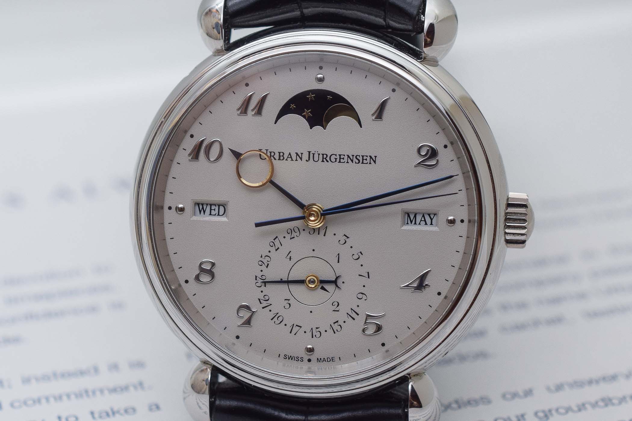
The dial of the Urban Jurgensen Reference 1741 features two other superb elements. First, are the stylized Urban Jürgensen Arabic numerals – an evolution of the famed Breguet numerals. The numerals are made of white gold, domed and hand-polished. Second, are the hands, made of blued steel and yellow gold, with their distinctive shape that are click-mounted with a diamond polished eye in yellow gold. These hands are so impressive that we wrote an entire story on them (a must-read).
Discreet elegance
If there’s one thing about Urban Jürgensen’s watches – and even more so with this reference 1741 Perpetual Calendar – is that we’re miles away from any hint of bling or ostentation. This watch is all about discreet elegance, restrained proportions and details for those in the know. Nothing screams its provenance… at least, at first. A trained eye will immediately spot the beauty of this watch. And that’s what makes it so desirable. The definition of true luxury for some.

With its 41mm case, manufactured in platinum (a heavy and rare metal that feels luxurious for its wearer only), the Urban Jurgensen Reference 1741 flies under the radar – or under a cuff if you prefer. Its dial, even though exquisitely finished as we explained, remains extremely subtle and clean. Certainly, watch enthusiasts and seasoned collectors will easily recognize its complexity but the neophyte won’t be shocked by its opulence. Discretion can be an advantage in certain conditions.
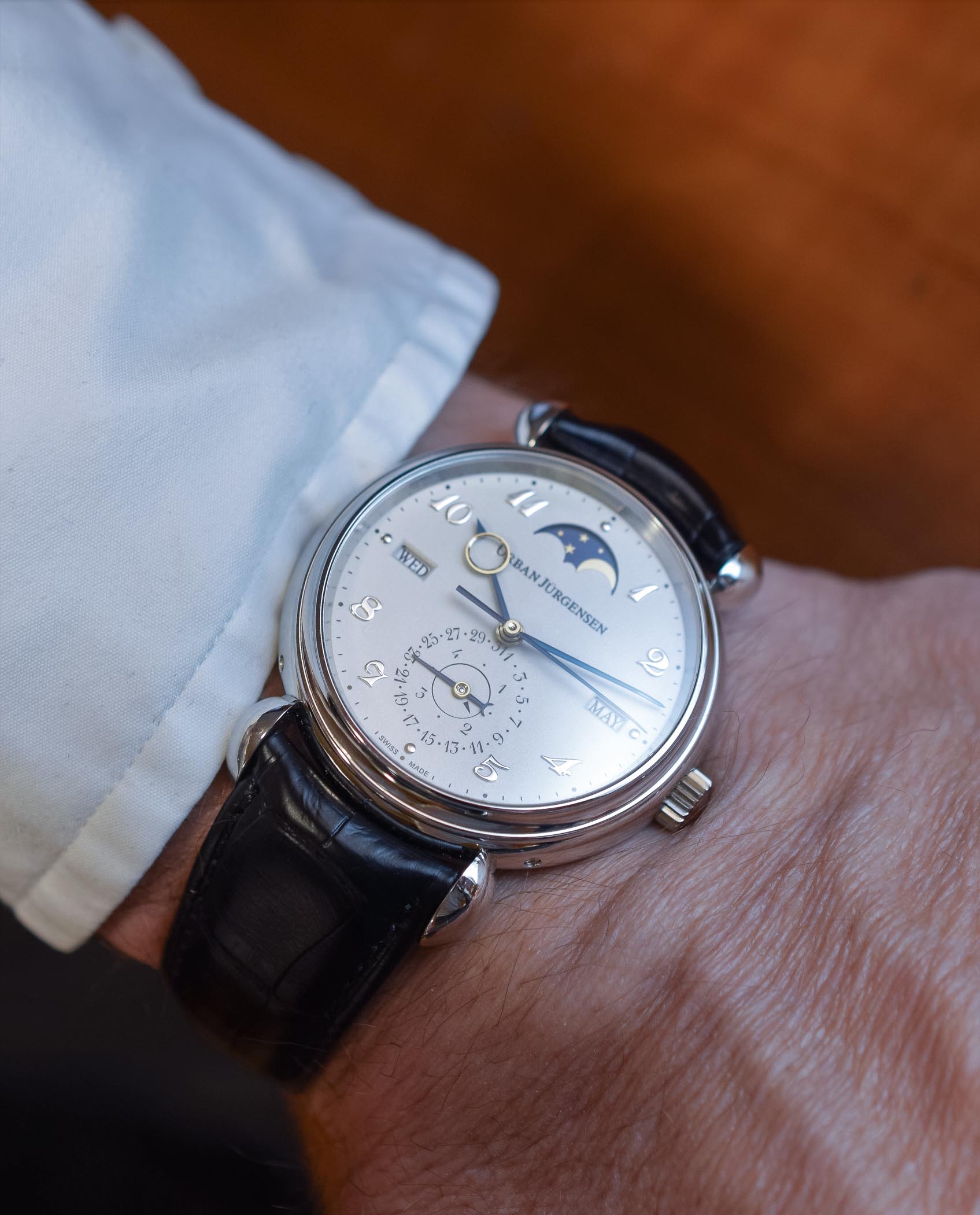
The watch, as worn here on a black alligator strap (which can be customized, of course), is all about tones of silver and grey and refined textures. The case is polished, the dial has a little twist with its shimmering silver grenage texture and only the unusual shape of the lugs and the signature hands give a clue about what is happening here. This watch is an egoistic object of pleasure that doesn’t flaunt its noble origins.
In-house movement
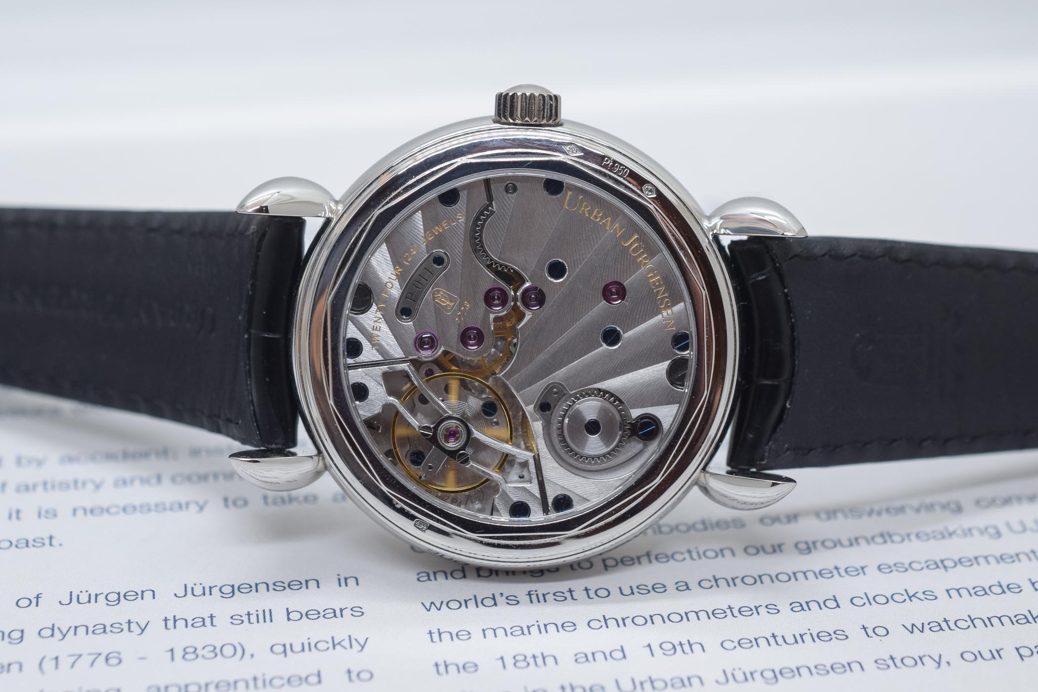
Not many surprises on the mechanical side of this Urban Jürgensen Reference 1741 Perpetual Calendar. Don’t get us wrong, it has some horological pedigree but the movement is well-known and uses the same base as the Reference 1140. The Calibre P4 is a proprietary movement developed exclusively for UJ by Jean-François Mojon of Chronode. This hand-wound movement beats at 21,600 vibrations per hour and the large balance is held in place under an openwork transversal bridge. The stop-seconds mechanism allows for precise time setting. The two barrels can store up to 60 hours of power reserve. The contours of the three bridges, with Geneva stripes radiating from the balance wheel, are highlighted with superb anglage. The full balance wheel bridge is openworked and features interior and exterior angles while the large balance wheel is held in place with adjustment screws. The screws are thermally blued and the jewel sinks and recesses are finely polished by hand.
The main difference is that, in the context of this Reference 1741 Perpetual Calendar, a module has been added on top for the calendar indications. It relies on the brand’s signature display, which combines legibility and balance design – the dial doesn’t feel too cluttered. The date is shown in a sub-dial at 6 o’clock, while the day of the week and the month rely on apertures. The moon, positioned at 12 o’clock, adds a bit of originality. Compared to older references with this display, Urban Jürgensen has added the leap year indication into the date sub-dial.
Price and availability
The Urban Jürgensen Reference 1741 Perpetual Calendar is part of the regular collection of the brand and as such, can be found at retailers. However, it is produced in low volumes, emphasizing its exclusivity. It is priced at EUR 85,800 (excl. VAT), which is in the same vein as similar platinum QPs from Vacheron or Patek (but with far less hand-finished parts and not the same scarcity). More details at www.urbanjurgensen.com.
5 responses
The only problem is the conflict between the date circle and the centre pinion.
Lovely thing. Don’t know if I prefer this or their 38mm Reference 3 QP with roman numerals, though.
Good to see a full UJ/Chronode movement in there instead of the Frederic Piguet P71 as a base – although that’s still a very good little calibre that I can attest to, what wiv it being in my Breguet, and I think it helps make the UJ Ref 3 a thinner case at 9mm. I’m guessing this 1741 is slightly thicker?
@Chia-Ming
That might be another advantage the Reference 3 has over this.
Though P4 has better specs, no doubt it’s thicker and manual(P5 is automatic but even thicker).
Yeah, the P4’s a beaut.
A good way to see how the potential date circle/pinion conflict of the dial on the 1741 looks in motion is to go to (ht*ps://w*w.urbanjurgensen.c*m/collections/perpetuals) and there’s a big grey animated graphic of it.