A Closer Look at the Vacheron Constantin FiftySix Complete Calendar
Vacheron's latest collection didn't impress at first sight... But we wanted to give this FiftySix a second chance.

When Vacheron Constantin announced the introduction of a new collection, the FiftySix, just ahead of the SIHH 2018, we were (in all honesty) rather sceptical. I can recall discussions with Frank about the design, the way the brand communicated the model, the “entry-level” approach or the millennial target. But as they say, first impressions can be wrong… So we decided to give this Vacheron Constantin FiftySix a second chance, but this time by wearing it. And for that, we chose the most complex (and most appealing) version, the Complete Calendar.
Why were we sceptical about the VC FiftySix?
Being journalists – or at least, people who run a magazine – we usually receive visuals and press releases about new models in advance. In this way, we have time to prepare articles so you can enjoy reading about novelties right when they are officially launched. This was the case with the Vacheron Constantin FiftySix, which we discovered a few days before the SIHH 2018. Yet, what we discovered were only some press photos (so-called soldat images or 3D renderings – see below) that often don’t give credit to the watches themselves. No sense of proportions, no depth, no reflections… Such images are made for glossy paper and don’t help trasnmit an objective opinion about the watches.
When we saw the images of the Vacheron Constantin FiftySix for the first time, Frank and I became very sceptical indeed. The watches looked plain flat and didn’t show the usual elegance of a VC watch. Certainly, we noticed a slightly unusual shape, but we missed the proportions and dimensions of this watch on the wrist. Same went for the dials, which appeared too monochromatic and lacking that true VC originality – once again, on photos. This is where a test on the wrist makes sense – and not only for us but also for you when you want to invest in a new watch. Press images can be truly deceptive.
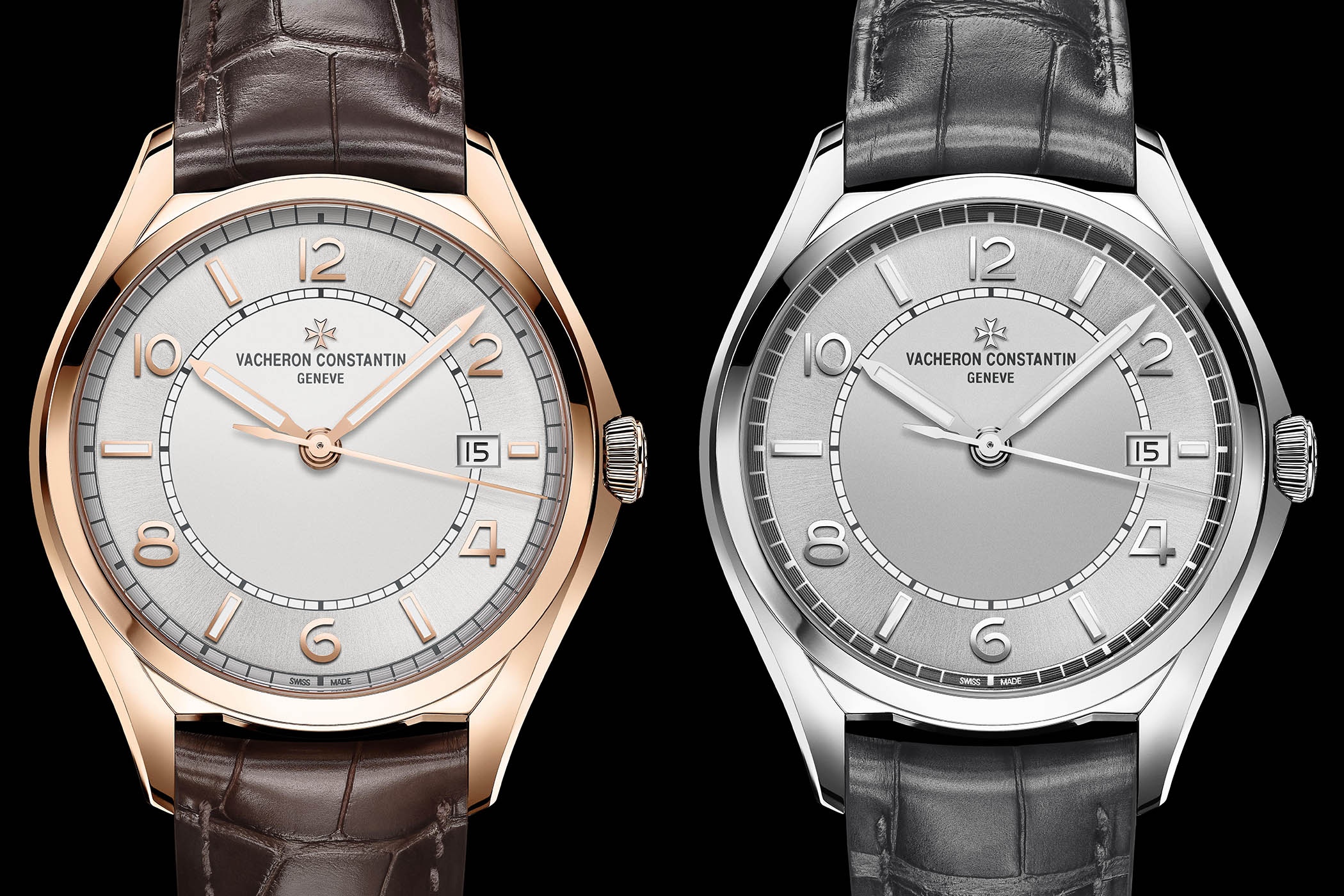
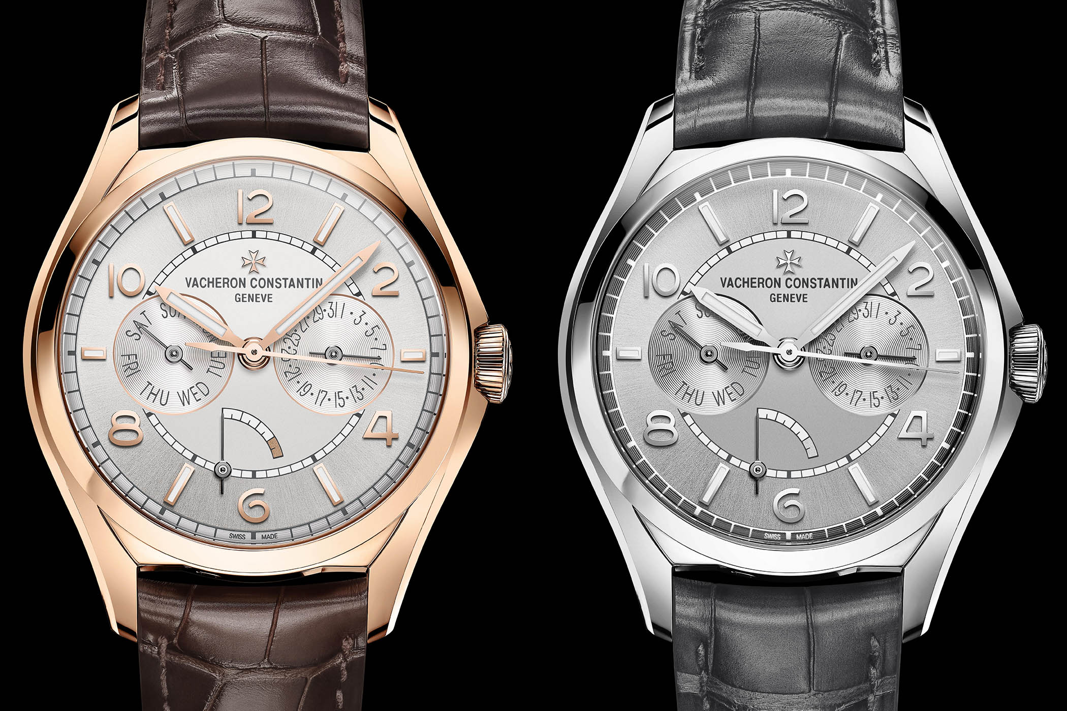
The second point of discussion was about the strategy itself. Launched in steel, the Vacheron Constantin FiftySix was clearly intended to be an “entry-level” option for the brand. For this reason, the simpler model, the Automatic, is equipped with a movement produced by ValFleurier and based on a Cartier ébauche – even though it features specific bridges and a much more detailed decoration. No Hallmark of Geneva here and a price tag of EUR 10,000 before taxes. However, looking at the Complete Calendar and the Day-Date versions, prices went up to EUR 20,000 in steel – and over EUR 30,000 in gold. Not what we would label as an “entry-level” watch anymore. Again, this was without having touched and felt the watches and understood that they were more qualitative than we thought.
Why wearing the watch changed our minds?
So what has changed since our first impression? Well, in short, we’ve been wearing the watches intensively. And believe us, that changes everything. A watch is something that you have with you on a daily basis, all day long. It’s like a pair of jeans. It can look good in a store’s showcase and be a true pain once worn. A watch is something that needs to be on the wrist to reveals its beauty or its flaws. It lives, it plays with the light and it’s about proportions – and not about the dimensions printed on a specification sheet.
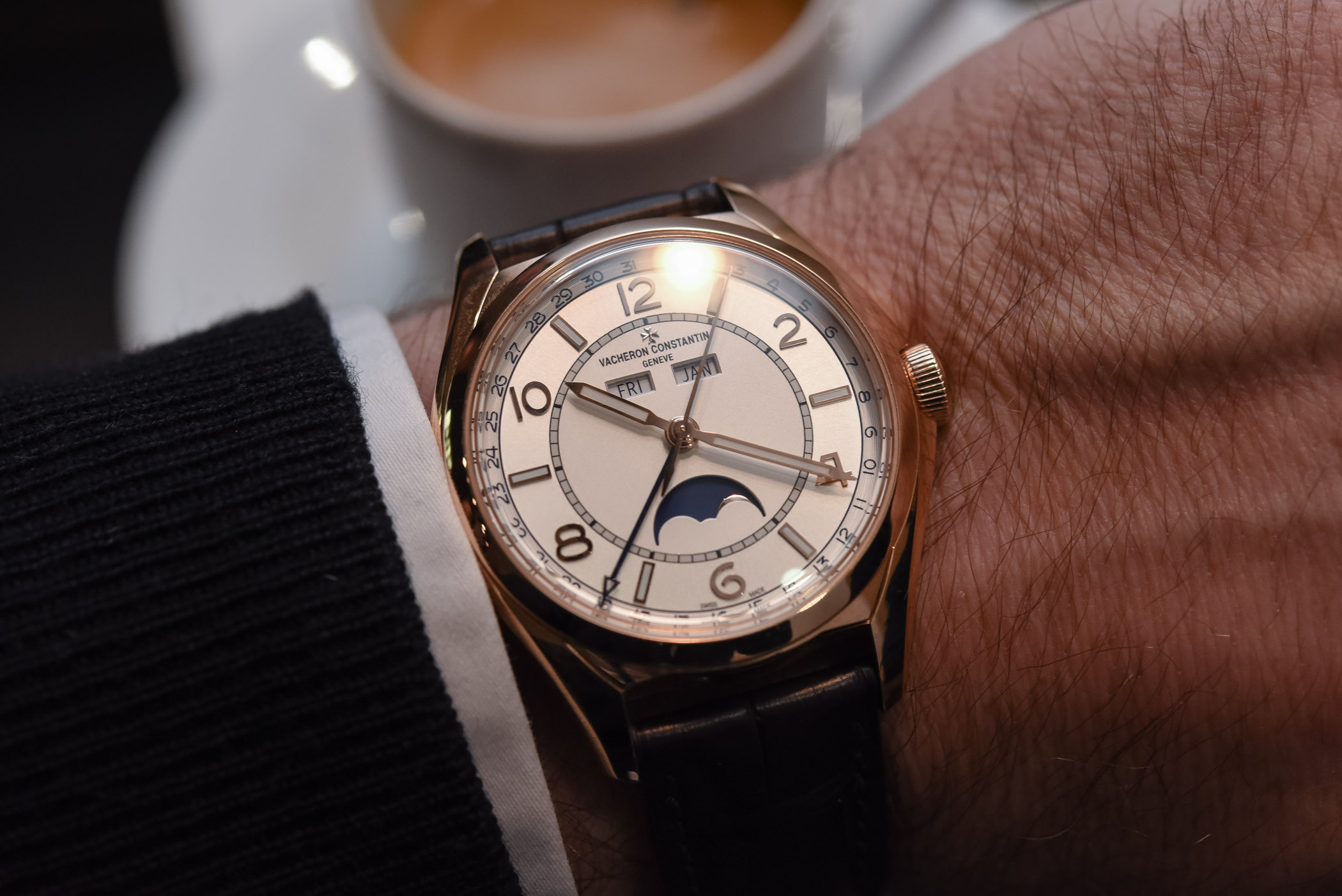
This is where the Vacheron Constantin FiftySix proved a great surprise. When we first saw the watches in the metal, the beauty of the case and the elegance of its proportions immediately made sense. Certainly, it isn’t an ultra-thin watch and the case could be slightly thinner. However, it is much more pleasant on the wrist than when seen in a display window or in the pages of a glossy airport magazine.
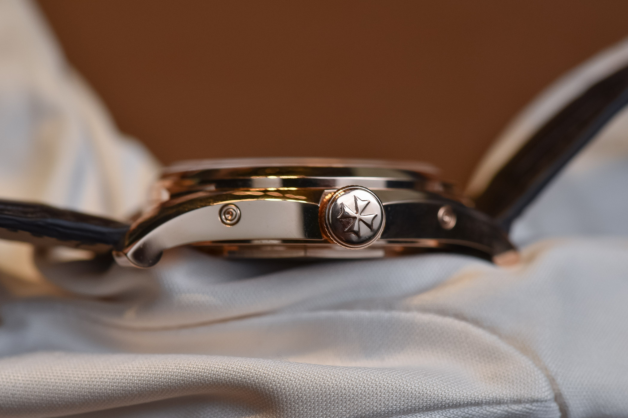
The case appears more compact, more balanced and mainly, much more inspired in the metal, when ambient light and reflections appear on its polished surfaces. The surfaces, some convex, some concave, the angles, the combination of round shapes and straight lines, create a discreetly original design. A lesson for all of us: ALWAYS try watches on the wrist before you even consider buying them – or before you want to write an opinion-oriented article.
The Vacheron Constantin FiftySix Complete Calendar in detail
When I first wrote about this new model, this is what I said as an introduction “The new Vacheron Constantin FIFTYSIX is meant to attract new watch enthusiasts. By that, we mean younger, less fortunate and maybe less hardcore collectors. To reach that group of customers, VC worked on both a more contemporary design, yet still very Vacheron overall, as well as creating a well-positioned offer price-wise.” Not that I have entirely changed my mind since, but I have to nuance these words a bit now that Frank and I have worn the watch.
This position is true for one model only, the Steel Automatic version. The two other models, the Day-Date and the Complete Calendar we’re looking at today, are much more VC-oriented. The meticulously finished movement, gold (or steel) cases and traditional complication/display are very much in line with Vacheron’s classic design. However, it is true that the design, combining originality, elegance and a slight vintage feel will certainly talk to potential new clients.
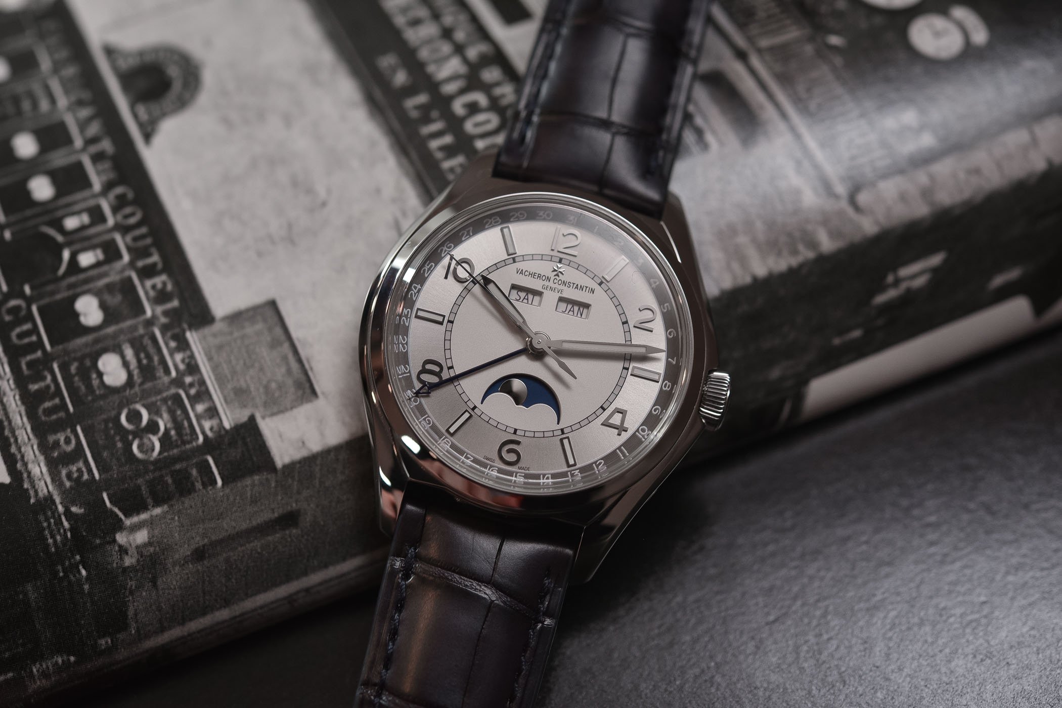
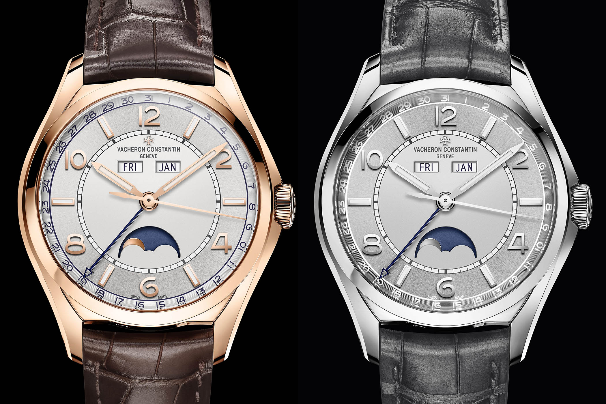
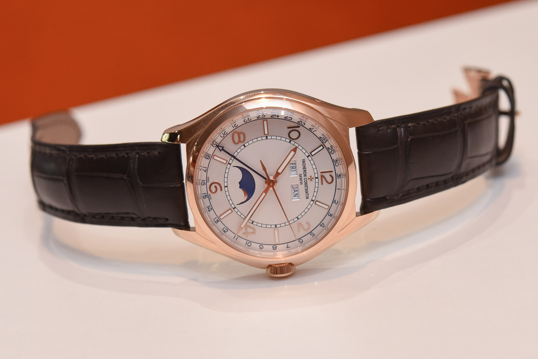
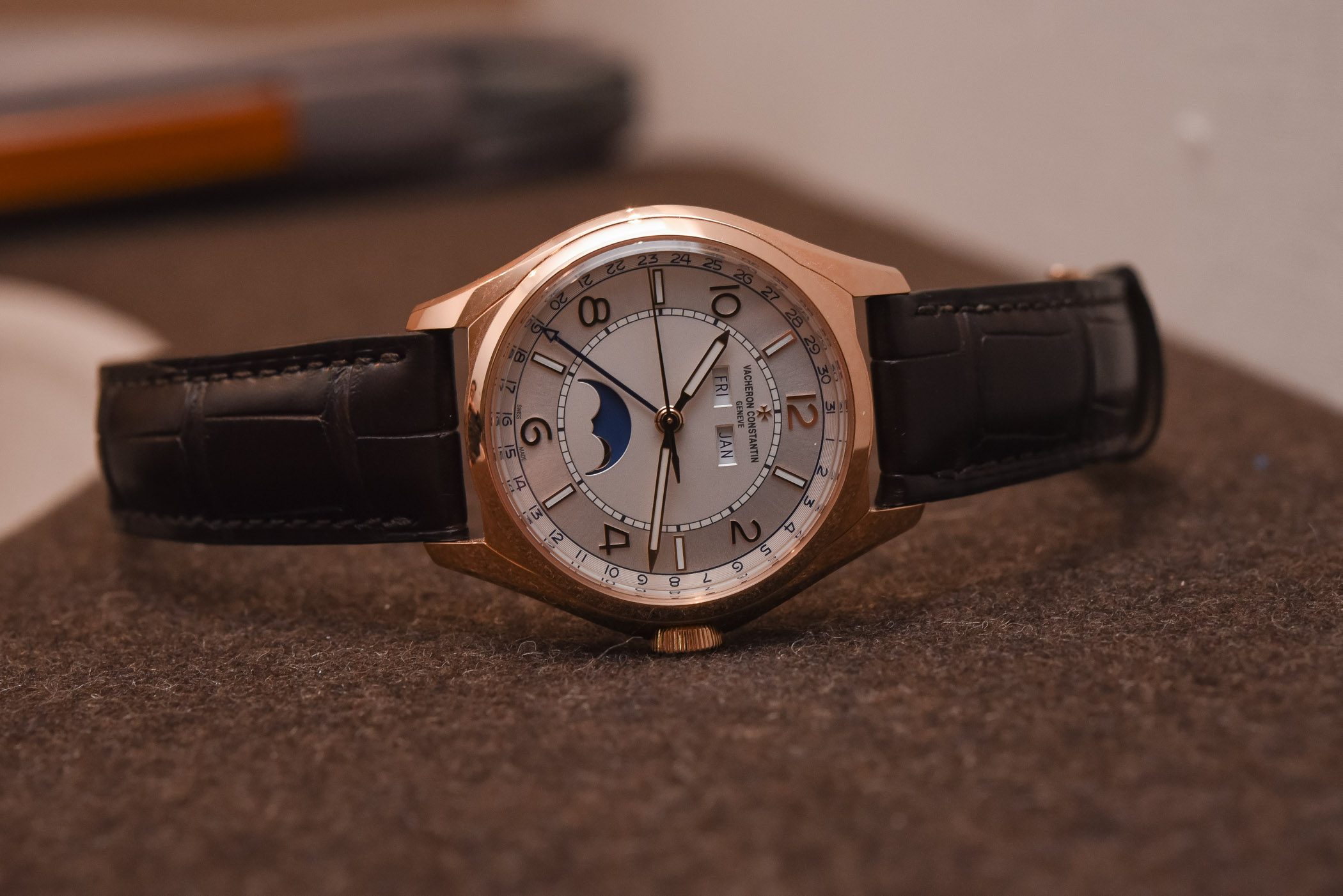
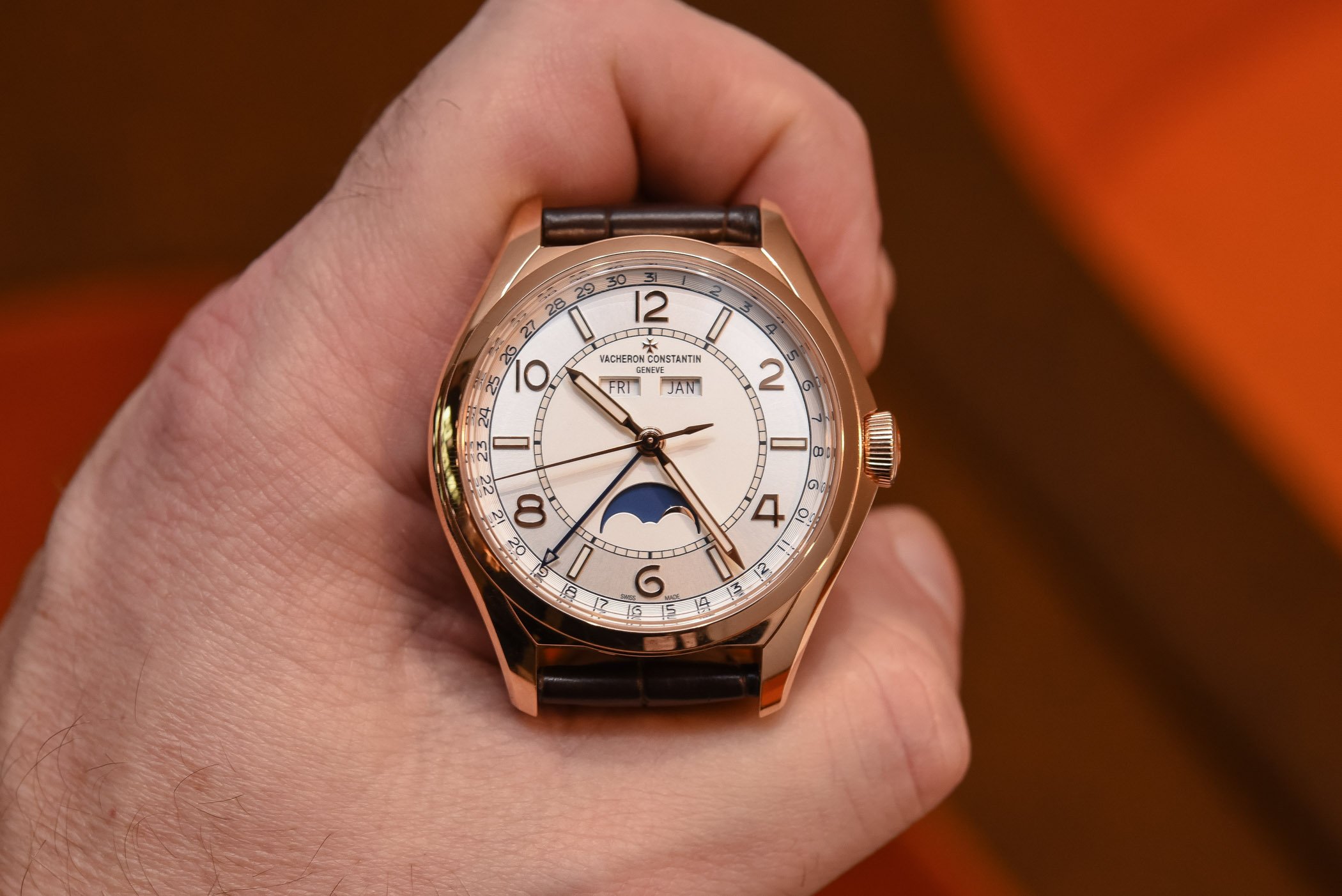
The Vacheron Constantin FiftySix Complete Calendar is, obviously, a balanced watch on the wrist. This version, with its more complex triple/complete calendar complication, has a slightly thicker case. However, on the contrary of what I thought, this relative thickness – 11.60mm, not especially thick either – fits the shape of the case and makes it pleasant to look and wear. The lugs are short, meaning that it sits well on most wrists. Finally, the shape of this watch, a mix between a round and a tonneau watch, deserves to be a bit present on the wrist. I know, it is quite hard to explain with words but I had the feeling that this watch was very well proportioned.
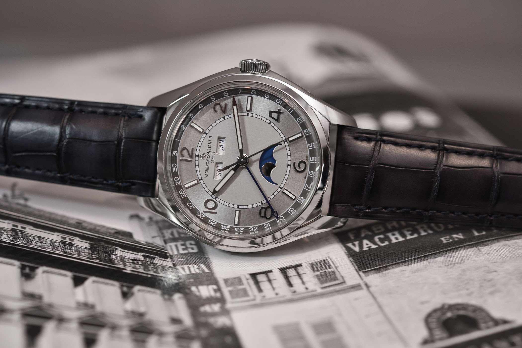
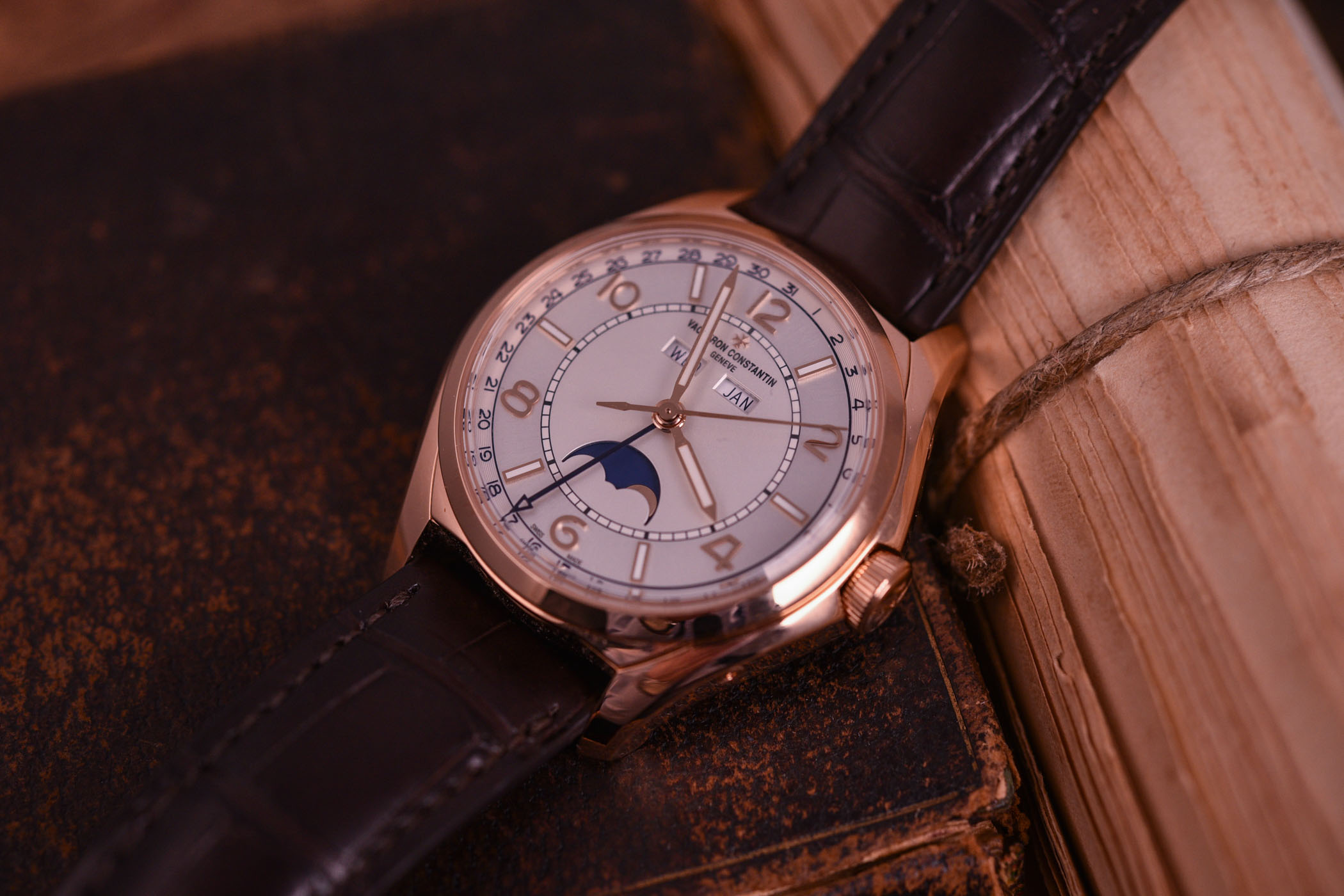
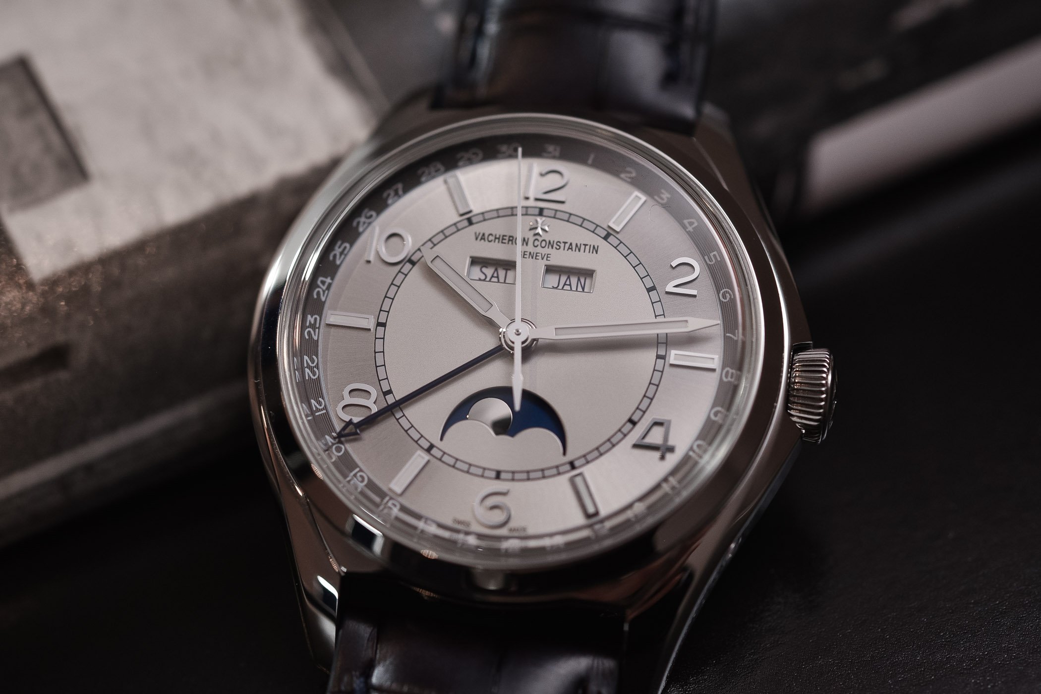
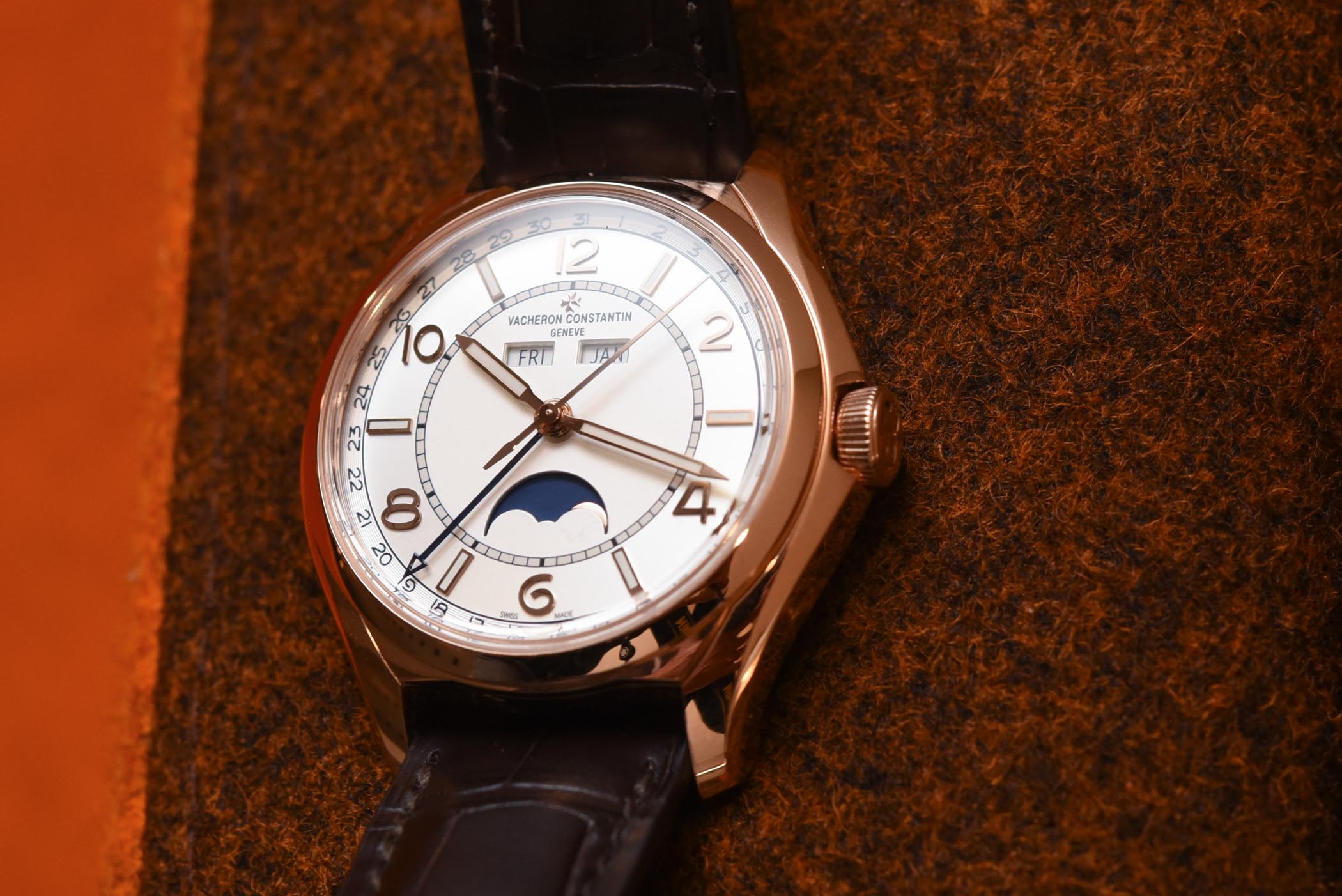
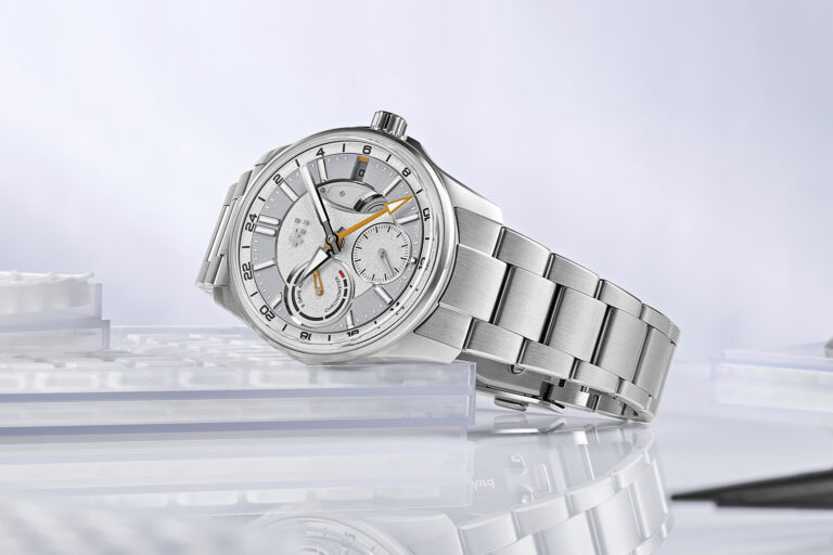
As for the dial, the same can be said. While it appeared quite plain and flat on the official photos, the Vacheron Constantin FiftySix, especially this Complete Calendar version, is much more playful in real light. The choice of a “sector” or “two-tone” dial is rather dans l’air du temps but works well with the overall design and 1950s inspiration. Not only is the dial well segmented, with several areas delimiting the different indications, but it also features different finishes.
As you can see, the date ring has concentric grooves, the hour ring features a metallic sunray brushed pattern alongside highly raised numerals and indices, and the central sector, which contains the calendar indication and the moon phase, is opaline finished. One difference between the gold and steel models is the colour of the dial. The gold version is silvery-white and thus more classical. The steel edition is metallic grey, for a more casual, slightly darker look.
As for the movement, Vacheron Constantin has a different strategy here than with the simpler 3-hand model. No outsourced movement here but an in-house, Hallmark of Geneva-certified automatic calibre. Although both watches might be in the same collection, they don’t play in the same league. Again, I was quite surprised, at first, by this choice. After thinking about it, I think I understand the reasons behind this strategy.
Such a watch, with a complete calendar, will remain more exclusive than the 3-hander and thus, will target a different audience – more traditional, more used to complicated watches or even collectors that are already clients of the brand. Having a nicely executed manufacture calibre in this context makes more sense than with the 3-hand version, which has been created to attract new customers.
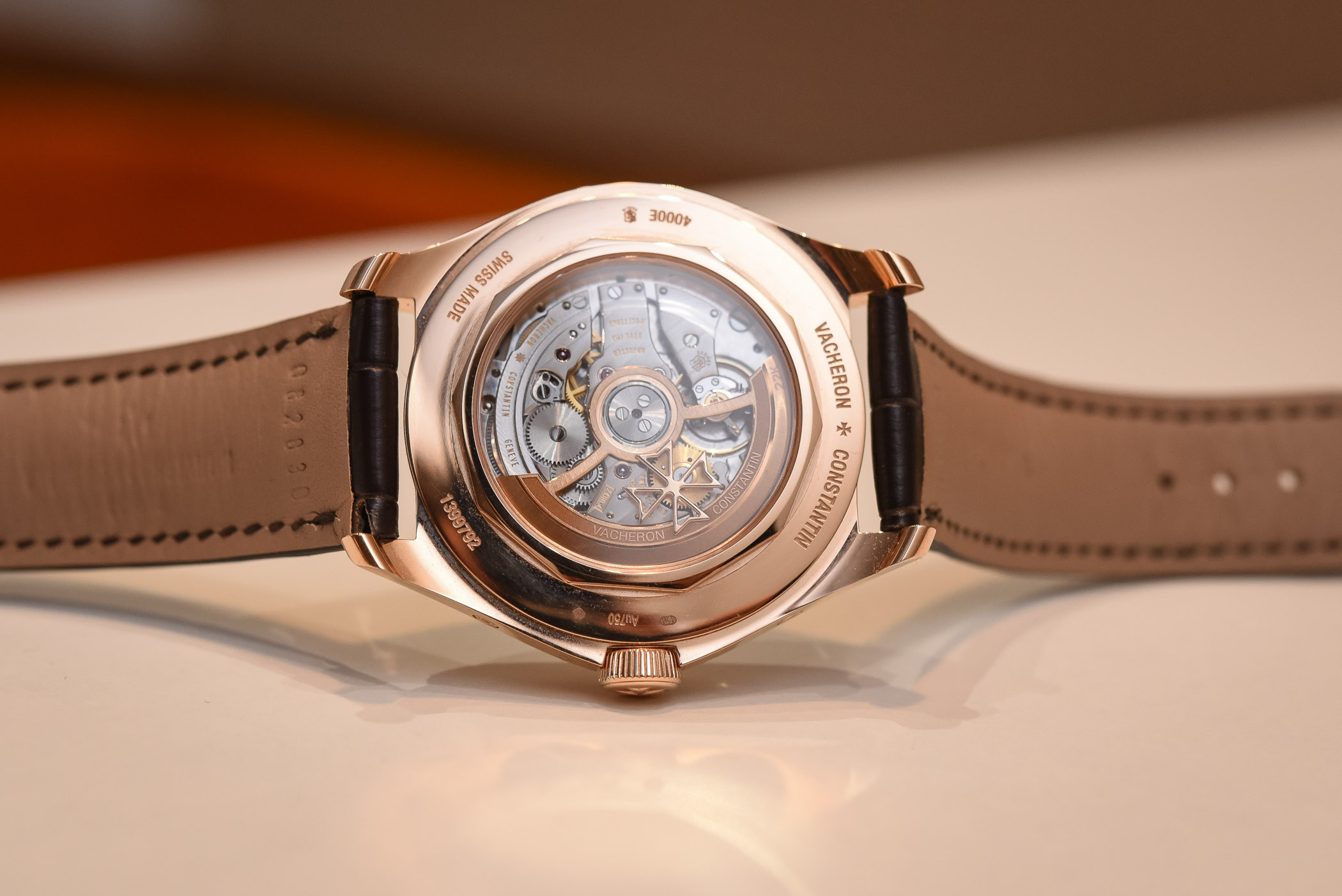
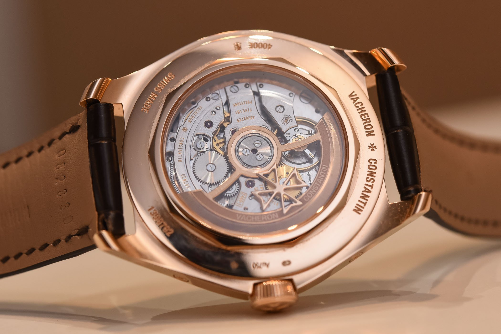
In the same vein, VC made the choice of an automatic movement, instead of the hand-wound base calibre found in the Historiques 1948 – which shares the same calendar module. The FiftySix is younger, more casual and more “urban”. An automatic movement makes more sense in this context. As for the movement itself, it is the well-known and beautifully finished calibre 2460. The view through the sapphire caseback, with beautifully decorated bridges and an openworked gold rotor, is very pleasant. My only complaint about this movement is the length of the power reserve – only 40 hours.
Conclusion
The expression “don’t judge on first impressions” makes a lot of sense with this Vacheron Constantin FiftySix Complete Calendar. While we were rather tough with VC when it presented the watch, I honestly think the brand did a far better job than I imagined. Having the time to wear this watch and play with it for a few days – and share my impressions with Frank, who also wore it – the FiftySix is a balanced and inspired timepiece, pleasantly designed, well proportioned and superbly finished – at least, this Complete Calendar version. More exclusive and more mature than the 3-hander version, its price is, of course, accordingly higher: EUR 22,600 in steel and EUR 35,300 in 18k rose gold. Not a cheap watch for sure, but not a cheaply executed piece either. More details on www.vacheron-constantin.com.

4 responses
Excellent article! You don’t see an article such as this one on any other blog. Thank you for that. And as we say, only fools don’t change their minds so… on a funny note, there’s some kind of irony when the article mentions the monochromatic dial in a negative way (given the name of the magazine). Congrats once again for a superb review.
I agree. Well written and quite closely attuned to my impressions as well. I think this piece has good legacy potential, though I certainly would need to try the shape on for a ride. For me it looks more backward than forward, but I consider that a good thing when done with care and respect, which this watch proudly evokes.
It’s a nice watch. Not being a fan of arabic markers I’d probably go for the Traditionnelle complete calendar, which has the similar 2460 QCL movement. However, the FiftySix’s 2460 QCL/1 movement is better to look at on first glance as it has an open rotor.
That face, though! It looks like a sad clown emoji.