The Revamped F.P. Journe Quantième Perpétuel
Journe's classic automatic perpetual calendar with new dials for 2020.
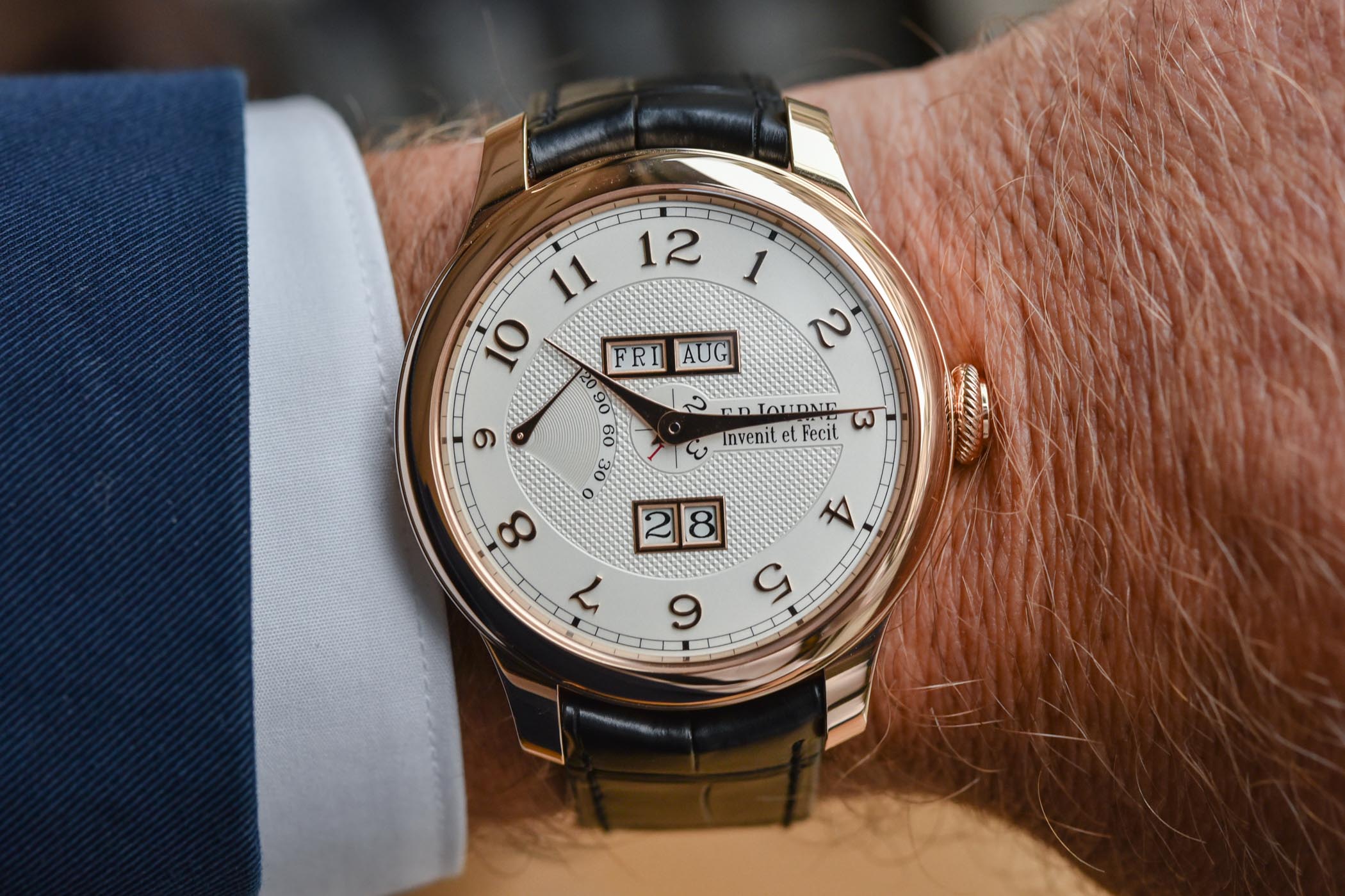
F.P. Journe, as one of the most revered contemporary independent watchmakers, needs no introduction. His work has been acclaimed by many collectors, especially his focus on chronometry – including his work on resonance or constant force – and complications. With such a background, it almost feels like a prerequisite for Journe to have a perpetual calendar in the collection, which did, of course, exist with the Octa Perpetuelle (now discontinued), or a watch launched in 2013 and simply named “Quantième Perpétuel”. The latter has been revamped this year with new dials, and today we take a look at this new F.P. Journe Quantième Perpétuel.
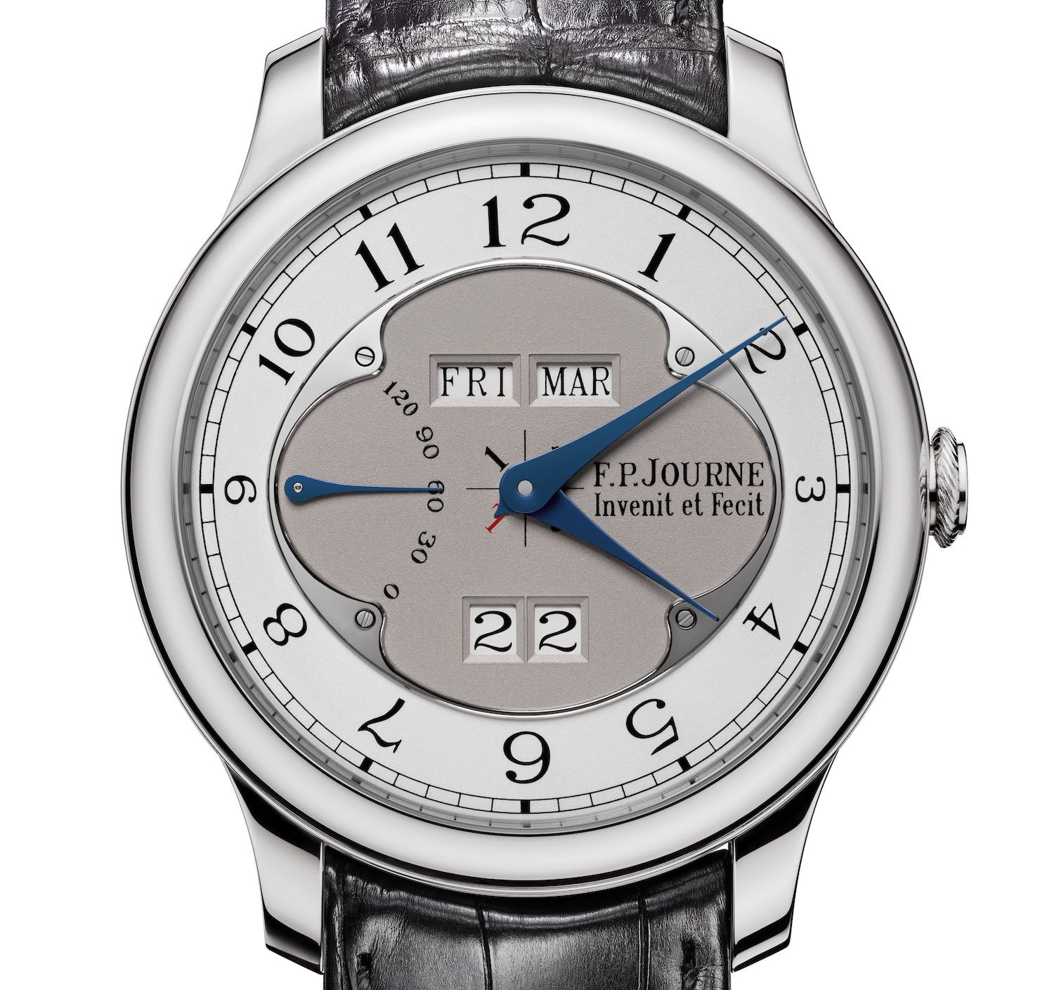
Following the Octa Perpetuelle and its original display with a retrograde date on a semi-circular arch and off-centred time indication, F.P. Journe launched his Quantième Perpétuel in 2013, with a more classic but highly legible display composed of clean, well-arranged windows for all the calendar indications. Offered in multiple variants with different materials and even in two sizes, the main specificity of this watch – which was a common feature of many models of the Octa collection – was its central cartouche in a grey or gold colour, framed by an ovoid ring in polished steel. The periphery of the dial was composed of an hour chapter ring with printed Arabic numerals and a railroad minute track – as seen above.
Introduced in a very discreet way this year – the watches were already available in boutiques even before the announcement of the launch itself – F.P. Journe adds new dials to the collection with a style that is more in line with the watches from the “Souverain” collection, meaning guilloché patterns and applied numerals. Yet, the mechanics and the overall display have been kept.
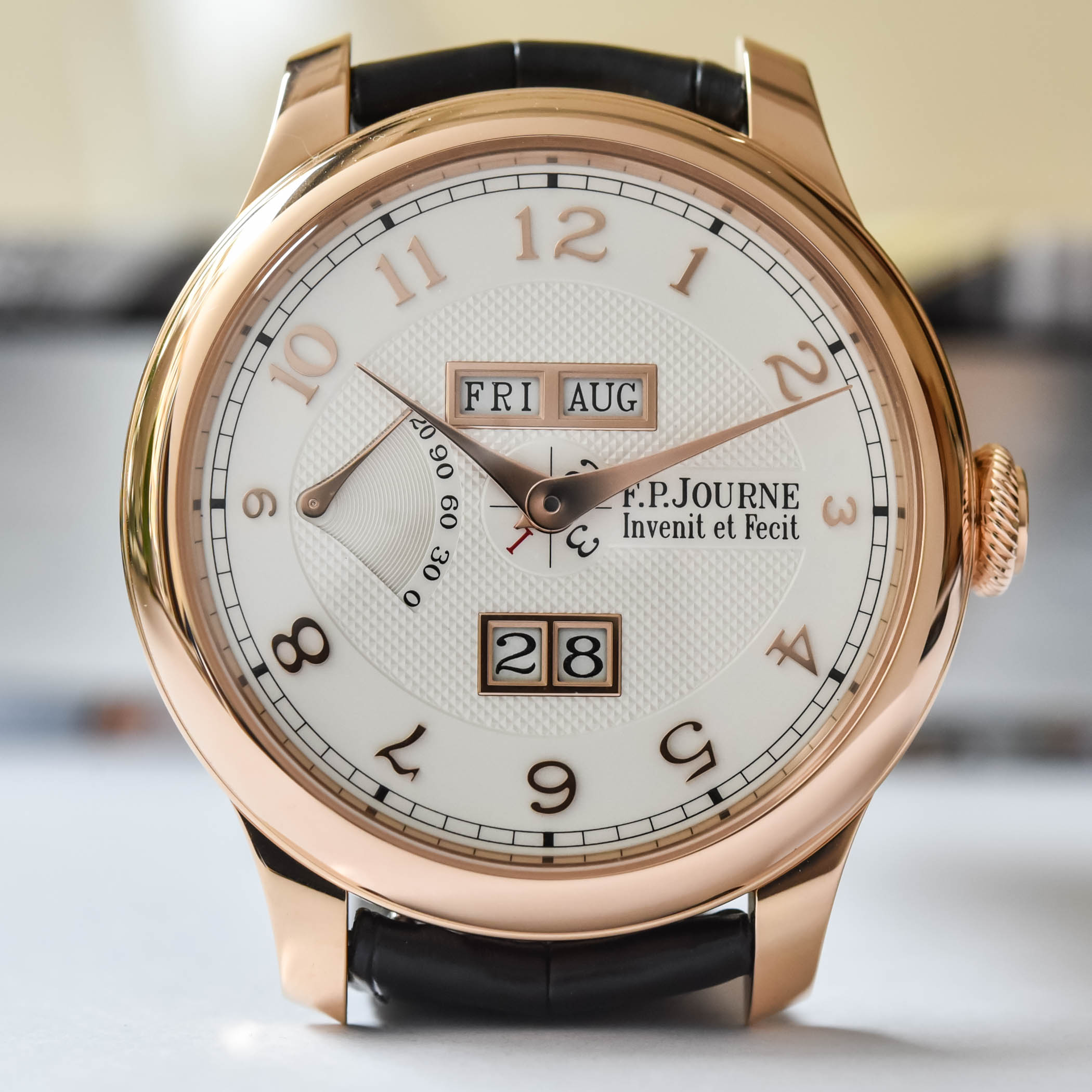
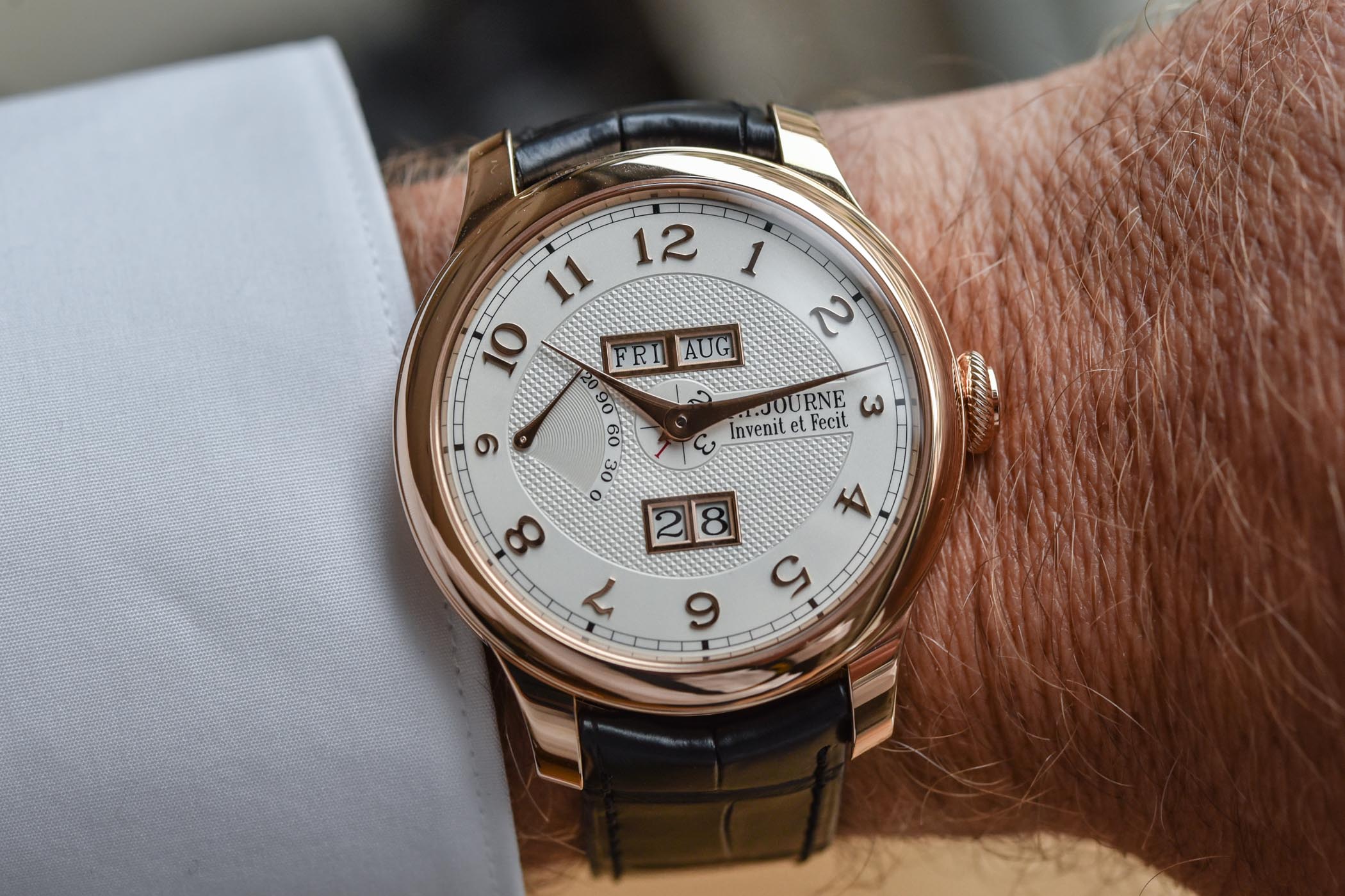
The update on the F.P. Journe Quantième Perpétuel only concerns the dial but we’ll also take a look at the watch itself since we’ve never covered it before on MONOCHROME. First, let’s take a look at what has changed. In place of a two-tone dial with a steel frame and printed numerals, these 2020 models now feature a solid silver dial with a central part decorated with a “clous de Paris” guilloché pattern, but still with the ovoid shape that encloses the indications. While the windows were previously simple cutouts in the dial, these are now framed by metallic applied parts that match the case material – and so are the hands, in steel with rhodium or gold plating. Finally, the other major novelty involves the numerals. Even though they retain the typical F.P. Journe font, these are now made from solid white or red gold (depending on the case) and applied on the dial.
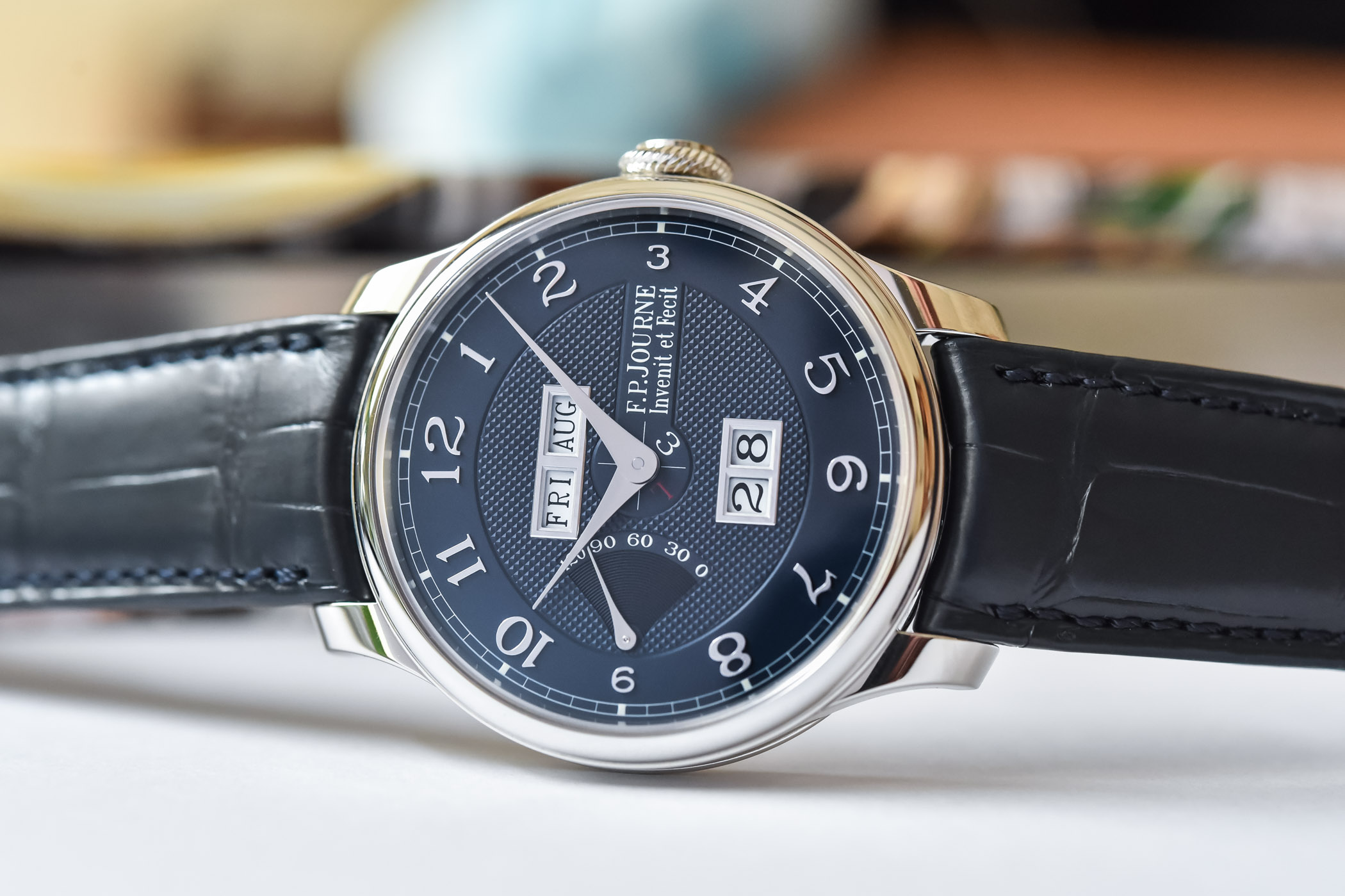
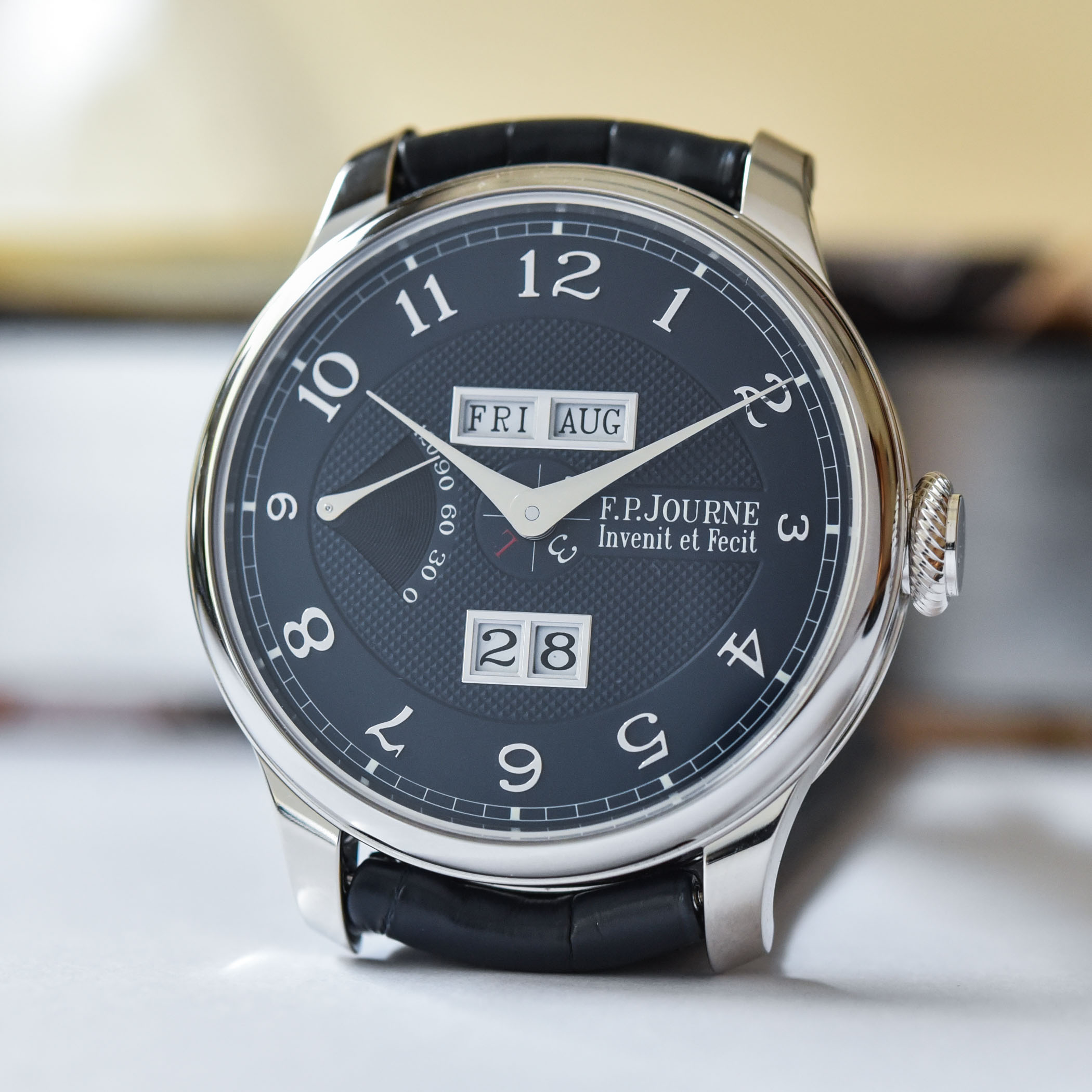
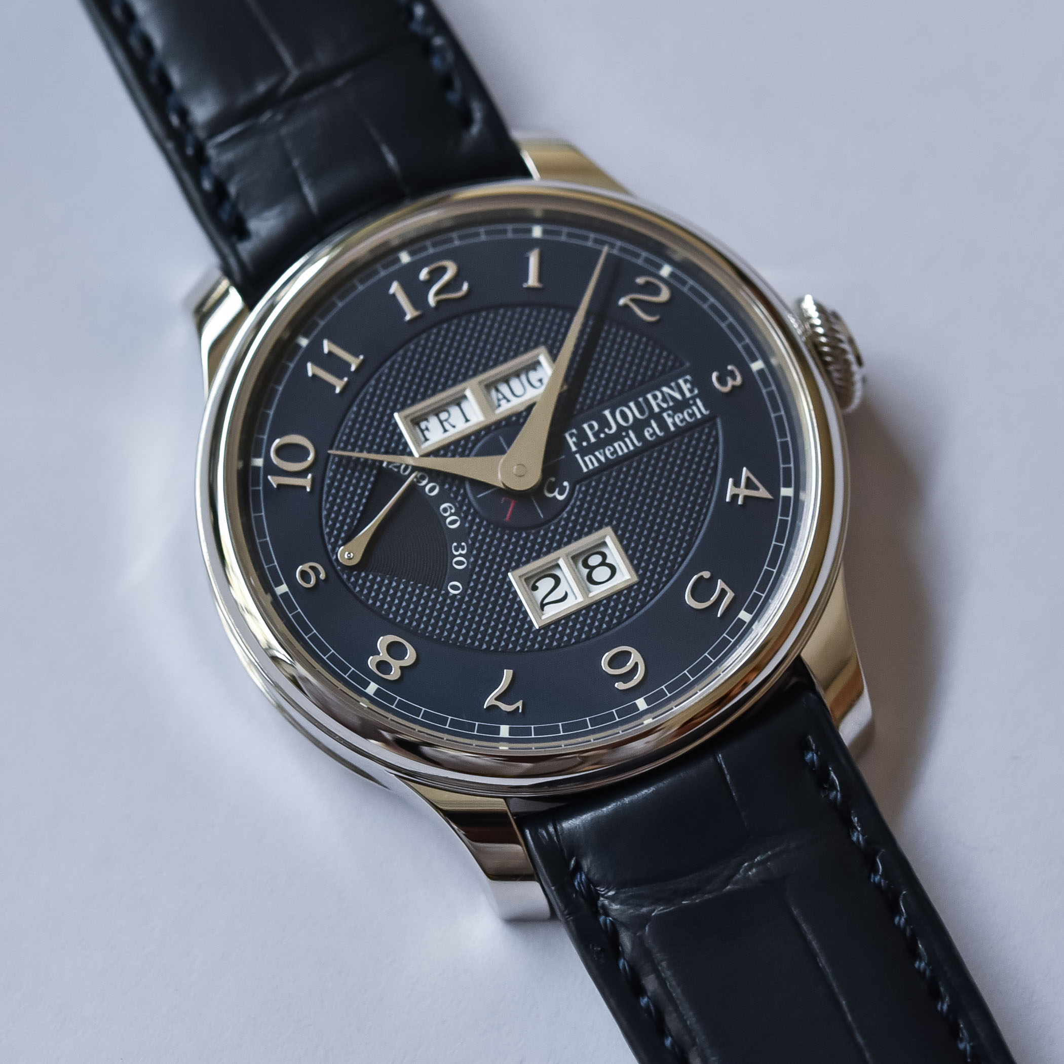
The standard at Journe is for silver-coloured dials, whether for the platinum or red gold models. New to the collection is a blue dial, which will only be available from official Journe boutiques, while the silver dials are offered also by retailers. The blue dial is deep and more contemporary; the silver models, especially when paired with a red gold case, are classic, timeless with an unrivalled elegance.
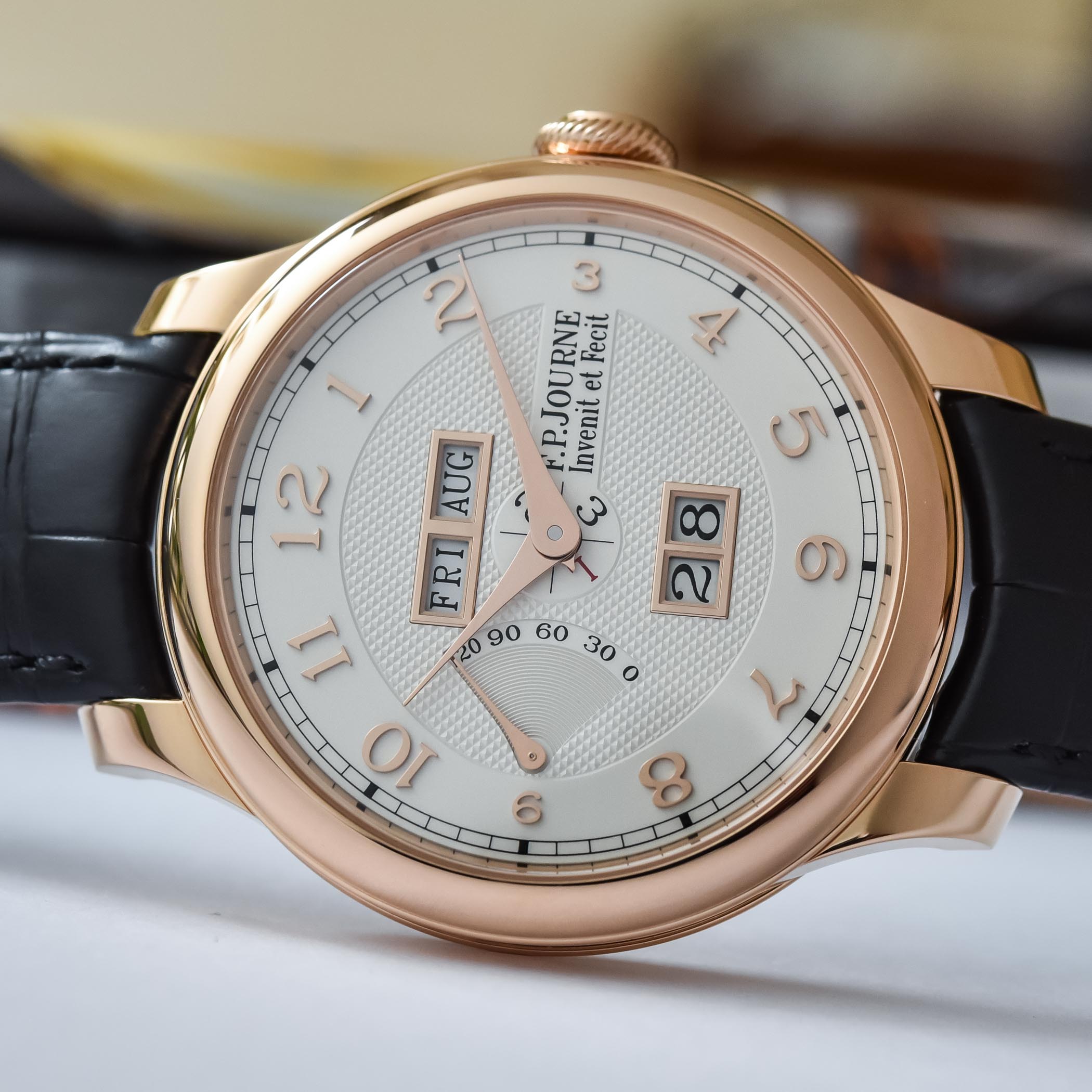
Whichever option you choose for the dial, all models are available in 40mm or 42mm diameter – always with a relatively compact height of 11mm. The main difference between these two sizes is the width of the bezel, more prominent on the 42mm watch. Also, the silver dial or the blue dial can be paired with a platinum or a red gold case. Finally, F.P. Journe offers the option of a traditional alligator strap or a platinum or red gold 5-row bracelet, particularly appreciated in warmer areas of the globe.
Back to the mechanics and the watch itself. When it was launched in 2013, the F.P. Journe Quantième Perpétuel marked a huge step in practicality and legibility over the Octa Perpetuelle. Time is centrally positioned (hours and minutes) while all calendar indications, with the exception of the leap year indicated by a small central hand, are displayed by large and clean windows. This means a large date at 6 o’clock with two independent discs, and the day of the week and the month at 12 o’clock. The new metallic frames also increase legibility, making this watch a clean, balanced and practical QP.
There are other noticeable features in the F.P. Journe Quantième Perpétuel. For instance, all the indications have instantaneous jumps. Also, this QP is very easy to use. All corrections are made using the three-position crown, except for the rapid correction of months, which is carried out by a protected and hidden corrector lever beneath the lug at 1 o’clock facilitating the adjustment over four years without a specific tool.
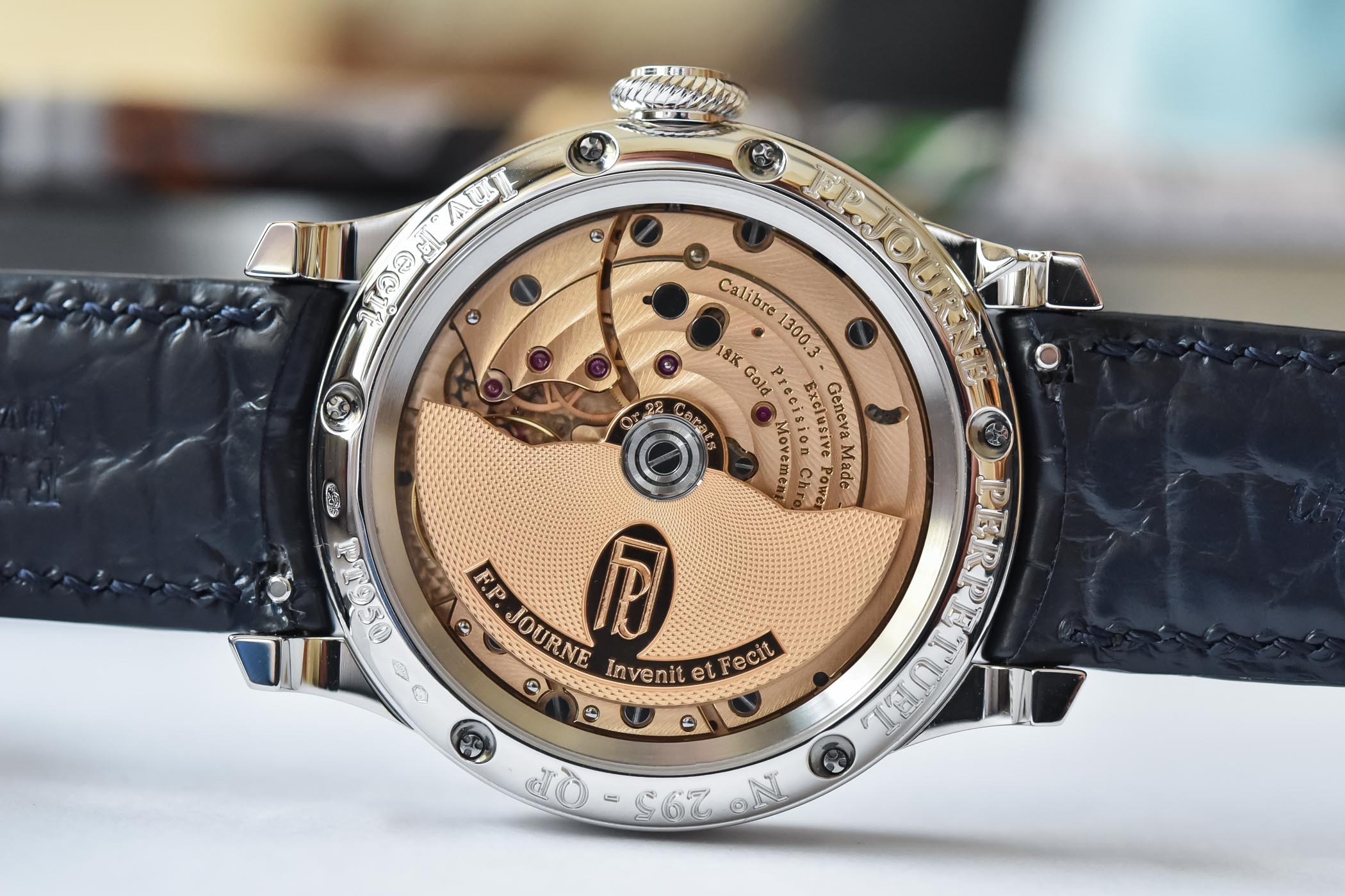
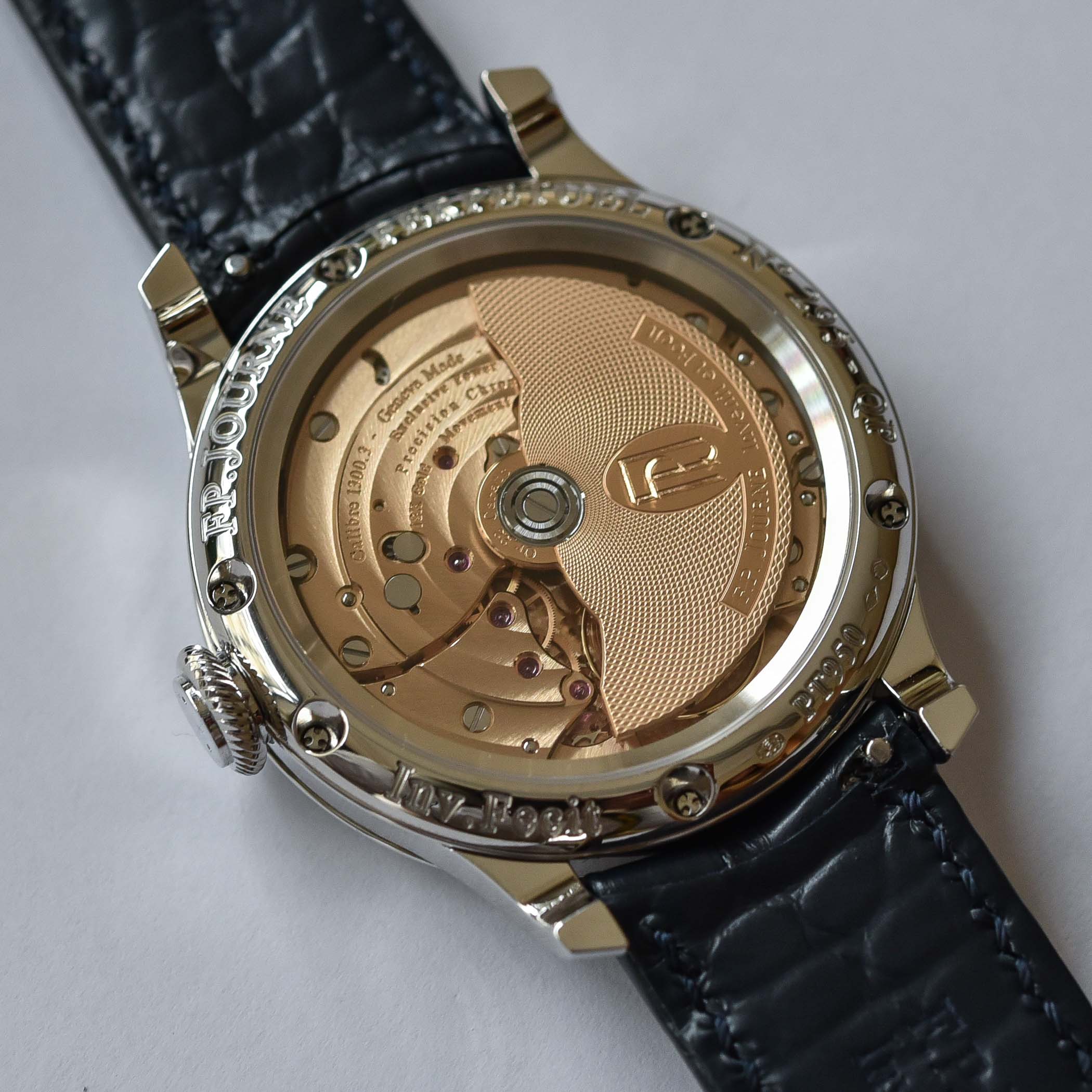
Inside its case, the F.P. Journe Quantième Perpétuel relies on the well-known and powerful “Octa” automatic base movement – a choice that makes sense for a QP, being far more practical than a hand-wound movement. Manufactured mostly in rose gold – 18k for the bridges and mainplate and 22k for the off-centred guilloché rotor – it is superbly decorated with circular graining, circular Geneva stripes, polished chamfers and all the traditional decoration techniques you’d expect from such a watch.
Technically-speaking, the winding is done in one direction only, with an autoblocant ball-bearing system. This allows the movement to wind in an efficient way, as every movement of the wrist is fully exploited for an optimised winding of the watch. Running at a frequency of 3Hz, with a free-sprung balance wheel, the movement stores over 120 hours of exploitable energy (even though it has a full power reserve of 160 hours).
Availability & Price
The F.P. Journe Quantième Perpétuel silver models are now available from all retailers and boutiques, while the blue models are reserved to boutiques only. The watch is priced at CHF 66,400 in red gold and CHF 70,000 in platinum (prices excl. taxes).
For more details, visit www.fpjourne.com.



8 responses
About time someone gave this a proper review, nice one Brice. The rose gold version with silver dial is possibly the finest QP (of the window/non-moonphase style) out there. Do you know if it can wind the date/month backwards?
A lot of information displayed without the dial looking busy, unlike a lot we have seen recently. Only thing missing is a second hand. Unusually the red gold is the most attractive
2013 edition is much more balanced and visually less crowded.
Whoa. I must have read hundreds of watch articles without leaving a comment. But this one is something special.
1. That is by far the cleanest and most legible perpetual calendar design I’ve ever seen. There’re others with big date windows, yes, but wanna see the day of the week and month? You need a magnifying glass again. Bonus: all calendar indications are instant jump, and they are so fast that you can’t even see it without a high speed camera, according to Hodinkee.
2. Self winding and 120 hours of power reserve. Most QPs seem content with around 40 hours. Or long power reserve but manual winding, which considering the hassle of setting the perpetual calendar, kind of defeats the purpose.
3. Coordinated day date adjustments with the 3 position crown, and rapid month advancement with the secure under lug corrector. No ugly dimples and tool requirement here. This is almost not needed given the long power reserve and self winding. Yet other QPs seem content with 3 dimples ugly-fying the case, and requiring a toothpick.
4. Movement finishing. Anglage where it’s supposed to be. Winding mass is mesmerizing with that guiloche pattern. Slightly off center for some character. In this day and age of hand finishing being replaced by machines, this is a watch you can wear upside down. Bonus: gold, gold everywhere. 18k on the main-plate and bridges, 22k on the rotor, numerals on the dial.
Any one of these four points would make a compelling QP. Put them all on 1 watch? Throw in some nice bonuses? That’s in a class of its own.
Visible configuration resembles Patek movement 315.
It seems to do too much and becomes distracting from its main task. I really like the hands.
I much prefer the clover dial and the undefined borders (for date display) on the previous edition. This looks like more like a typical CS and doesn’t have the quirky dial characteristic Journe is known for. With a short production of the 1st gen quantieme clover dial, I predict that besides being handsome aesthetically, it will go up in value as well.