Why I Think The Black Heritage Classic Sector Dial Is Longines At Its Best
When vintage inspiration meets modern specifications, and a surprisingly modernist design...
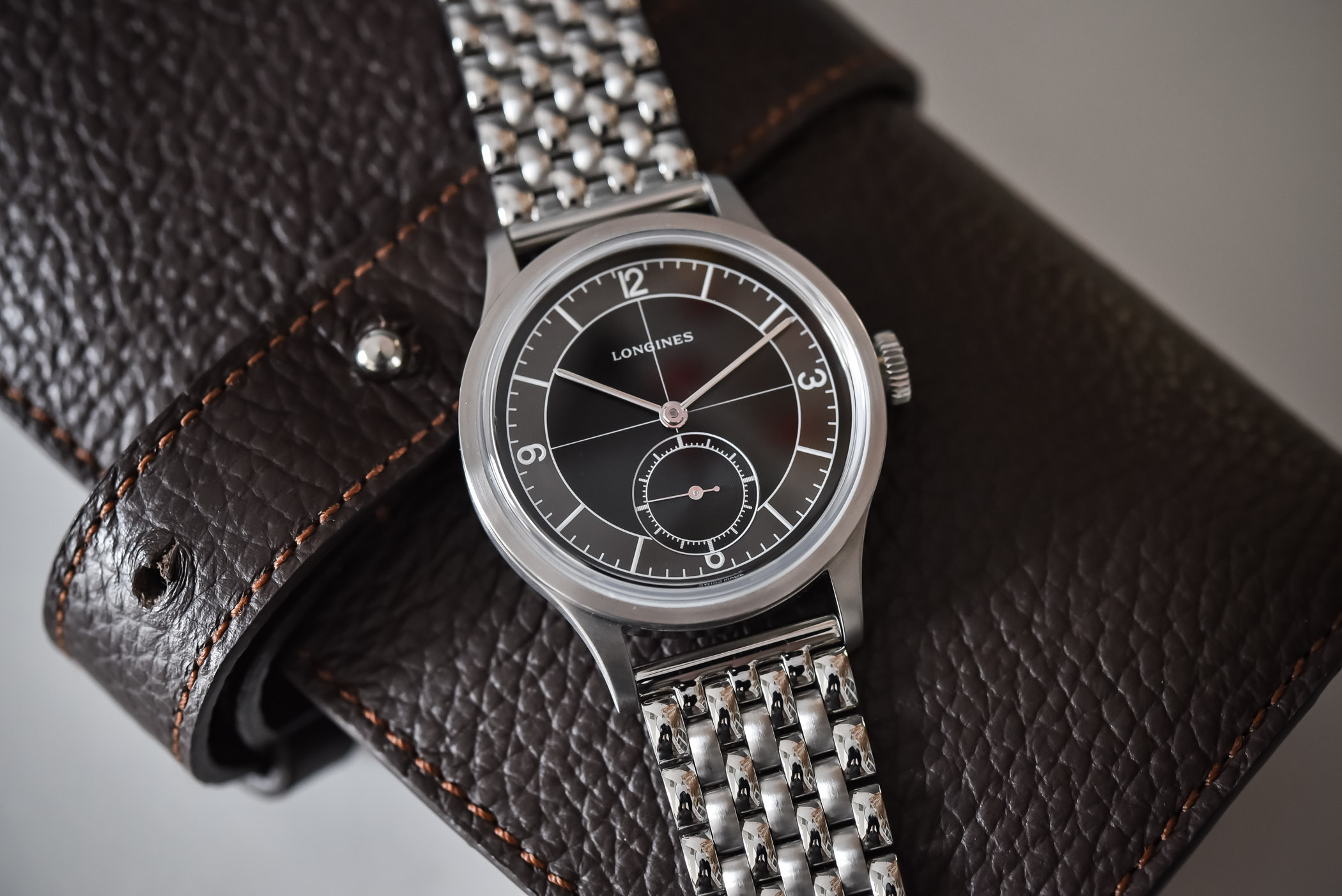
Explaining that Longines is good at making vintage-inspired watches that are bringing back the flair of some of its greatest hits of the past is like saying that Porsche does good sportscars. It’s almost like repeating yourself. Looking at the brand’s portfolio, and putting apart the recent Spirit collection, watches such as the Legend Diver or the all-new Ultra-Chron High-Frequency are enough to make a point. But there’s one watch in particular that appeals to me, a watch that isn’t the most striking and that doesn’t come with the most spectacular design or specifications. But one that truly caught my attention, the Heritage Classic Sector Dial Black…
Longines’ Heritage collection is the brand’s playground for vintage re-editions. While recently the brand has shown great creativity in the Spirit collection, with this titanium chronograph or the acclaimed Zulu Time, this range is not per se about re-editing glorious watches from the past, but about infusing elements of various vintage watches into a modern, retro-styled watch. The Heritage collection is, on the other hand, all about recreating specific old watches, brought back directly from the brand’s gigantic archives – the Winged Hourglass does own one of the most impressive vintage collections in the industry…
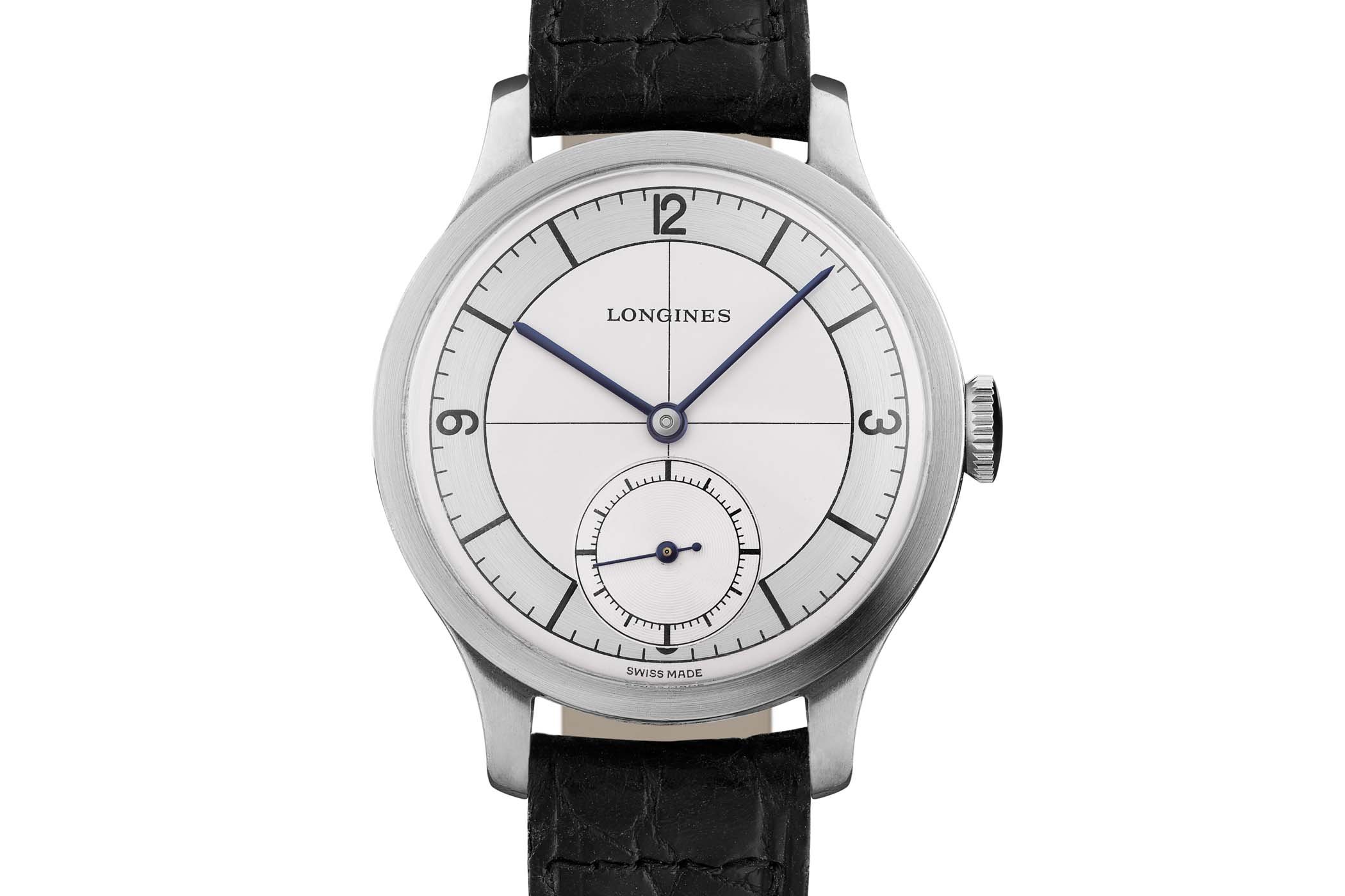
Knowing what lies in the brand’s museum (and everything that isn’t on display), the Heritage collection could be an almost endless story, with so many stunning old-school designs to bring back. And in so many eras, from the classic watches of the 1930s and 1940s, to stunning sports watches of the 1960s. And don’t get me started on funky 1970s models… In 2019, Longines brought back a highly traditional design, a typical 1930s watch. A so-called Calatrava watch – central case that integrates the lugs, 3-part construction with stepped bezel, coin-shaped flat profile – this watch first made in 1934 also had a typical Art-Deco influence on its dial with a sector layout and a crosshair in the middle.
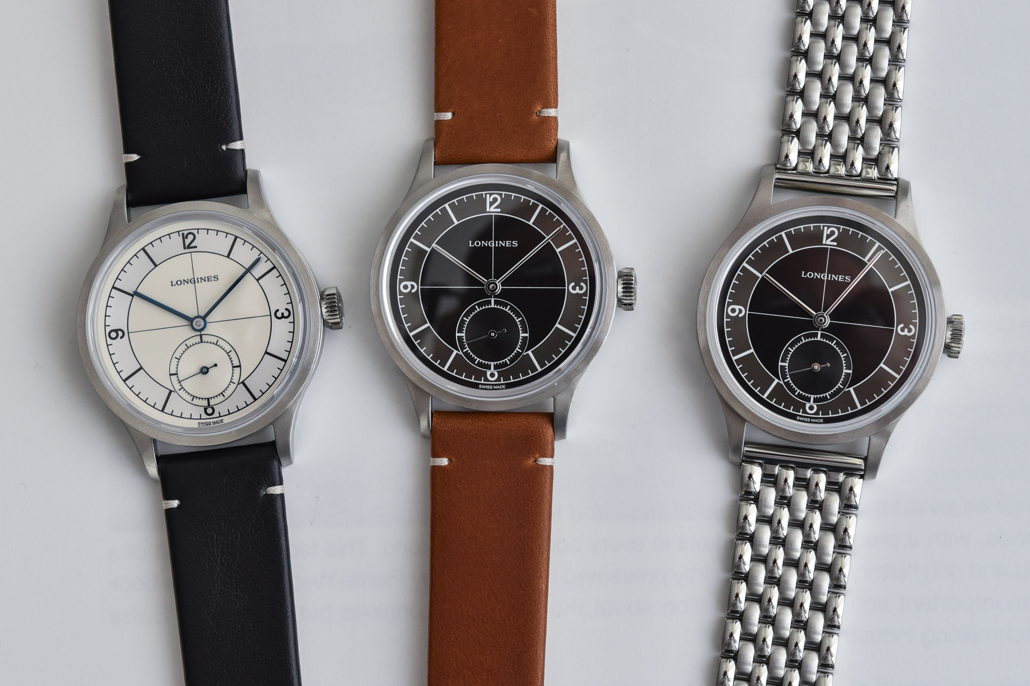
It would first come back with a serene two-tone silver dial and blue accents. Classic and discreet, it certainly made an impression and was well received. But last year came a new version that somehow stole my heart. Basically the same watch with a black dial, the different colours surprisingly changed drastically the look of Heritage Classic Sector Dial… I somehow have difficulties to express the reason why, but there’s something special about this watch, a mix of historical elements and a certain modernism that makes for a stunning piece.
Looking at the contemporary Heritage Classic Sector Dial and its historic counterpart, there’s an undeniable resemblance. Faithful is the key word here – with a certain stubbornness that, coincidentally, also created some discussion regarding the design (more on that later). It’s all about vintage, though. As always with this collection, this Heritage Classic isn’t just a 1-to-1 copy and some elements have changed. Starting with the proportions. Rest reassured, as at 38.5mm in diameter, 11.5mm in height and 46.5mm in length, the case still is fairly compact and does exude a vintage feel. Personally, I would have been happy with a 36mm, historically-relevant case. But the market is what it is and such small watches are still a niche. Anyway, I’m good with this 38.5mm case and its restrained proportions.
Then comes the design and it is simply cool. Those who know me enough will tell you that I have a deep love for Calatrava watches, in particular, the Patek 5196P and its two-tone dial with Breguet numerals. A dream that will probably never come true… The beauty of these so-called Calatrava watches comes, at least for me, from the design of the case, which mixes elegance and restrained proportions with a slightly utilitarian feel. It has that non-nonsense coolness that makes an object timeless and interesting, without the need for tricks. It’s simple in a perfect way. It materialized in the context of the Heritage Classic Sector Dial with a central case which integrates the lugs and a flat stepped bezel that frames a highly domed sapphire crystal. And since Longines has given this case an almost entirely brushed finishing, there’s something slightly raw and unornamented that makes this design a bit muted and modest – again, in the best possible way.
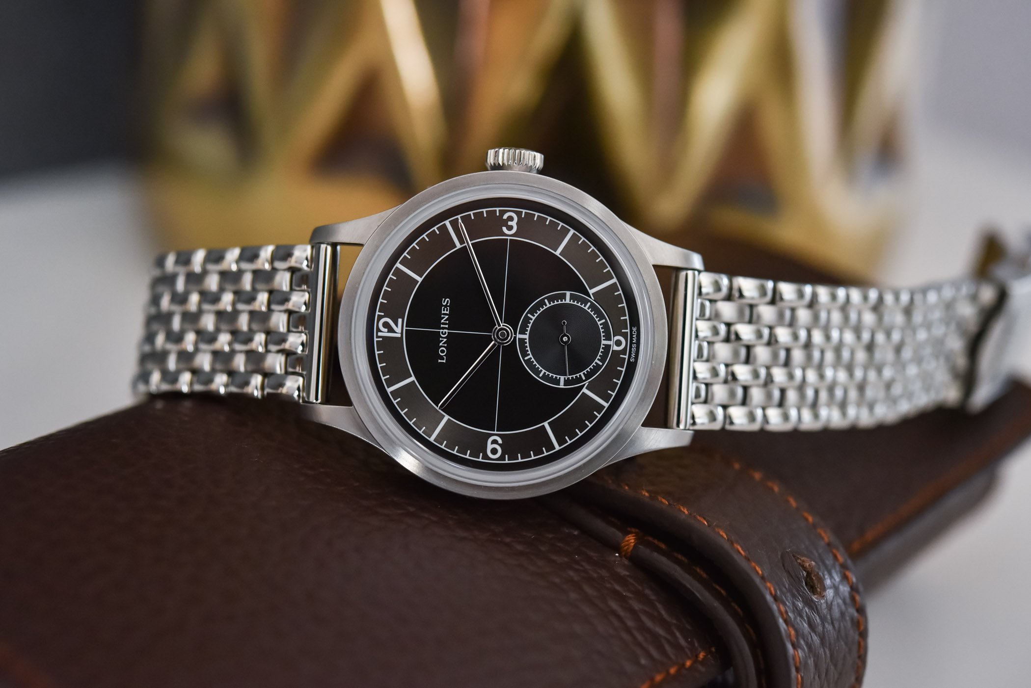
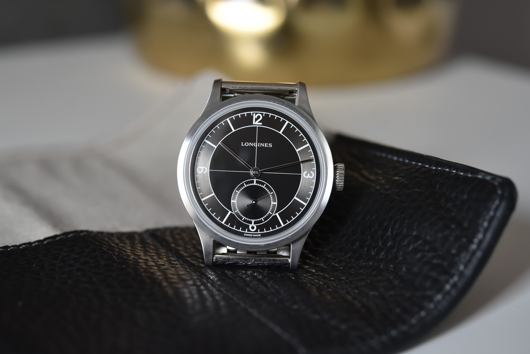
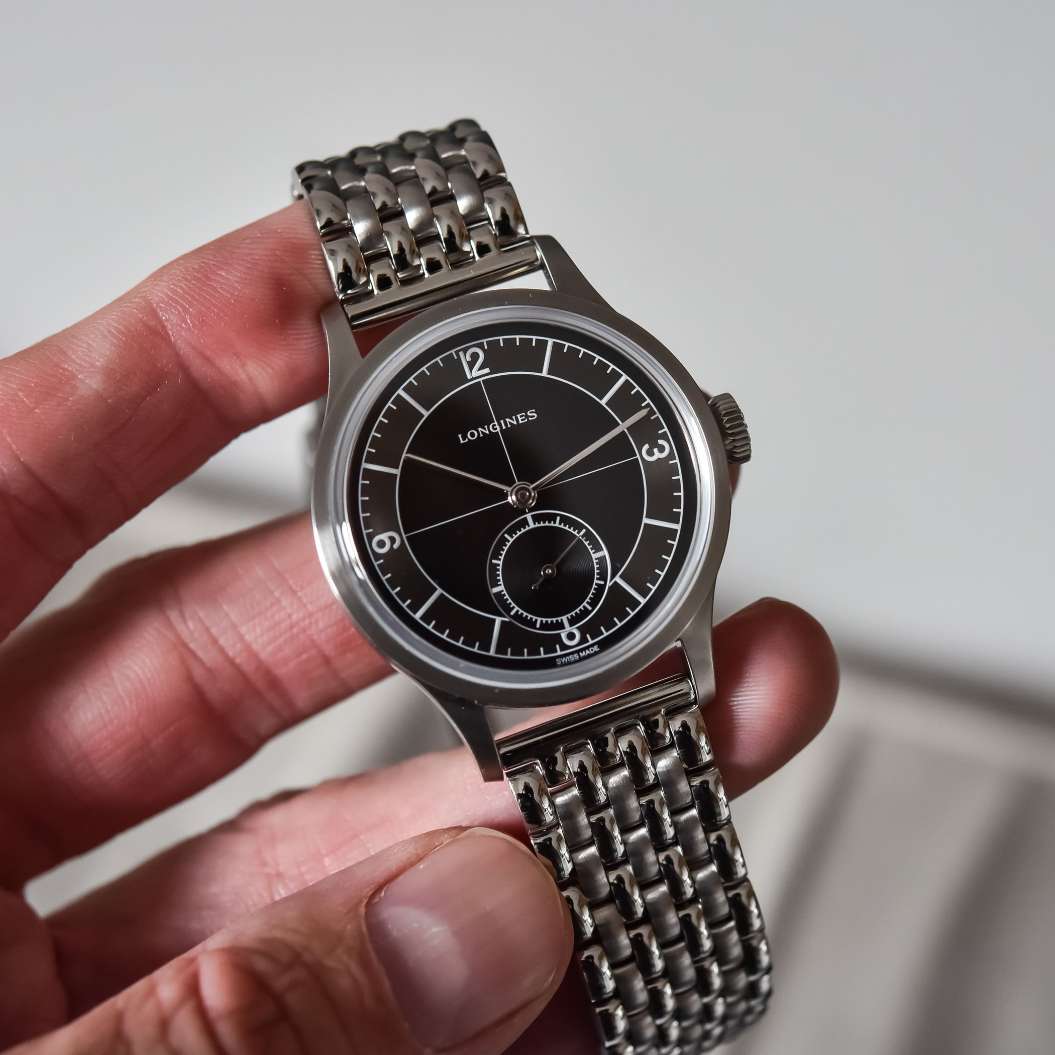
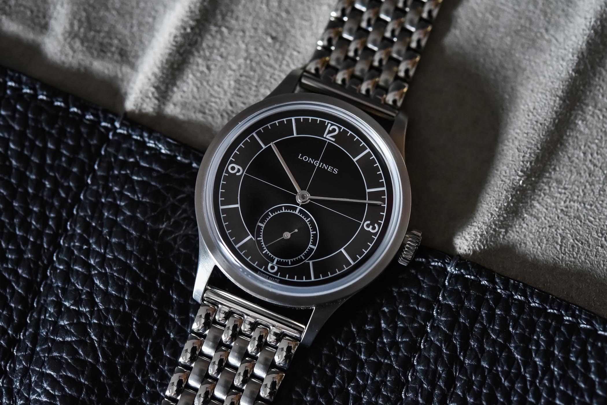
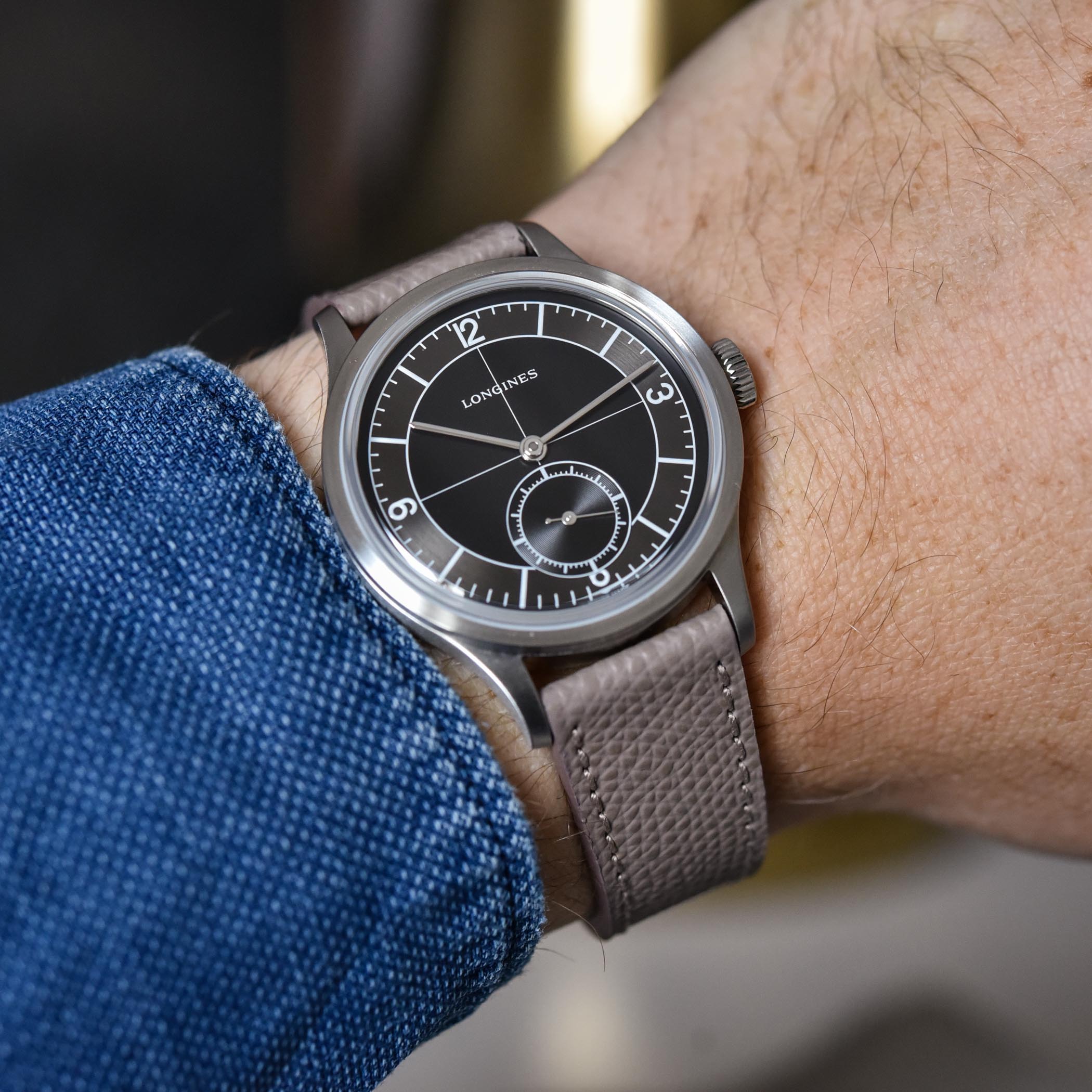
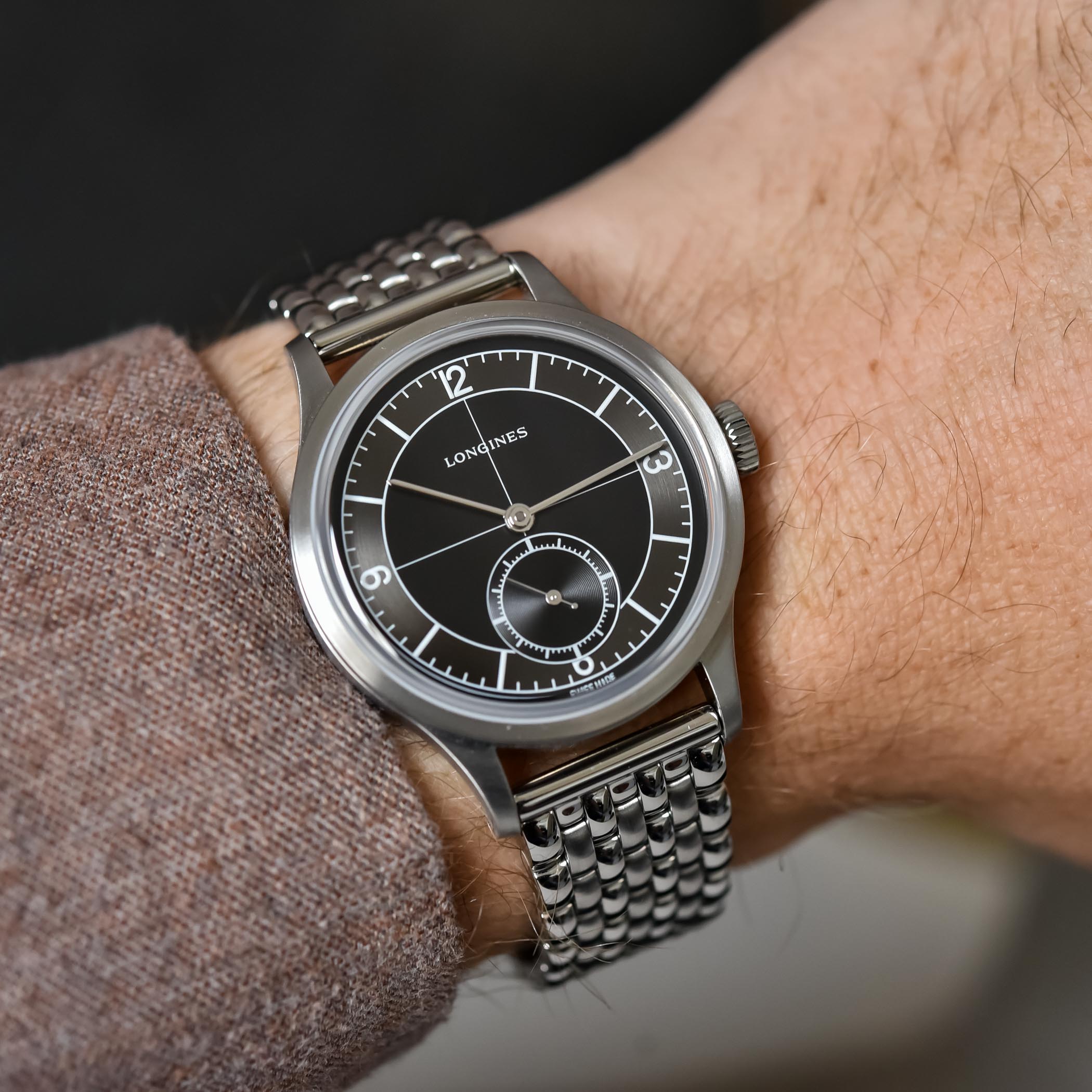
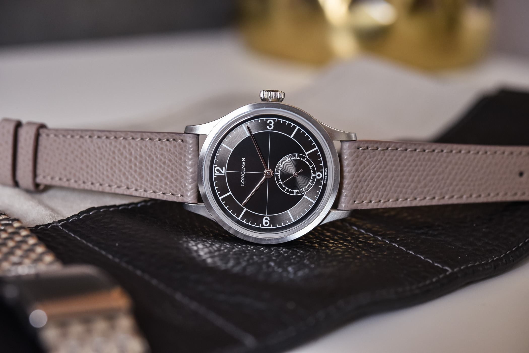
I have the same feelings about this two-tone dark sector dial. Again a classic from the 1930s, it is here rendered with a smooth black central section and a brushed, charcoal grey hour chapter ring. Hands are simple yet attractive polished batons and the dial is, under ambient light, lively and playful. All printings are silvery-white without the need for faux-patina or design tricks. It recreates faithfully the style of the original watch. And since Longines has proprietary movements that are correctly sized, the small seconds isn’t lost in the middle of the dial but well positioned and large enough.
What surprised me most when handling this Longines Heritage Classic Sector Dial is how modern it actually feels. I know the design is deeply classic and historically relevant, but it is impressively striking and contemporary – like those streamlined pieces of furniture from the same Art-Deco era. You know their design is almost a century old and at the same time, I’m still amazed by their avantgardism. The dial of this Longines does exactly the same to me. I know it’s old and at the same time, it’s structured, slightly austere and has a graphic vibe that makes for a modernist object. This could be the definition of timelessness.
It’s not all positive though… There are some elements in this watch that have created discussions. As said, Longines has been almost stubborn in its recreation, up to the point where some watch enthusiasts felt that it was a job half done. First is the cut marker at 6 o’clock. It’s an endless debate, with two sides opposing objective arguments. I, personally, have no problem with this. The second concerns the point where the crosshair and the Longines logo meet… with the G in the logo partially cut by the crosshair. Sure, the original watch was like that, but things could have been improved. Finally, there’s the water-resistance topic. This watch is rated at 30m, a depth that is too low for some. I personally don’t mind it.
The beauty of these modern vintage-inspired watches is also about contemporary technical solutions and the pleasure of having a retro-designed watch without the hassle of a vintage movement. And Longines is good at it. Inside the case is the automatic calibre L893, a movement made by ETA exclusively for Longines with a 3.5Hz and a comfortable power reserve of 72 hours – which makes it a so-called weekend-proof watch. And there’s a silicon hairspring too, meaning that you don’t have to worry about magnetism.
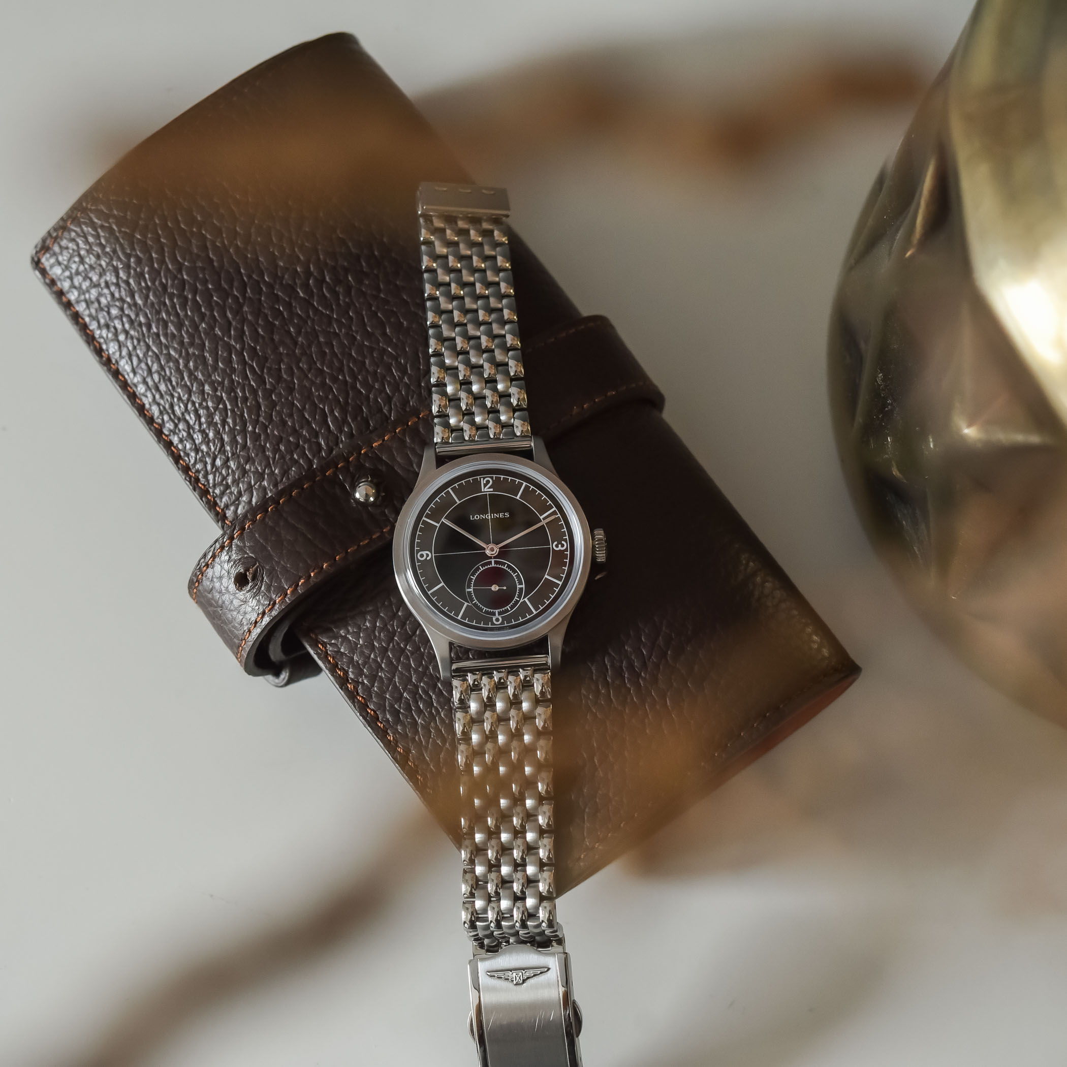
The final touch that was given by Longines to its Heritage Classic Sector Dial (and only for the black model) is a beads-of-rice stainless steel bracelet, which only reinforces that utilitarian feeling I was talking about previously. Soft, flexible and comfortable, it truly elevates the look of the watch. If you want to acquire this watch, don’t think twice; get it on the steel bracelet. And afterwards, you’ll always have the option of adding a leather strap… Just like we did here, using one of our own calf straps (the taupe-coloured strap is available from the MONOCHROME shop here).
Overall, and I know this watch isn’t perfect, but I can’t help thinking it’s the best currently available in Longines’ Heritage collection. It has charm, pedigree, undeniable quality of construction, modern features in its movement and the look… That look does it all.
The Longines Heritage Classic Sector Dial black on steel bracelet (reference L2.828.4.53.6) is available as part of the permanent collection from the brand and retailers, with a 5-year warranty. It is priced at EUR 2,430, which is objectively not cheap but justified. For more details, please visit www.longines.com.


10 responses
Cutting off the 6 looks bad.
‘Black’: TOP – ‘Silver’: FLOP
I would agree with you about the 36mm size, but then that would have been too good.
Cutting off the 6 is a piece of totally lazy design and there’s no excusing it.
I just don’t see how this could retail for so much coin, it is just a steel sector dial watch . As nice as it is.
I own the silver dial variant and absolutely love it – paid £1200 new in November 2021, so a bit of a bargain too.
Criticisms? Purely subjective, but I find it wears very big with an all-dial face and very long lugs. Longines do offer other men’s watches in different sizes – the Hydroconquest and Dolce Vita for example – and I think this would be a perfect candidate: 36mm, shorter lugs and a thinner case (<=10mm please) even if this meant hand-winding. Well, I can always hope…
When people say a nice 35mm watch , this the style they are talking about. Yet they did not make it 35mm , lazy execution on their part, maybe they will figure out style/size one day ? They must teach that in design school right ??
The cut 6 hour marker just breaks it for me. Would be unhappy each time I look down. I hope they reconsider in future releases. This watch is just beatiful and on the top of my list should it ever get a better design.
Watch IDGuy’s review of this piece and decide for yourself if cutting off the 6 is as bad as it sounds.
I have a sector and I’d rather the large seconds cut the 6 than not. People hung up on that stuff want to buy a museum piece and look at it. I use my watches. 100% love my sector like it is and I’ve had hundreds of watches.