The Tissot Le Locle Powermatic 80 20th Anniversary Edition
The classic, elegant and fully-equipped Le Locle wears blue to celebrate 20 years of existence.
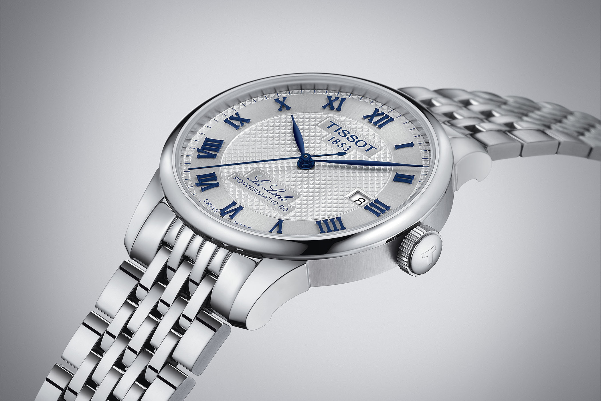
Today, Tissot is paying tribute to its most classic collection, a watch that was released 20 years ago, itself being a piece commemorating the rich past of the brand. Founded in the small town of Le Locle in Switzerland back in 1853, Tissot celebrated its 150th anniversary in 2003 by releasing an elegant, refined yet affordable collection aptly named Le Locle. A well-established cornerstone model, this lineup is now celebrating 20 years of production and Tissot presents a special edition watch for the occasion.
Chemin des Tourelles, Gentleman or Le Locle… There is more than one classic, elegant-ish collection at Tissot. Yet, the most traditional watch in the brand’s portfolio is, without a doubt, the Le Locle. Round case, polished surfaces, relatively compact dimensions, no lume on the hands and Roman numerals with dials bearing a traditional texture. Classic elegance, refinement and a watch that will please people with classic tastes and those who want to maintain a low profile in the office.
Over the last few years, Tissot has slightly revamped its Le Locle collection, giving it a bit of modernity in the design and a lot more on the side of the mechanics. We’ve seen this transition when exploring the new Le Locle Powermatic 80 Open Heart and you can expect the Le Locle Powermatic 80 20th Anniversary to follow the same rules. Yet with some specificities to make it unique within the collection.
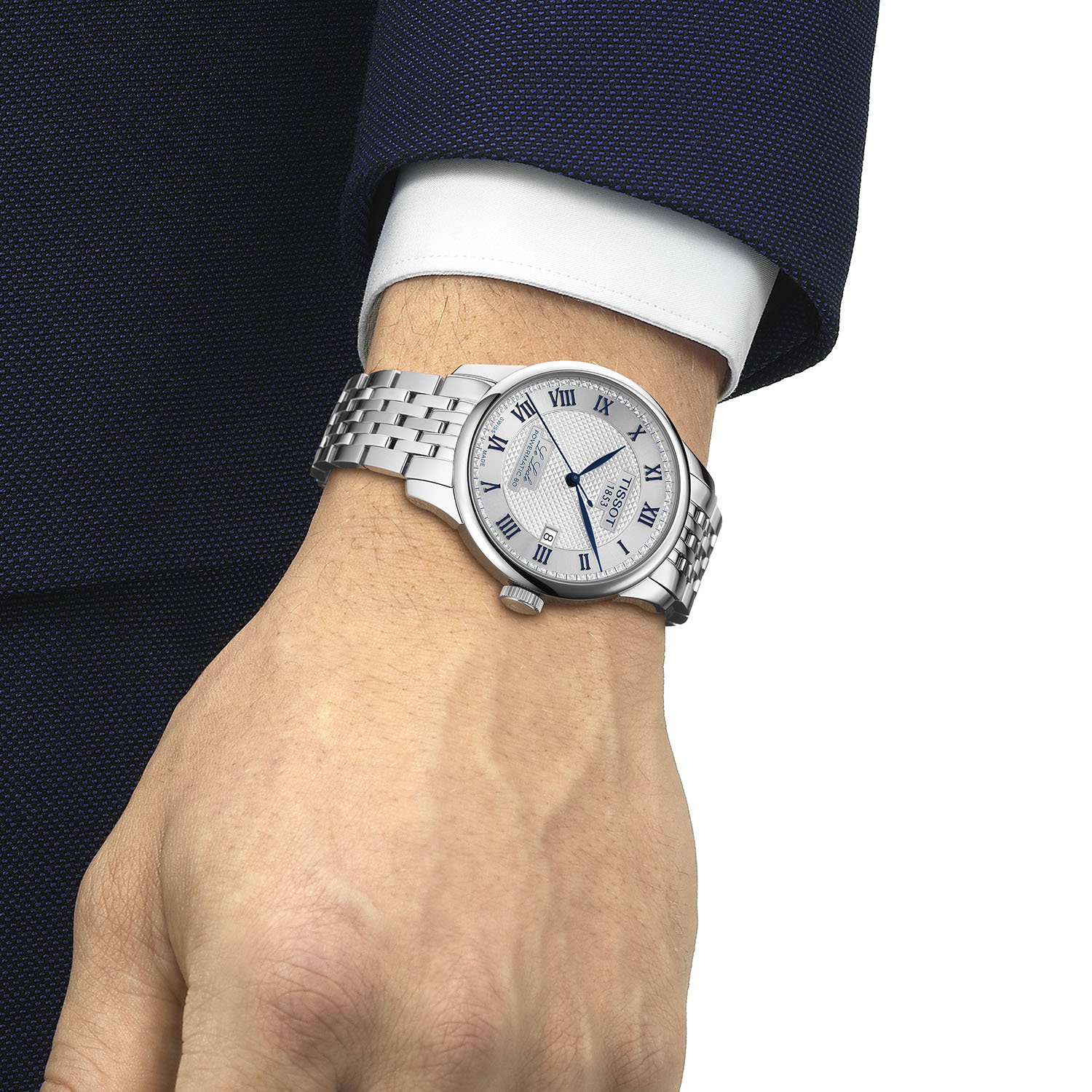
The 39mm case is made almost entirely of polished stainless steel, with vertically-brushed surfaces on the flanks adding some contrast. The watch keeps things elegant thanks to a relatively slim profile – just under 10mm, making it easy to slip the watch under a cuff – and the 30-metre water-resistance will annihilate any wish of taking it for a jump in the pool. It’s, without a doubt, a watch for office wear. A sapphire crystal protects the dial while the back has an original layout with a split see-through window and a lot of literature, logos and engravings (too much, one could say).
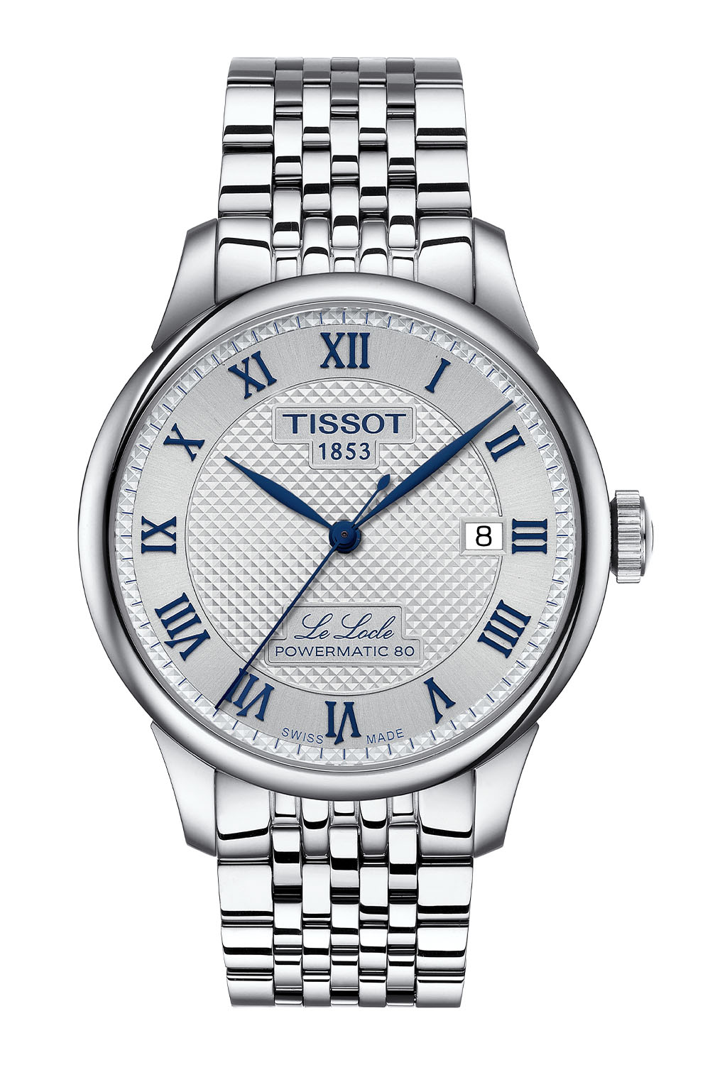
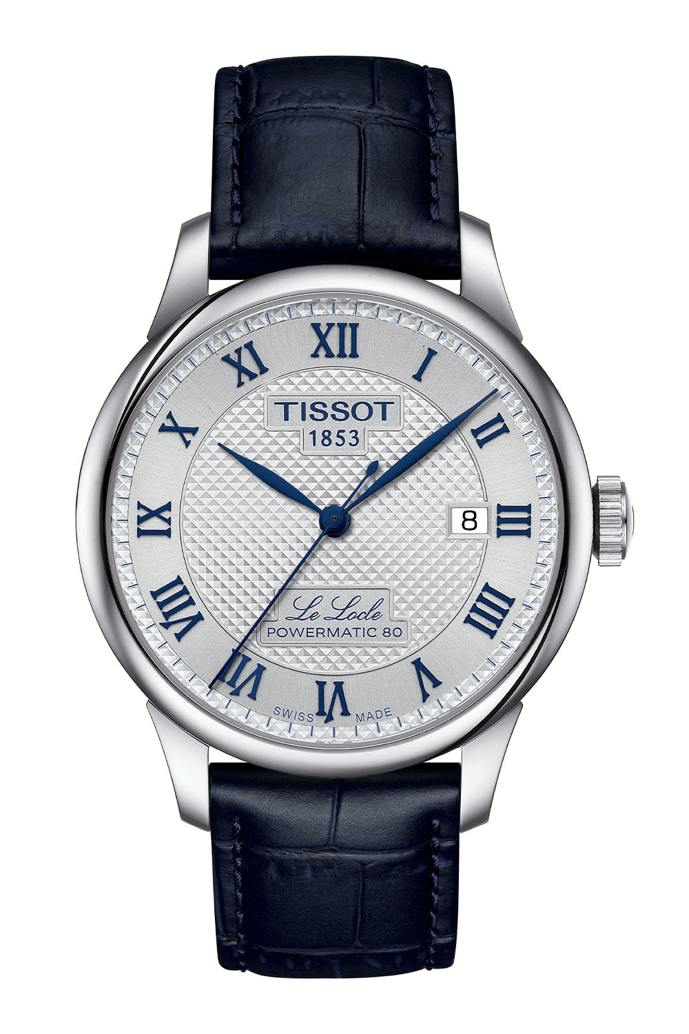
Following the evolution of the permanent collection, this special edition Le Locle Powermatic 80 20th Anniversary uses the revamped dial with an embossed Clous de Paris pattern in the centre and the chapter ring, with its applied Roman hour numerals, is treated with a sunray-brushed finish. The main specificity of this anniversary edition is the blue colour applied to the Roman numerals and leaf-shaped hands – a colour also found on the additional leather strap included in the presentation box.
Power comes from the tried-and-tested calibre Powermatic 80. Used across the entire Tissot range, this automatic movement is a strong evolution over the classic 2824 architecture. Notably, its kinetic chain has been reworked and the frequency of the regulating organ lowered to 3Hz, resulting in a stronger 80h power reserve. Also, the escapement features a Nivachron hairspring, bringing anti-magnetic properties.
Alongside the blue faux-alligator leather strap, this new Tissot Le Locle Powermatic 80 20th Anniversary Edition is worn on a 7-link steel bracelet with a folding clasp. Now available from the brand and its retailers, and not limited in production, it is priced at EUR 775, CHF 675 or USD 750. For more details, please visit www.tissotwatches.com.




4 responses
Always something marring the *perfection*. Why on earth the date numerals are not in dominant blue????
I don’t understand why the Swatch group doesn’t develop a movement with a larger date disc or make their cases 37mm in size. The date placement on the inside of the sector ring is a complete non-starter for me. I shudder to think about the spacer ring around the movement.
Then they should drop the square shield that says powermatic 80 on the front. I can live with Tissot 1883 and Le Locle, but that lower shield is so large it’s disturbing. The powermatic 80 is a run of the mill basic and somewhat spartan movement without user regulation options, so it’s nothing to brag about.
As such, to my mind this looks like a typical mall watch. Somehow I don’t think it’s helped by the somewhat strange looking minute track, and its location. A 37mm design would have been more focused, I think.
I just don’t like the case back. Otherwise it seems to be a less expensive Tudor 1926, which is a good thing.
As in a lot that goes on with the trust fund babies swatch group, it appears that not much thoughtfulness happens, as it may exhaust their collective minds in doing so. The movement is nothing to advertise about on the dial. It is not an “evolution”, contrary to what you’d like to have us believe. If anything, it’s a step backwards, a de-evolution, if you will. Tissot deserves better. And so do their customers.