Bell & Ross Ups Its Game With The New BR-X5 And Its Manufacture Movement (Video, Live Pics)
Bolder look, more powerful engine, still B&R.
For many years, Bell & Ross has been all about pilot- and military-inspired watches. This was the brand’s motto, the style that made it famous. And while the Parisian brand still leans heavily on those codes in its current instrument collection, materialised by the emblematic BR03 range, it had to evolve. How? By becoming more urban, less hardcore. This strategy took shape in the BR 05 collection, a sports watch with an integrated design. And just like the BR-X1, which was a bolder take on the classic BR-01, there’s now a new, more muscular, more powerful take on this watch with the Bell & Ross BR-X5 collection. And it comes with a new movement too. And we have it here live, including a video review.
Even though Bell & Ross was founded in 1992, the brand gained recognition in 2005 with the launch of the BR 01 Instrument, a watch that established the house style for the decade to come. Inspired by dashboard instruments, it introduced the emblematic square case with 4 screws and a circular aperture for the dial and became the cornerstone of the brand for 15 years. Still, the pilot/military look couldn’t be the brand’s only offering, and to adventure into more urban territories, the BR 05 collection was launched in 2019.
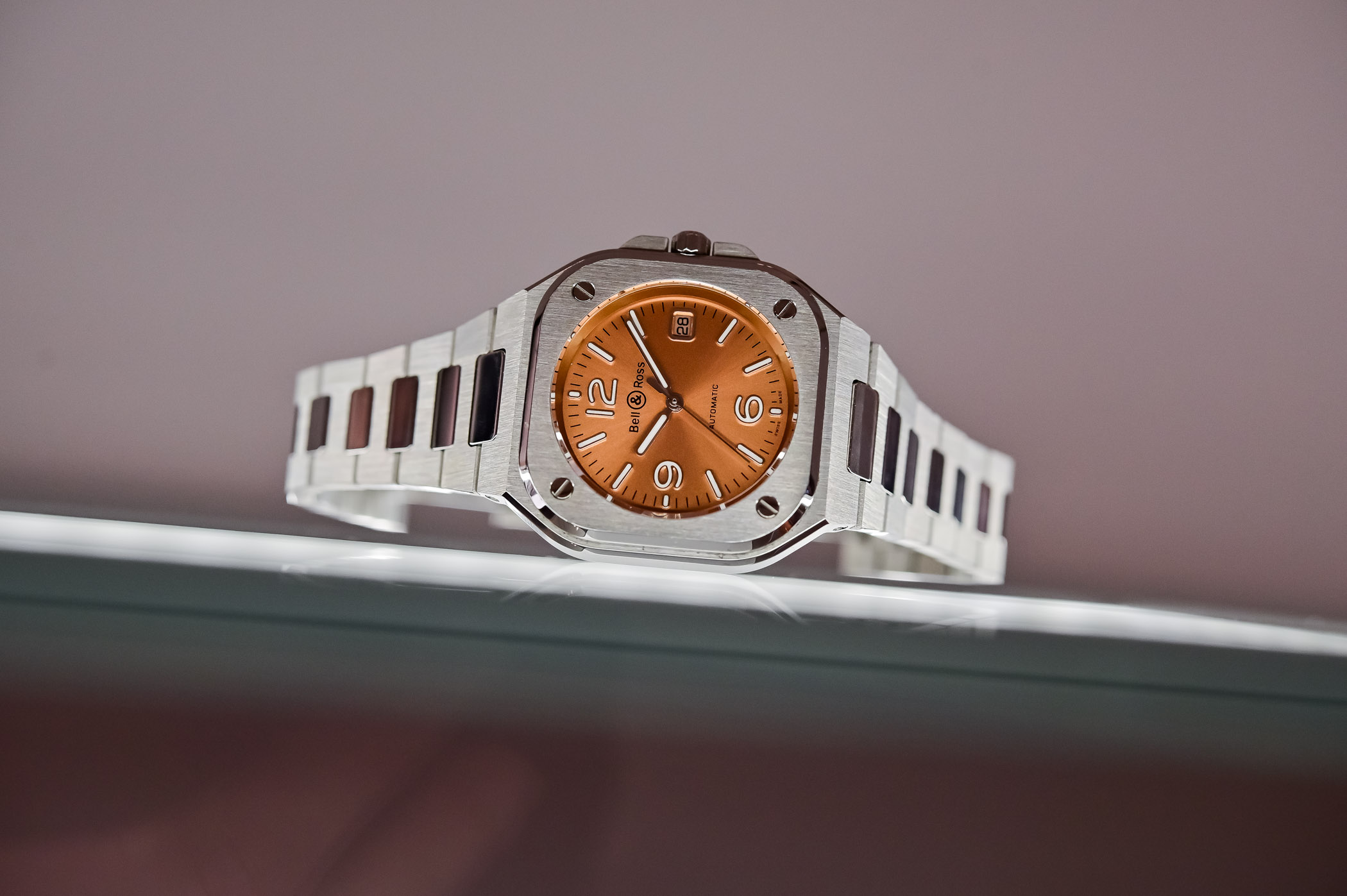
Probably the most important collection of Bell & Ross in a decade, the BR 05 was all about bringing the classic codes of the brand into a more contemporary, less military-oriented style. The fundamentals are still there but revisited with an integrated bracelet, and luxury sports watch codes with 1970s inspirations. And now that this cool, sporty-chic model has made a name for itself, it’s time for it to evolve. The strategy that Bell & Ross is applying today is similar to the transition from the BR-01 to the BR-X1: the same overall inspiration, a far more muscular look and a multi-part architecture that opens the door to many variations.
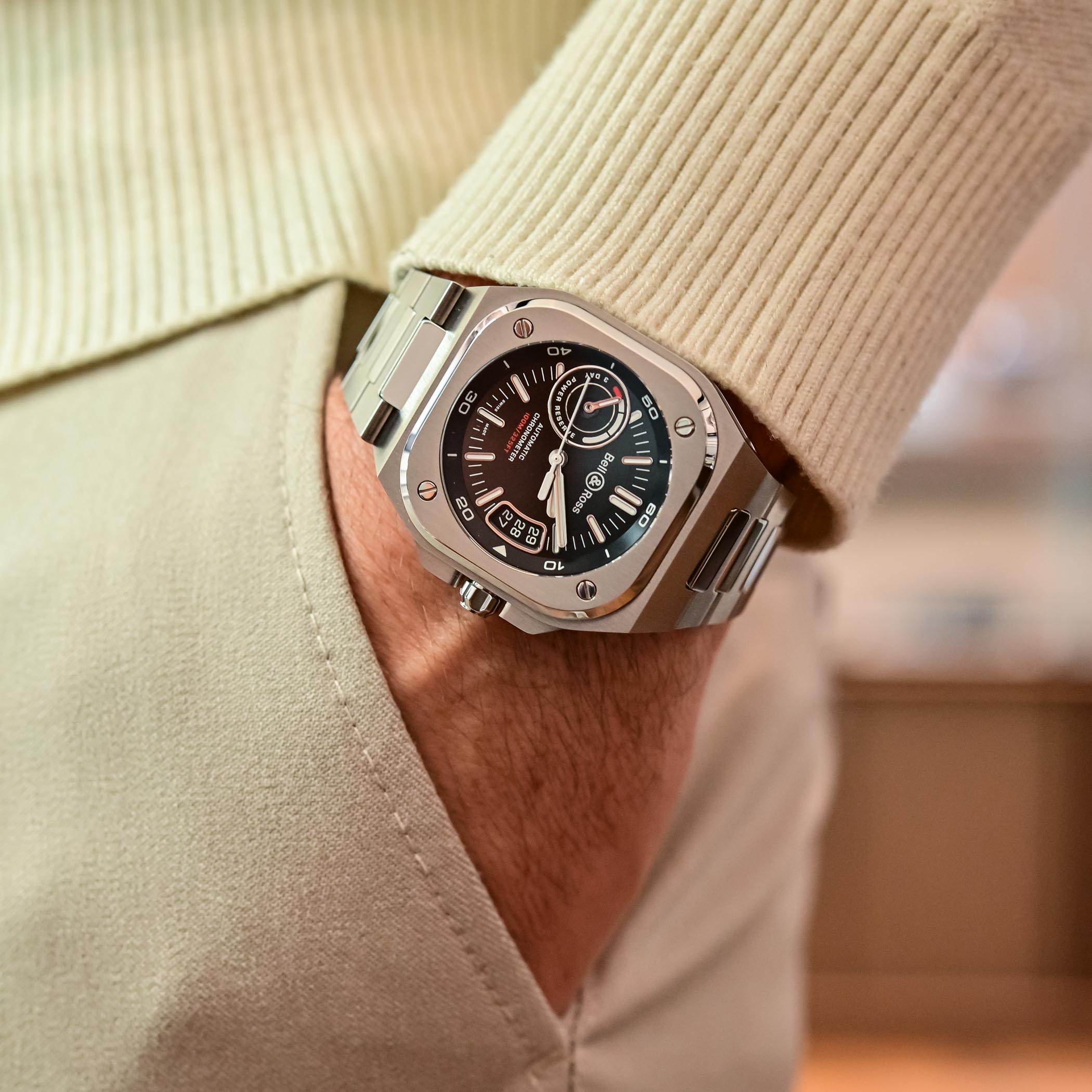
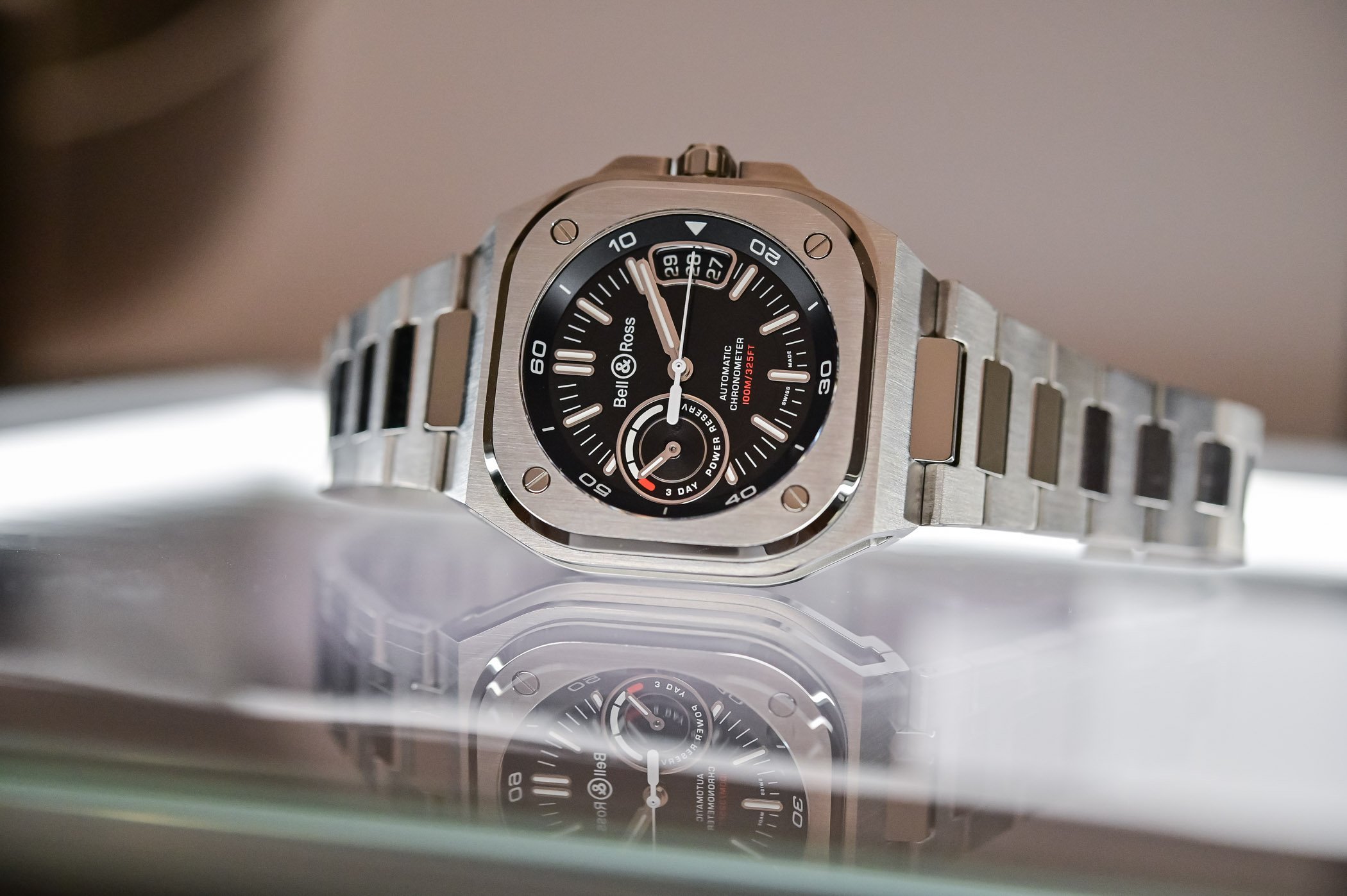
Here comes the new Bell & Ross BR-X5, the bold, muscular and technical side of B&R’s urban collection. And yes, the letter X translates into experimentation. We’ve seen this in the past already with the BR X1, and now the same treatment comes to the 05 collection. First and foremost, the new BR-X5 is keeping the design of the range alive. The circle within a square, the 4 screws, the overall pilot inspiration… it’s all there. So is the integrated design with a bracelet following the lines of the case. But as you can see, some work has been done to up its presence.
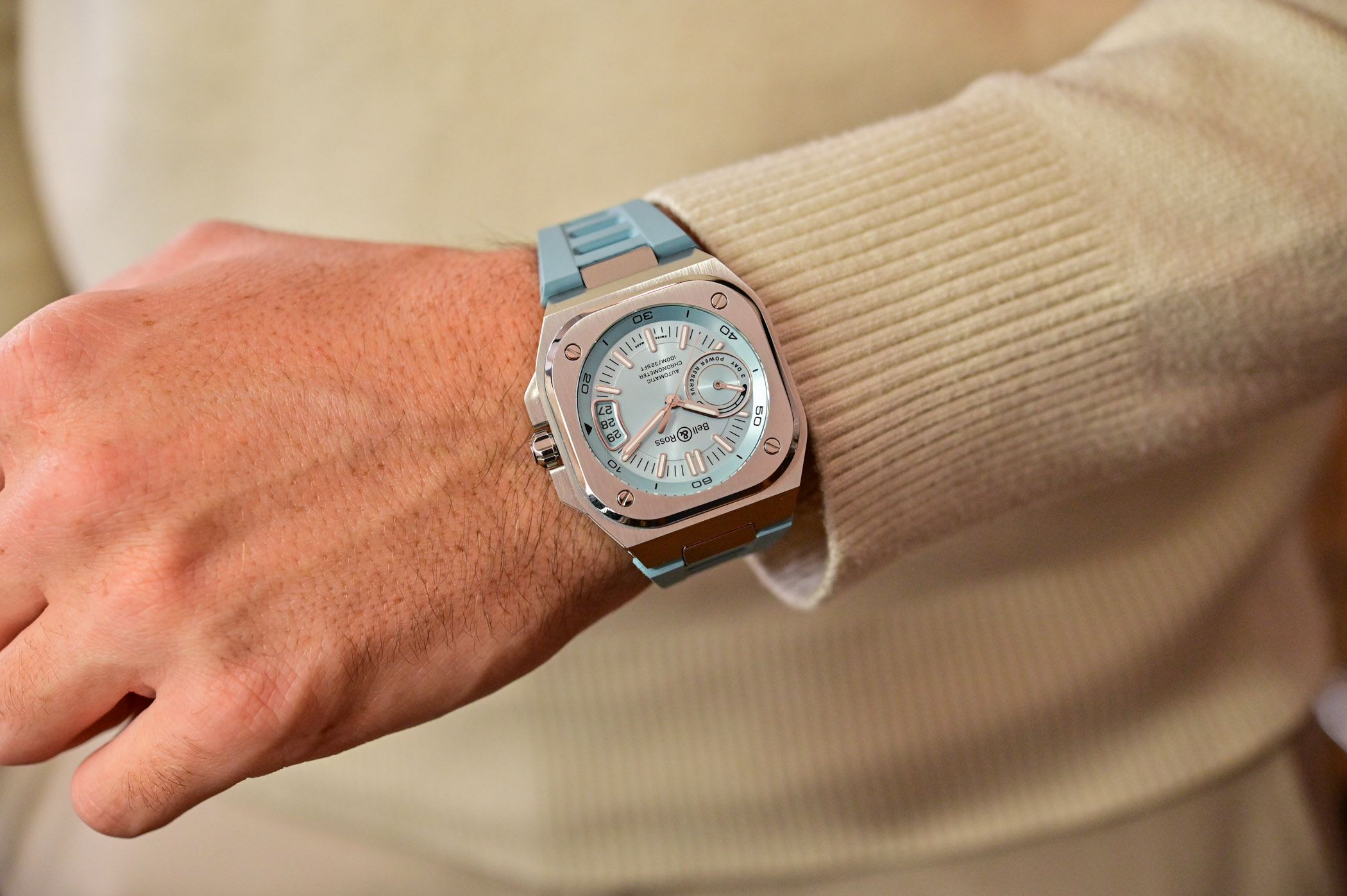
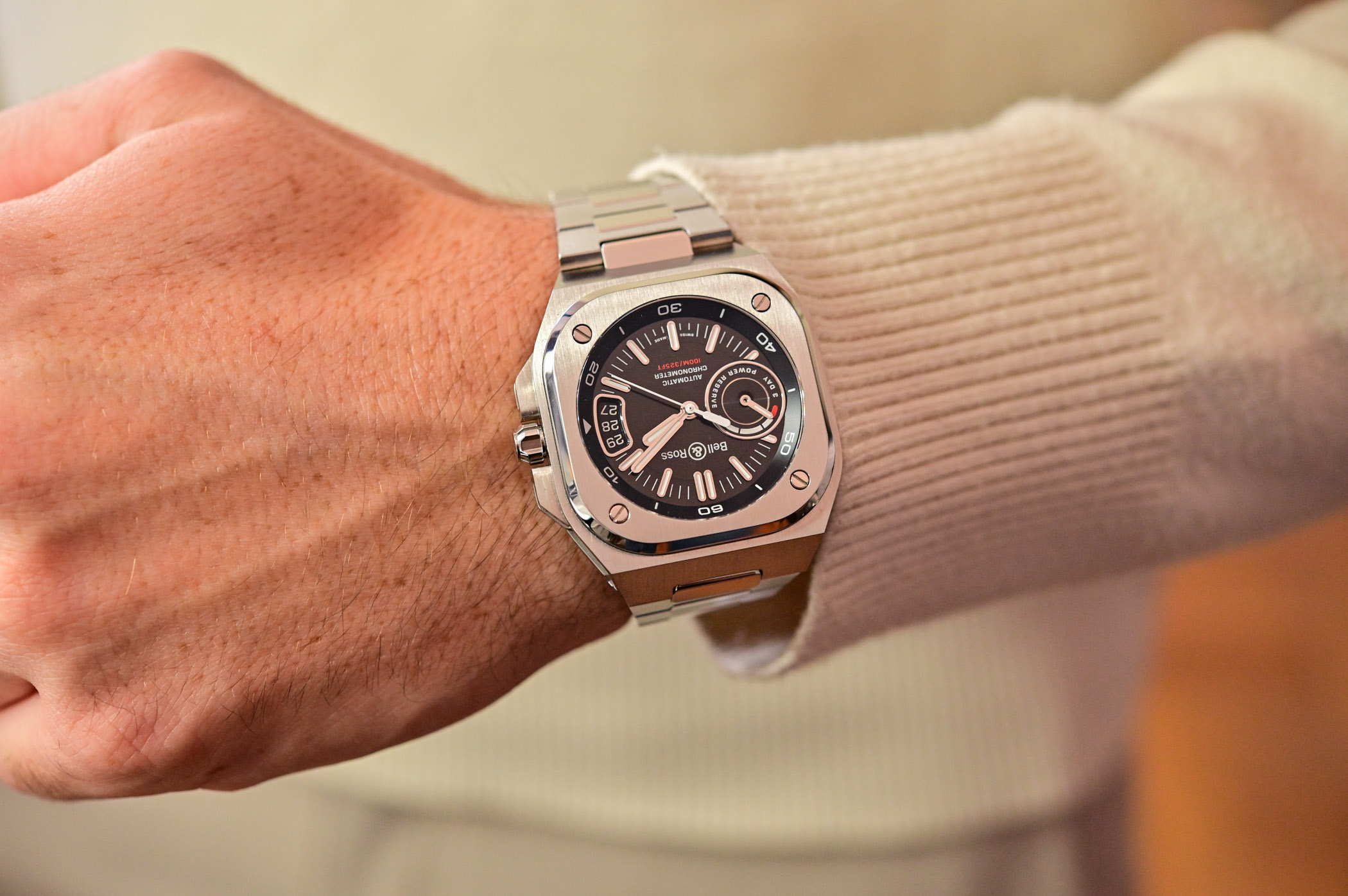
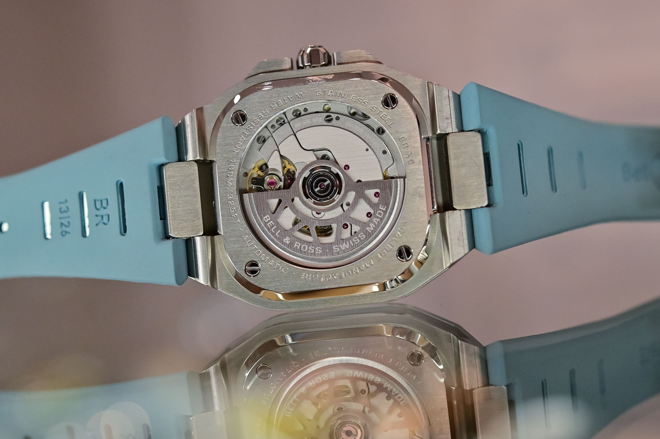
If the overall lines of the case are almost identical to the BR 05, the new BR-X5 relies on a different architecture. It’s also slightly larger, at 41mm in diameter and 12.80mm in height. Not small but still manageable on the wrist. The main change regards the construction, with a watertight container, a kind of central core that protects the movement. But now, the square bezel with its round sapphire crystal on the dial side and the open caseback on the movement side are fixed to the two steel plates that form the top and bottom of the case, all secured by the 4 screws. And this opens the door to countless potential evolutions, as it’ll be easy to change materials to create new, contrasting editions.
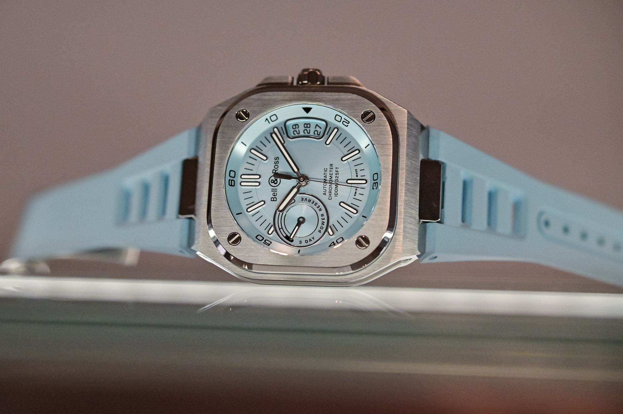
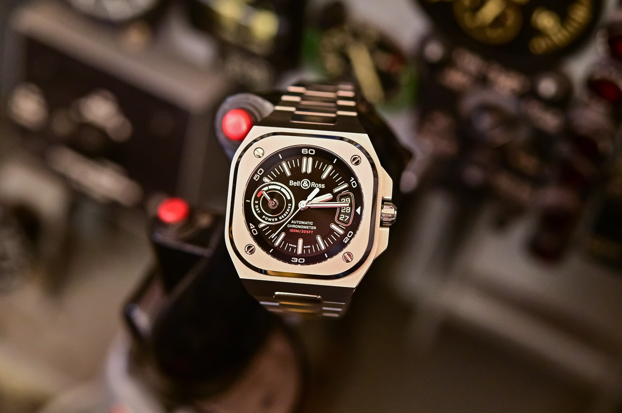
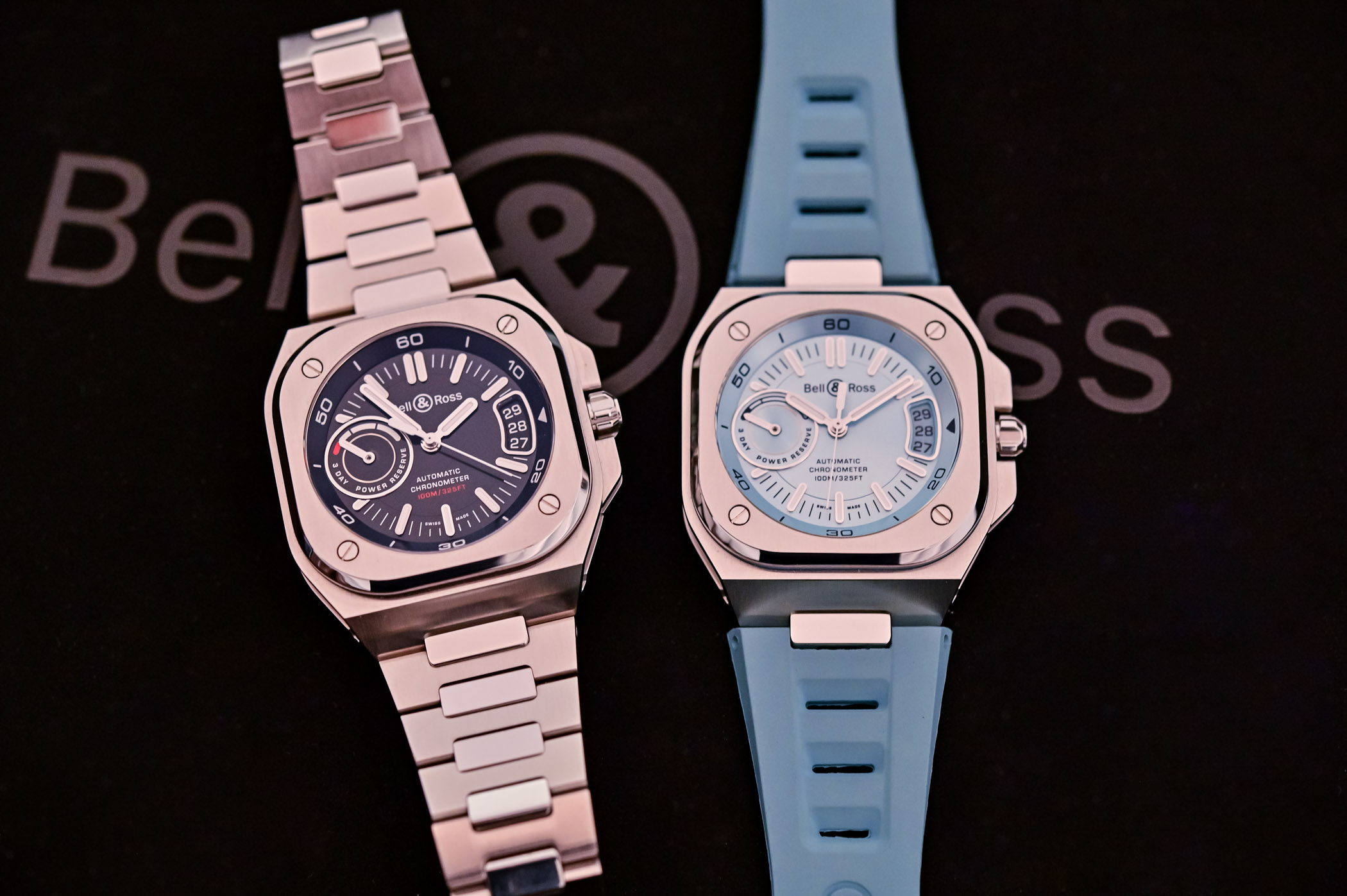
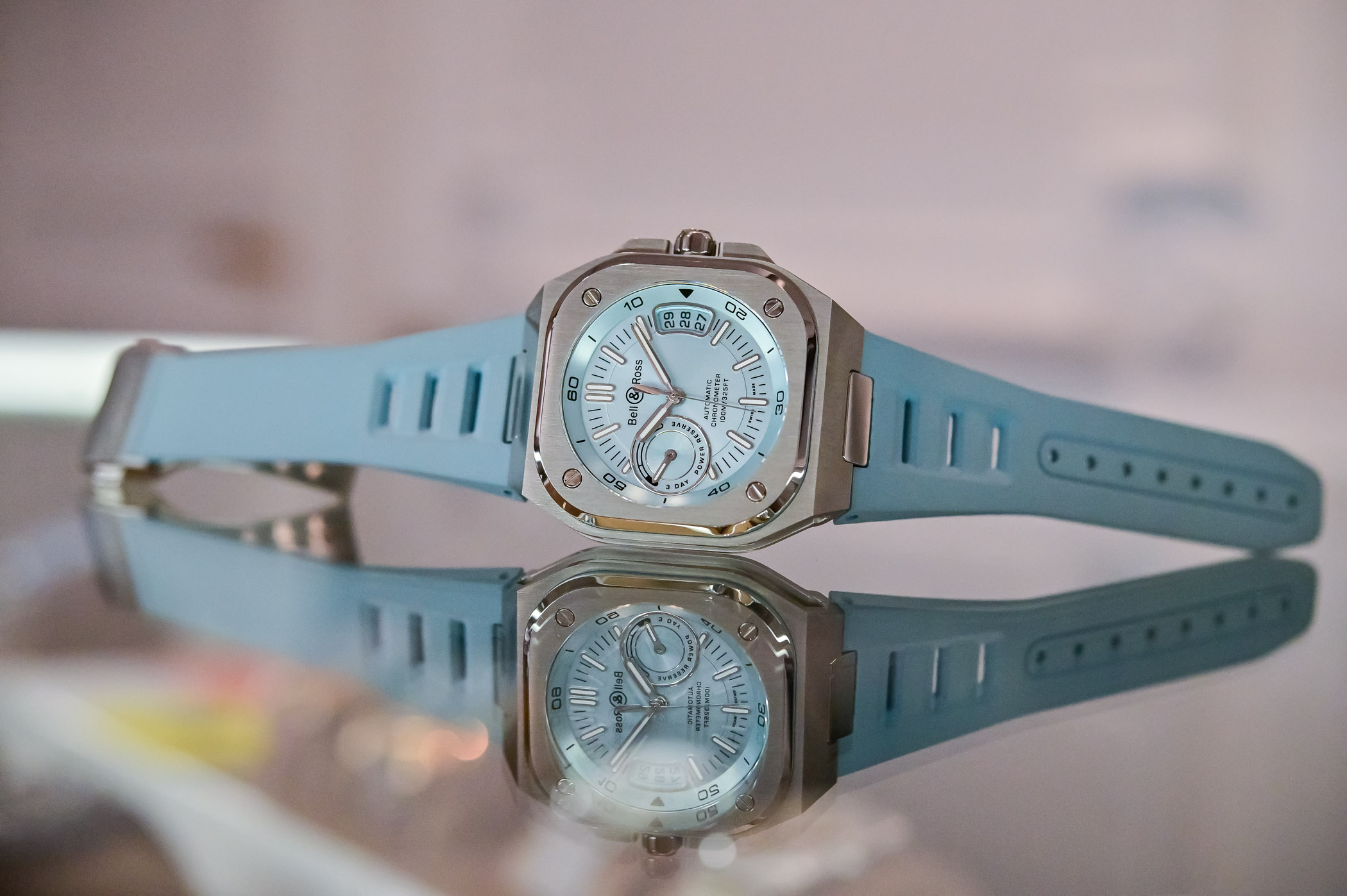
The multi-layer assembly can be appreciated on the sides of the case with their hollowed-out architecture and different textures – from polished to brushed or matte. And a rubber ring under the bezel gives it a sportier, more technical look. The watch is presented for now in two full-steel editions, available on a rubber strap or a steel bracelet. The crown, well protected by guards, screws down, and the water-resistance is rated at 100 meters.
A new dial complements the bolder design of the case. The hands and markers on the BR-X5 are bolder, larger and generously filled with Super-LumiNova. Two elements indicate that something special beats underneath the dial. There’s a power reserve indicator with a 3-day mention and a large triple-digit date window. The dial is available in classic sunray-brushed black or a trendy new colour known as ice blue. And both come with a matching rubber strap.
The main game changer in the BR-X5 is the movement. For the first time, there’s a manufacture movement made by Kenissi (which makes sense since this movement maker is partially owned by Chanel, which also partially owns Bell & Ross). Using the same base as Tudor, Breitling, Fortis or Norqain, the BR?CAL.323 is a solid automatic movement with a 3-day power reserve, variable inertia balance, a transversal balance bridge and a 4Hz frequency. It’s also a certified chronometer by the COSC and comes with a 5-year warranty. All of that with a finishing and design specific to Bell & Ross, which you can see through the sapphire caseback. No doubt that this is a step up compared to previous models.
The Bell & Ross BR-X5 is a powerful watch. No doubt about it, it has presence. It looks and feels technical, more daring and more rugged than before, which actually feels quite natural for the brand. Sure, it has lost a bit of the elegance of the BR-05 but retains a relatively wearable case. And B&R finally has some appealing mechanics under the hood. However, this comes at a price.
Availability & Price
The new Bell & Ross BR-X5 Collection launches now as part of the permanent collection, and orders are now being accepted. The models on a rubber strap retail for EUR 6,900, and those on a steel bracelet for EUR 7,400. For more details and orders, please visit www.bellross.com.



5 responses
So much prominence for the power reserve I don’t know if it favors it.
Maybe if they hadn’t dedicated an entire subdial to it. Going through a mid-arc at hour 9 would be less aggressive visually
In of the back of the watch, you will see a very sad “calibre manufacture” engraved on it. Today the term “Manufacture” is abused everywhere, using it as a substitute for what is often the vertical integration of watchmaking companies. Kenissi loses exclusivity but it doesn’t matter, now it’s all about making money. And not just Kenissi, they all do. These are times of crisis, we must survive
The design language on this one does not work on so many levels. Clashing ideas, dial elements fighting for a space, broken symmetries, unbalanced ratio between polished and brushed surfaces where one does not compliment the other, too much text for a cockpit born tool etc. I will not comment on the new caliber, even Oris offers a five days PR for less. And why do you even need a PR indicator if its automatic and you wear it daily? Maybe I’m just bored with the whole integrated bracelet thing.
absolutely gorgeous, I bought mine (ice blue), definitely my new favourite
Great watch, great design, great finishing, great bracelet and strap, great movement, ok price.